
Table of Contents
Last update: June 2026. All opinions are my own.
Machine Learning from Scratch · Part 2/12
📋 In a hurry? Read the one-page cheat sheet — every decision rule, code pattern, and trap from this post, condensed for fast revision (or ⌘ P to print it).
1. Why Data Cleaning Matters — and Where It Fits
A large part of the data science job is data wrangling. As a classic tweet by David Robinson puts it: "90% of data science is wrangling data; the other 10% is complaining about wrangling data." X · drob
Machine learning isn't just about selecting algorithms. In practice, the performance of a model depends heavily on the quality of its input data. GeeksforGeeks
🔑 A good model trained on bad data is still a bad solution. Towards AI
Data Cleaning vs Feature Engineering
Before going further, let's distinguish between two concepts that are frequently conflated but mean fundamentally different things:
| Concept | Meaning | Practical Example |
|---|---|---|
| Data cleaning | Detecting, correcting, or handling structural flaws and errors in raw data. | Removing impossible ages, treating outliers, imputing or flagging null values. |
| Feature engineering | Creating newer, more informative variables from existing clean data. | Extracting weekday/month from dates, bucketising continuous variables, creating interaction terms. |
💡 Data cleaning makes data usable and trustworthy. Feature engineering makes data more informative for the algorithm. Both happen before training, and both set the absolute ceiling on your model's capabilities. This post focuses strictly on data cleaning; feature engineering is covered in Part 3.
Where Data Cleaning Fits in the ML Pipeline
A typical machine learning project progresses through four ordered phases. Data cleaning serves as the gatekeeper in the second stage:
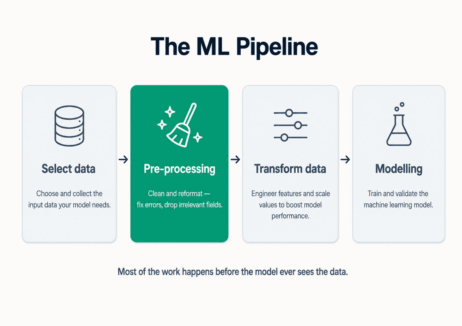
- Select data — define the prediction problem, identify ingestion sources, and determine what an individual row represents.
- Preprocessing (data cleaning) — detect errors, handle missing entries, resolve incorrect data types, eliminate duplicates, and correct impossible boundaries.
- Transform data — scale numerical values, encode categorical strings, reduce dimensionality, and handle highly skewed distributions.
- Modelling — train, tune, and validate the algorithm. This is often the smallest codebase in the entire project.
Many downstream modelling failures are actually data issues that should have been caught in stages 2 and 3. Mastery over these preprocessing steps is what separates entry-level practitioners from seasoned professionals.
2. Understanding the Data — and the Meaning of the Features
Before executing a single transformation, you must understand the business logic behind every feature. Automated scripts cannot catch the silent data anomalies that ruin models.
Errors with a Meaning
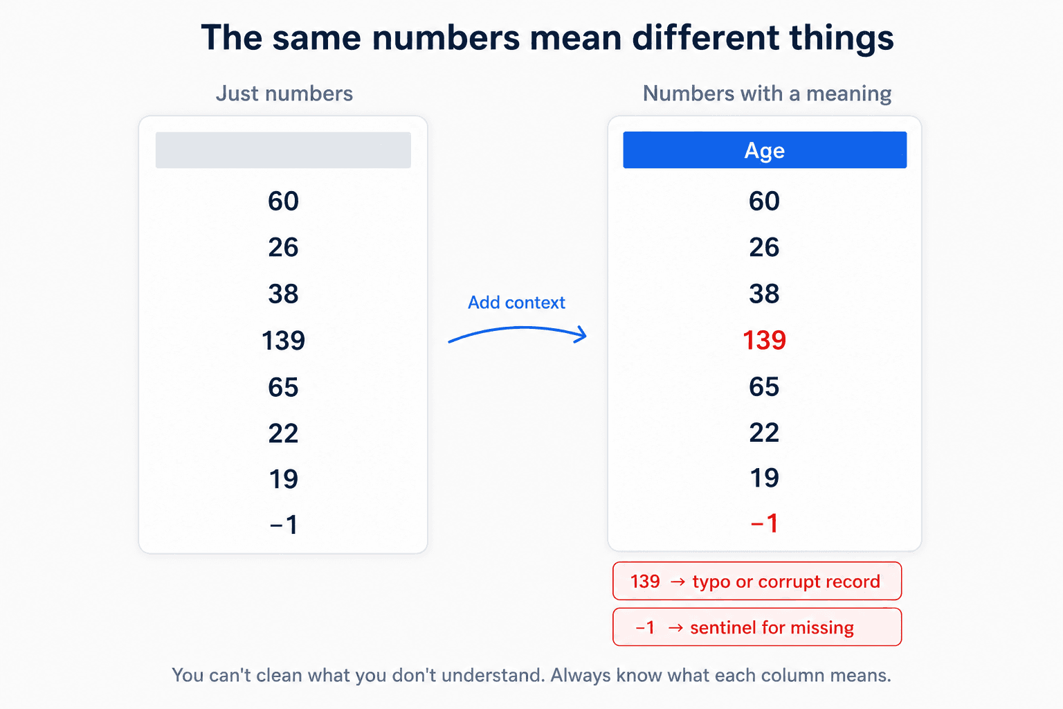
A number is never just a number; context dictates its validity. Consider these classic gotchas:
agecontaining-1or139. Both are valid integers, both are physically impossible. The-1is likely an intentional sentinel used by upstream systems to flag "missing" data;139is probably a corrupted entry or typo. Feed these raw values to a model and it will dutifully learn that some customers are 139 years old.solar_power_outputcontaining0for half the dataset. This does not necessarily point to broken sensors. Half of a 24-hour cycle is nighttime. A model trained without this context will misunderstand the panels' baseline efficiency.purchase_amountwith negative values. Refunds, promotional credits, or processing glitches? Your choice of remediation depends entirely on the answer.
You cannot rely purely on automated anomaly detection here. You must cross-reference data values with real-world operational definitions.
Non-Representative Training Data
Algorithms are mathematical mirrors: they faithfully replicate — and amplify — whatever structural biases exist in the training data. IBM
⚠️ Biased data yields biased models. To generalise reliably to production, your training set must faithfully represent the statistical distribution of the future unseen data. When training data is skewed or restricted, accuracy collapses — particularly at the tails of the distribution (e.g. ultra-high-net-worth clients, infant medical diagnostics, rare security classes).
Ensuring representative samples is difficult due to two primary statistical traps:
- Sampling noise — non-representative patterns emerging entirely by chance due to small sample sizes.
- Sampling bias — systematically excluding segments of a population due to flawed data collection methods.
Sampling bias typically manifests in three real-world flavours:
- Volunteer bias: Systematic discrepancies introduced because the individuals who choose to participate in a study differ fundamentally from those who opt out (e.g., certain demographics volunteering for clinical trials at much higher rates than others).
- Selection bias: Drawing data from a narrow or convenient subgroup that fails to mirror the macro-population (e.g., evaluating general public health trends by analysing only patients who are actively admitted to emergency rooms).
- Survival bias: Focusing exclusively on the entities that successfully passed a historical filtering process while remaining completely blind to the failures that vanished along the way.
The textbook example of survival bias occurred during World War II, when analysts mapped shrapnel holes on returning combat aircraft to figure out where to add protective armour plating. A plane had roughly a 50/50 chance of returning. When planes came back, analysts mapped where they had been shot — and the instinct was to reinforce those areas.
But those planes were the survivors. The right conclusion was the opposite: reinforce the areas where the returned planes had not been shot — because planes hit in those areas were the ones that didn't come back. Wikipedia
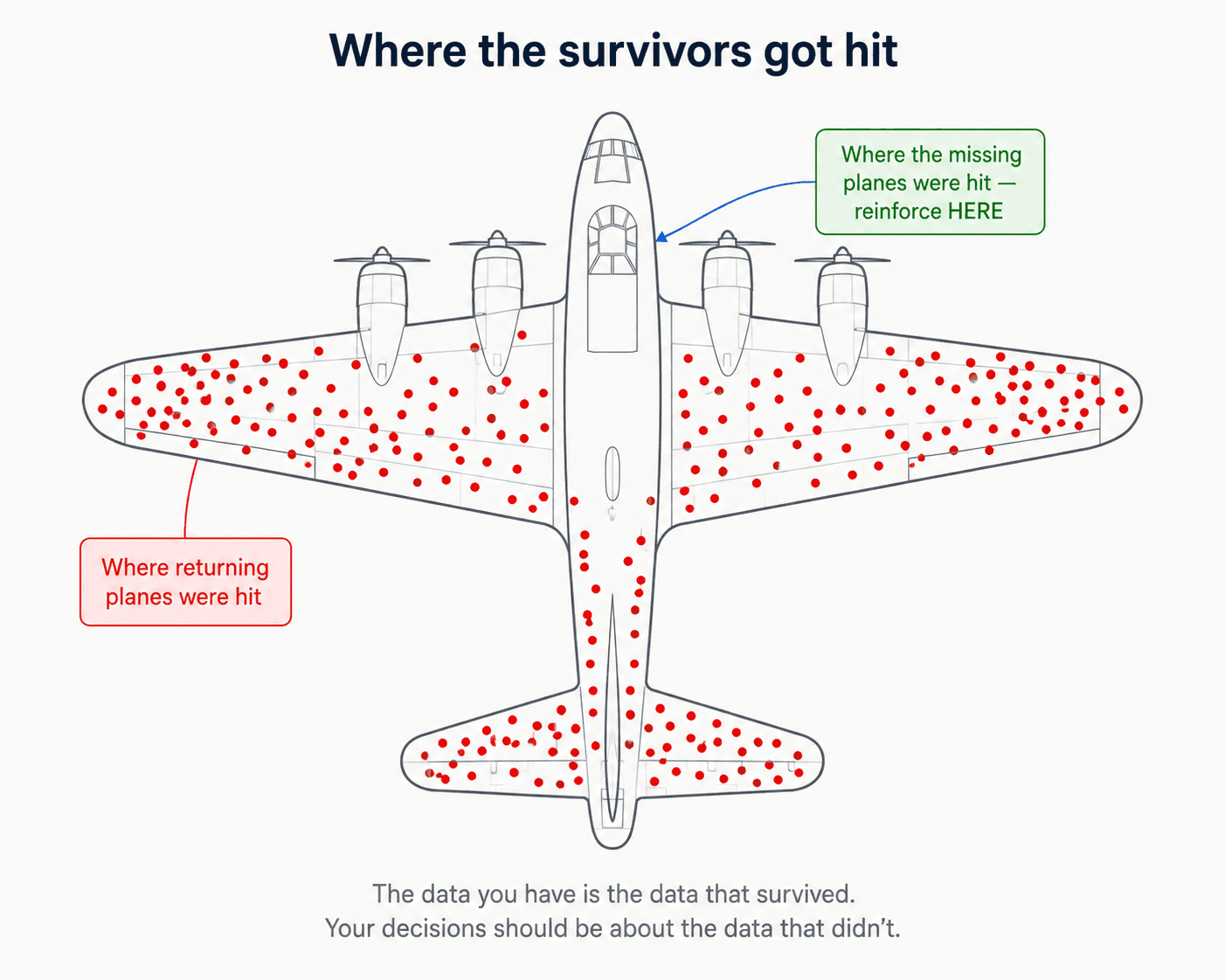
🔑 The key idea: you are focusing on a specific population with specific features, and you cannot extrapolate to the entire population.
A million rows of biased data is still biased. Volume doesn't fix selection.
One last thing before we move on: this whole section was about which rows you have. The next section is about what scale the columns are on — and that matters most exactly when there's a vast difference in range between features.
3. Scaling — When Magnitude Hijacks Your Model
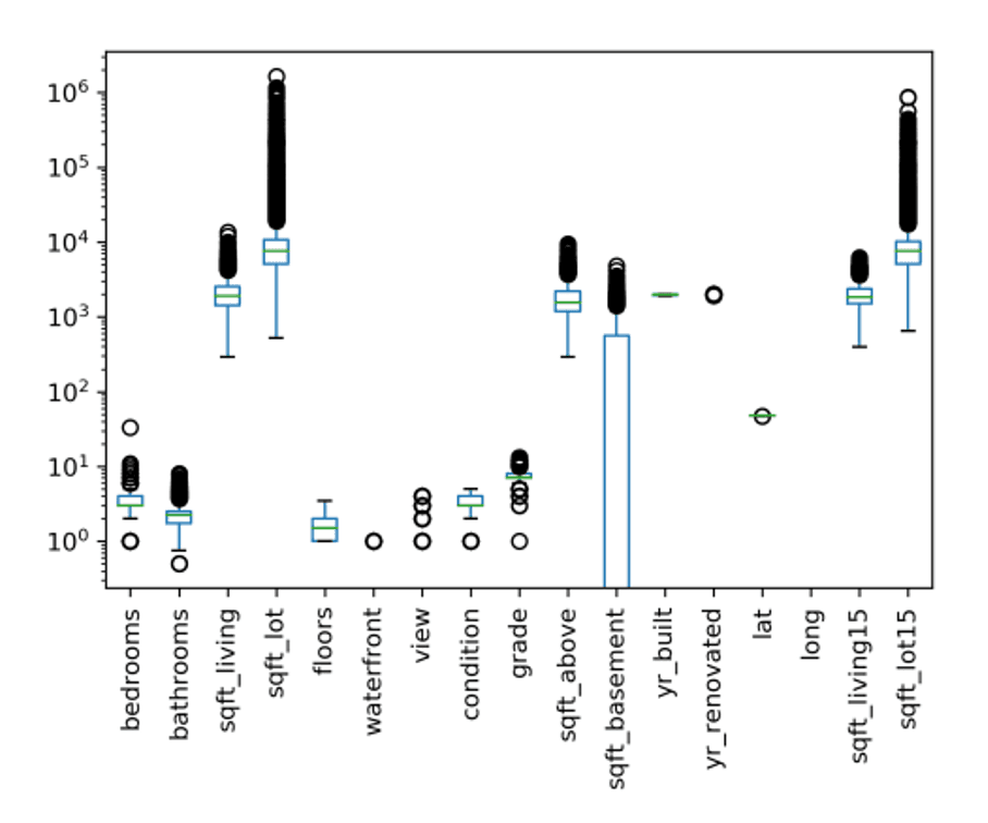
Imagine training a model on real estate data containing two independent variables: bedrooms (ranging from 1 to 5) and sqft_living (ranging from 500 to 5,000). If left unscaled, the raw geometric scale of the square footage feature will mathematically overwhelm the bedroom count, regardless of which feature holds more true predictive power.
It's not just two features — open any real dataset and the same chaos shows up across the board. Here are the King County house-sales features on a log y-axis, the dataset we've been using throughout this post:
Where Scaling is Mandatory vs. Optional
Feature scaling is determined entirely by the underlying mathematics of your chosen algorithm:
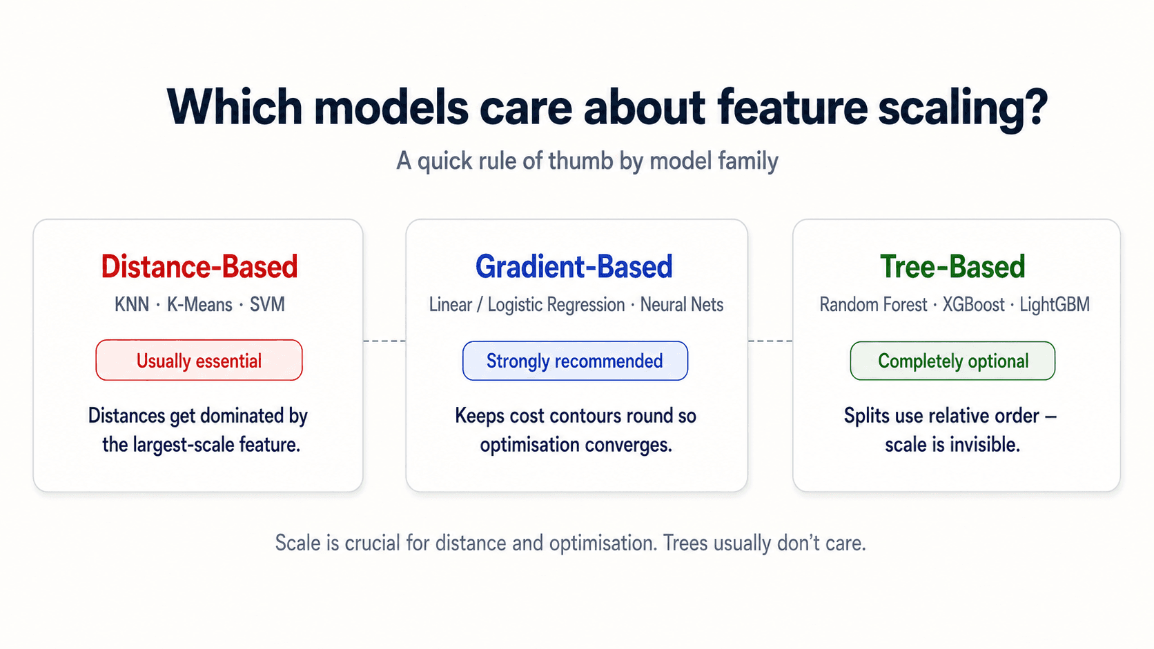
- Coefficient and Distance-Based Algorithms (Mandatory). Algorithms like K-Nearest Neighbors (KNN) and Support Vector Machines (SVM) measure geometric distances between records. Without scaling, a thousand-unit variance along a feature axis like
incomeswamps a single-unit variance on an axis likeage, making the model blind to age differences. For Principal Component Analysis (PCA), unscaled data tricks the algorithm into aligning its primary components purely with the columns possessing the highest raw variance. - Gradient-Descent Optimisation (Highly Recommended). For Linear Regression, Logistic Regression, and Deep Neural Networks, mismatched feature scales stretch the loss function's cost contours into highly elongated valleys. This forces optimisation paths to oscillate violently, delaying or completely blocking convergence. Scaling standardises these contours, mapping a direct line to the global minimum.
- Tree-Based Models (Invariant). Decision Trees, Random Forests, and Gradient Boosting architectures split nodes by evaluating individual feature cutoffs sequentially (e.g.,
if sqft_living > 1500). Because they never calculate cross-feature distances or weights concurrently, multiplying a column by an arbitrary scalar leaves the resulting tree splits completely unchanged.scikit-learn
💡 Where scaling is non-negotiable: KNN, SVM, PCA, gradient-descent-based methods. Where it doesn't matter: tree-based methods. Where it can speed things up anyway: almost everywhere else, because gradient descent converges much faster on scaled features.
The Distance-Based Case, Made Visual
Any algorithm that learns from the distance between two data points is going to be affected by the scale of the features — KNN and SVM are the textbook examples. Picture a classification problem with two classes (red and blue): on the left, the features sit on completely different scales (one runs from -1 to 6, the other from 8,000 to 120,000). On the right, both features have been standardised. KNN looks for the closest neighbours — and "closest" only means something honest when the axes are comparable.
![Two side-by-side classification scatter plots demonstrating how feature scale distorts distance-based algorithms. Left card 'KNN without scaling' shows Feature 1 (huge scale) from 8000 to 12000 on x-axis and Feature 2 from -1 to 6 on y-axis, with red triangles (class B) and dark navy circles (class A) — the decision boundary is a near-vertical line because the big-magnitude feature dominates. Right card 'KNN with scaling' shows both axes scaled to roughly [-2, 2] after StandardScaler — the decision boundary is now horizontal, properly separating the two classes by both features. Red pill under the left card: 'Big feature dominates'. Green pill under the right card: 'Both features count'. Caption: 'KNN and SVM measure distance. If one feature is 1000× the other, that feature is the only one they see.'](/_next/image?url=%2Fimages%2Fblog%2Fml-from-scratch%2Fdata-cleaning%2Fknn-scaling-comparison.png&w=3840&q=75)
🎯 Practical advice from class (my professor's, and now mine): plot the data — or compare model performance — with the features scaled and unscaled. Real-world problems will almost always need scaling. The exception is tree-based models, where scaling is rarely needed to improve performance.
Why Standardising to Mean = 0, Std Dev = 1 Works
Most weight-initialisation strategies and optimisation algorithms are explicitly designed around the mathematical assumption that input features are centered around a zero mean with unit variance. Scaling doesn't create that assumption — it brings your real data into the shape the algorithm was already built for. Skip the step, and you're feeding the model an input distribution it was never tuned to process.
The Four Scalers You'll Actually Use
Scikit-learn ships four scalers worth knowing. Each one is the right answer in a different situation.
| Scaler | What it does | When to reach for it |
|---|---|---|
StandardScaler | Centres to mean 0, scales to std 1 | Default for most algorithms. Assumes roughly Gaussian features. |
RobustScaler | Centres to median, scales by IQR | When you have outliers you can't / don't want to remove — it ignores them. |
MinMaxScaler | Squishes into the range [0, 1] | When you need bounded inputs — neural-net activations, downstream tests like chi-squared that can't accept negatives, or whenever negative values aren't meaningful. |
Normalizer | Projects each row onto the unit sphere (length 1) | When you care about direction not magnitude — cosine distance on text vectors, recommender systems. |
The default is StandardScaler. The rule of thumb: if StandardScaler doesn't work or your data has weird outliers, try RobustScaler next. scikit-learn
![Five side-by-side scatter plot cards titled 'Four scalers, same data'. Each card shows the same dataset (two clusters: dark navy on top, green on bottom) transformed differently. Card 1 'Original Data' shows axes [-10, 15] × [0, 10] with clusters in the upper-right region. Card 2 'StandardScaler' shows axes [-2, 2] × [-2, 2] with clusters centered around 0. Card 3 'MinMaxScaler' shows axes [0, 1] × [0, 1] with clusters squished into the unit box. Card 4 'RobustScaler' shows axes [-2, 2] × [-2, 2] similar to StandardScaler but with a visible outlier dot. Card 5 'Normalizer' shows the data projected onto the unit circle as an arc. Small slate-grey captions under each card: As-is / Mean 0, std 1 / Fits into [0, 1] / Median + IQR (handles outliers) / Each row → length 1. Bottom caption: 'The default is StandardScaler. Reach for the others when your data breaks its assumptions.'](/_next/image?url=%2Fimages%2Fblog%2Fml-from-scratch%2Fdata-cleaning%2Ffour-scalers-comparison.png&w=3840&q=75)
A Note Before You fit Anything
Every scikit-learn transformer you've seen so far — StandardScaler, MinMaxScaler, RobustScaler — has to be fit on your training data only, never on the test set. The same applies to every encoder, imputer, and detector that comes up later in this post. There's a discipline behind that — the fit / transform contract — and it's important enough that I've pulled it out into Section 8 at the end of the post where it can sit alongside the rest of the leakage-prevention principles. For now: just remember that the moment you write scaler.fit(X_test), you've broken your evaluation.
4. Categorical Features
Most ML algorithms are designed to deal only with numerical values — feed them a string like "Manhattan" or "red" and they fail.
- Some algorithms support categorical features directly: all tree-based models, some Naïve Bayes classifiers. Always check the library documentation — scikit-learn's tree implementations still require numeric input, even though the algorithm conceptually wouldn't need it.
- For everything else: you have to encode categories as numbers before the model can use them.
🔑 Don't trust numeric-looking categories. Zip code, product ID, customer ID, region code — they look numeric but their numerical order is meaningless. Treat them as categories unless the magnitude really means something.
There are three encoding strategies. Which one you use depends on the cardinality (how many distinct values) and whether the categories have a real order.
| Encoding | How it works | Good for | Main risk |
|---|---|---|---|
| Ordinal | Each category → an integer code (Bronx=0, Brooklyn=1, Manhattan=2). | Truly ordered categories: low/medium/high, small/medium/large. | Invents a fake order/distance when categories are nominal — the model thinks Manhattan is "closer to" Queens than Bronx. |
| One-hot / dummy | One binary column per category. | Nominal categories with a manageable number of levels. | More columns; possible collinearity; high-cardinality features explode dimensionality. |
| Target / impact | Each category → a statistic of the target computed on training data. | High-cardinality categories like zip code. | Target leakage if not fitted inside training folds. |
Ordinal Encoding
Ordinal encoding turns each category into an integer. It's only appropriate when the order is real and meaningful — education levels, satisfaction ratings, t-shirt sizes (S/M/L). Borough names don't have an order. Neither do colours, currencies, or country codes.
# Warning: only use if the category order is meaningful.
df["boro_ordinal"] = df["boro"].astype("category").cat.codes
# Bronx=0, Brooklyn=1, Manhattan=2, Queens=3
The catch: the integers imply an order AND distances between categories. The model now believes Manhattan (2) and Queens (3) are "closer" than Bronx (0) and Queens (3) — which is meaningless for boroughs.
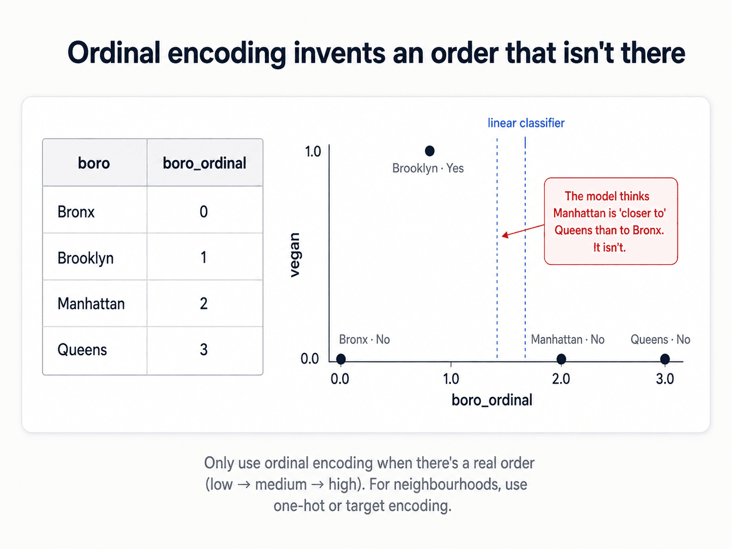
Use ordinal encoding only when an order genuinely exists — low / medium / high, small / medium / large, education levels, t-shirt sizes. Otherwise reach for one of the next two.
One-Hot (Dummy) Encoding
One binary column per category. The borough column becomes four columns:
| boro | salary | boro_Bronx | boro_Brooklyn | boro_Manhattan | boro_Queens | |
|---|---|---|---|---|---|---|
| Manhattan | 103 | → | 0 | 0 | 1 | 0 |
| Queens | 89 | → | 0 | 0 | 0 | 1 |
| Brooklyn | 54 | → | 0 | 1 | 0 | 0 |
| Bronx | 219 | → | 1 | 0 | 0 | 0 |
Two ways to do it:
# Quick exploration — pandas
pd.get_dummies(df)

# Inside an ML pipeline — sklearn (prefer this)
from sklearn.preprocessing import OneHotEncoder
encoder = OneHotEncoder(handle_unknown="ignore")
The sklearn version is what you want for any real model. It plugs into ColumnTransformer and Pipeline so the same encoding fits on training data and applies cleanly to test/production data. handle_unknown="ignore" is a small but critical detail — without it, the encoder crashes when production data contains a category it didn't see during training.
The catch — collinearity. The dummy variables are redundant. The last category is always 1 − sum(others), which means the columns are perfectly co-linear. For linear and logistic regression, that's a real problem.
- Drop one to break the redundancy. You lose nothing — the dropped category is implied when all the others are 0.
- But even after dropping one, the remaining columns can still be correlated. For nominal categories with many levels, the safer move is regularisation or a tree-based model.
- Keeping all can make the model more interpretable (you can read off the coefficient for each category directly) — fine for tree models, risky for linear ones.
💡 Special case: binary features (Yes/No, True/False). You only need one column, not two. vegan_Yes = 1 already tells you vegan_No = 0. Dropping the redundant column removes the collinearity entirely and saves a dimension. For binary categorical features, always drop one.
The bigger catch — high cardinality. If zipcode has 200 distinct values, one-hot encoding adds 200 columns. You've just exploded your dimensionality. Every algorithm that suffers from the curse of dimensionality (Part 1) is now hurting. And the columns are mostly zeros, which is a sparsity nightmare.
This is where target encoding comes in.
Target (Impact) Encoding
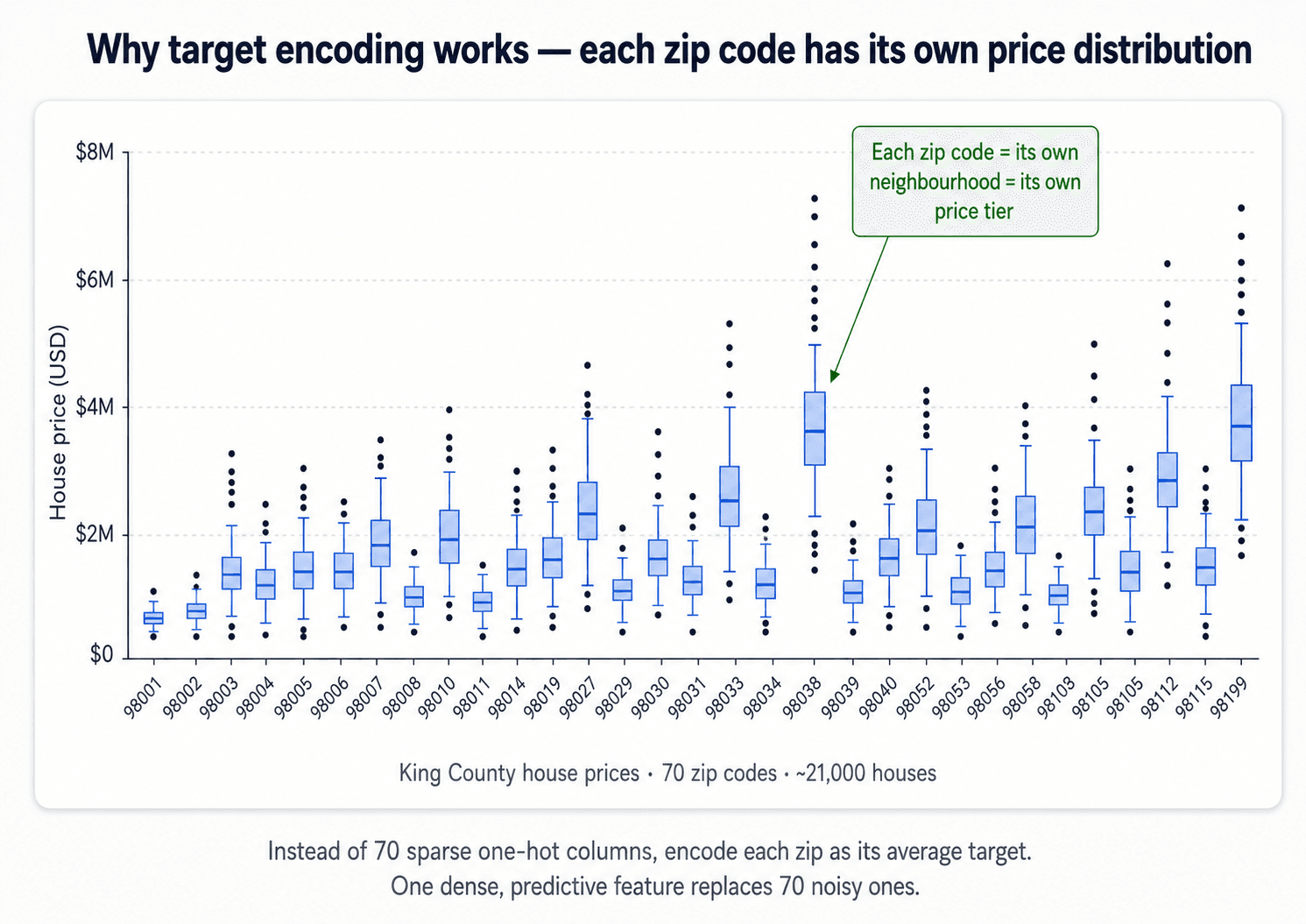
For high-cardinality categorical features, instead of 200 sparse columns you get one dense column. The value for each category becomes the average value of the target variable for that category.
For zipcodes predicting house price: the value for 98029.0 becomes the average price of houses in 98029.0. Suddenly the model has a single, strongly-predictive feature instead of 200 noisy columns.
from category_encoders import TargetEncoder
te = TargetEncoder(cols='zipcode').fit(X_train, y_train)
X_train_encoded = te.transform(X_train)
(Not built into scikit-learn — use the category_encoders library.)
In benchmarks on the King County house-prices dataset, switching from one-hot to target encoding on zipcode lifted R² from around 0.5 to 0.78. That's a huge gap. Kaggle If the categorical is informative and high-cardinality, target encoding is often the cleanest win in the whole pipeline.
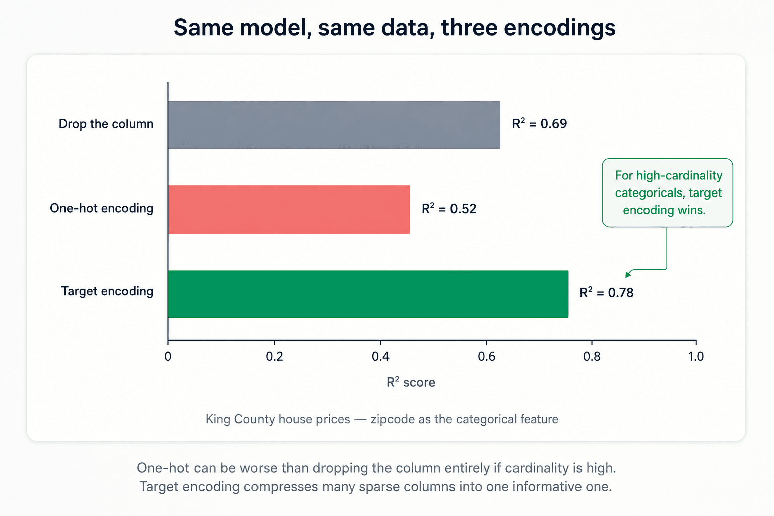
The trade-off: you lose direct explainability, but you can recover it. The model is now running on "average price in this zip" instead of raw zipcodes — fine for prediction, awkward when the stakeholder asks "which zips drive the price?" But you can map back — every encoded value corresponds to a category, so you can always join back to the original codes to explain which zip codes the model considers expensive.
Two Traps in Target Encoding — and How to Fix Them
Target encoding is one of the highest-leverage moves in this whole post, but it has two failure modes that quietly break models. Both are easy to fix once you know what to look for.
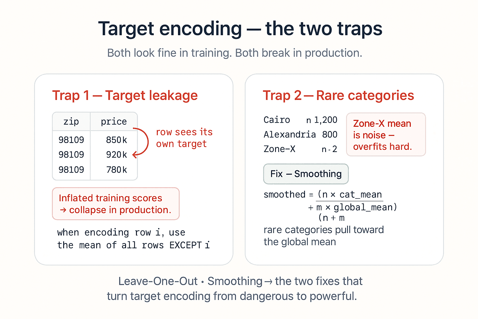
Trap 1 — Target leakage. The most common mistake. If you compute the target mean for each category using all rows — including the row you're encoding — the encoded value already contains the target you're trying to predict. The model gets handed the answer at training time. Training scores look fantastic. Production scores collapse.
The fix: Leave-One-Out target encoding. When encoding row i, compute the mean using every row except i. The signal stays; the leakage goes. Scikit-learn ships this directly as TargetEncoder (since v1.3) — category_encoders has had it for years.
from category_encoders import LeaveOneOutEncoder

encoder = LeaveOneOutEncoder(cols=['zipcode'])
X_train_encoded = encoder.fit_transform(X_train, y_train)
X_test_encoded  = encoder.transform(X_test)   # no fit on test — same rule as everything else
Trap 2 — Rare categories. Imagine zipcode 98109 shows up only twice in your training set. The "mean price for 98109" is computed from two rows — that's not a category effect, that's noise. The encoder will happily emit that noisy number, and the model will overfit hard.
The fix: smoothing. Blend the category-specific mean with the global mean, weighted by how many rows you have for that category:
smoothed = (n × category_mean + m × global_mean) / (n + m)
Where:
n= number of observations for that categorym= a smoothing parameter (hyperparameter; biggerm→ more trust in the global mean)
A common category (lots of rows) → its own mean dominates. A rare category (few rows) → pulls toward the global mean. The encoder degrades gracefully instead of cliff-edging into noise.
In category_encoders you pass smoothing= (and min_samples_leaf= for an alternative formulation); scikit-learn's TargetEncoder uses smooth='auto' by default.
from category_encoders import TargetEncoder

encoder = TargetEncoder(cols=['zipcode'], smoothing=10.0)
⚠️ Always fit target encoders inside the cross-validation loop. Even with Leave-One-Out, computing the category means before splitting leaks aggregate target information across folds. The right place for a target encoder is inside a Pipeline, the same way you'd put any other transformer.
Putting It Together with ColumnTransformer
In practice every dataset has a mix of categorical and numerical columns, and you want different transformations on each. ColumnTransformer lets you compose them:
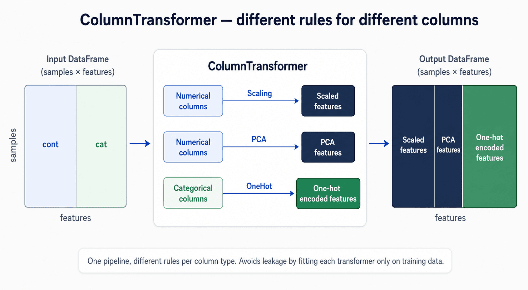
from sklearn.compose import make_column_transformer
from sklearn.preprocessing import StandardScaler, OneHotEncoder

categorical = df.dtypes == object

preprocess = make_column_transformer(
    (StandardScaler(), ~categorical),
    (OneHotEncoder(), categorical),
)
One pipeline, scales the numbers, encodes the categories, all under the same fit/transform discipline. This is how you should structure preprocessing in any real project. scikit-learn
5. Outliers
Outliers are data points that don't follow the distribution of the rest. They bias the overall pattern by forcing the model to accommodate extreme behaviour at the cost of fit on the bulk of the data.
Before You Detect Anything — Understand the Distribution
You can't talk about outliers without first knowing what the bulk of your data looks like. The fastest tool for that — and the one every box plot you'll ever see is built on — is the five-number summary.
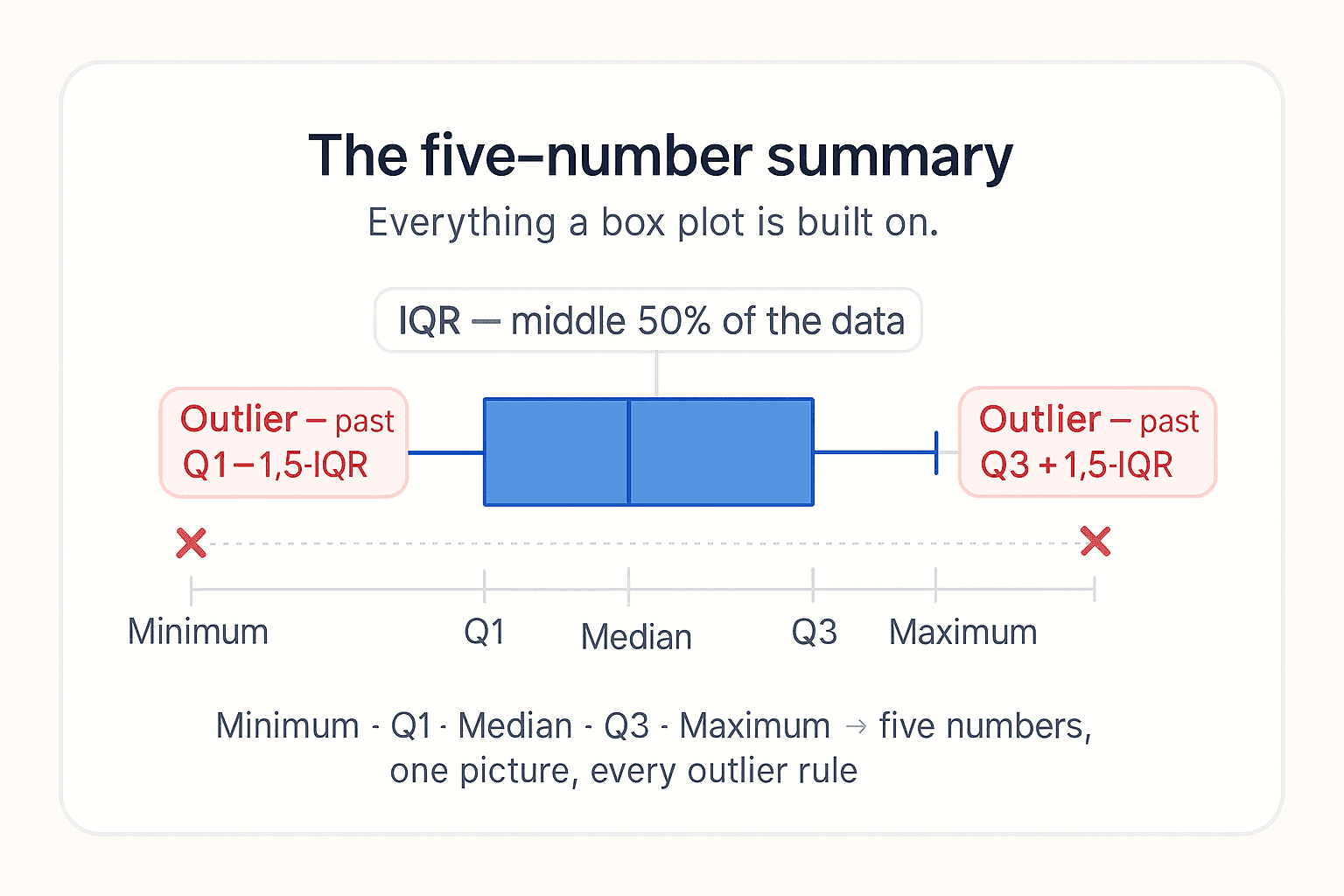
The five numbers in order:
- Minimum — smallest value in the dataset.
- Q1 (first quartile) — the value below which 25% of the data falls. The bottom edge of the box.
- Median (Q2) — the middle value. Half the data is below, half above. Median is more reliable than the mean when outliers are present.
- Q3 (third quartile) — the value below which 75% of the data falls. The top edge of the box.
- Maximum — largest value in the dataset.
From these five numbers you get the IQR (interquartile range): IQR = Q3 − Q1. The middle 50% of your data lives in that interval, ignoring the tails. That's why the IQR is so useful — outliers, by definition, sit outside it, so they can't distort it.
Worked example. Dataset = [2, 4, 5, 7, 8, 10, 15]:
- Minimum = 2
- Q1 = 4
- Median = 7
- Q3 = 10
- Maximum = 15
- IQR = 10 − 4 = 6
From those five numbers alone you already know: most of the data clusters between 4 and 10, no extreme outliers, distribution looks roughly balanced. That's the entire reason for the box plot you've seen a thousand times — it's a visual five-number summary.
This is also why RobustScaler works the way it does (covered earlier): it scales using the median and the IQR, not the mean and standard deviation, so outliers don't pull the centre or stretch the scale.
💡 Whenever a stakeholder asks for "the average" of a column, push back and report the five-number summary instead. The average is one number. The five-number summary is the actual story.
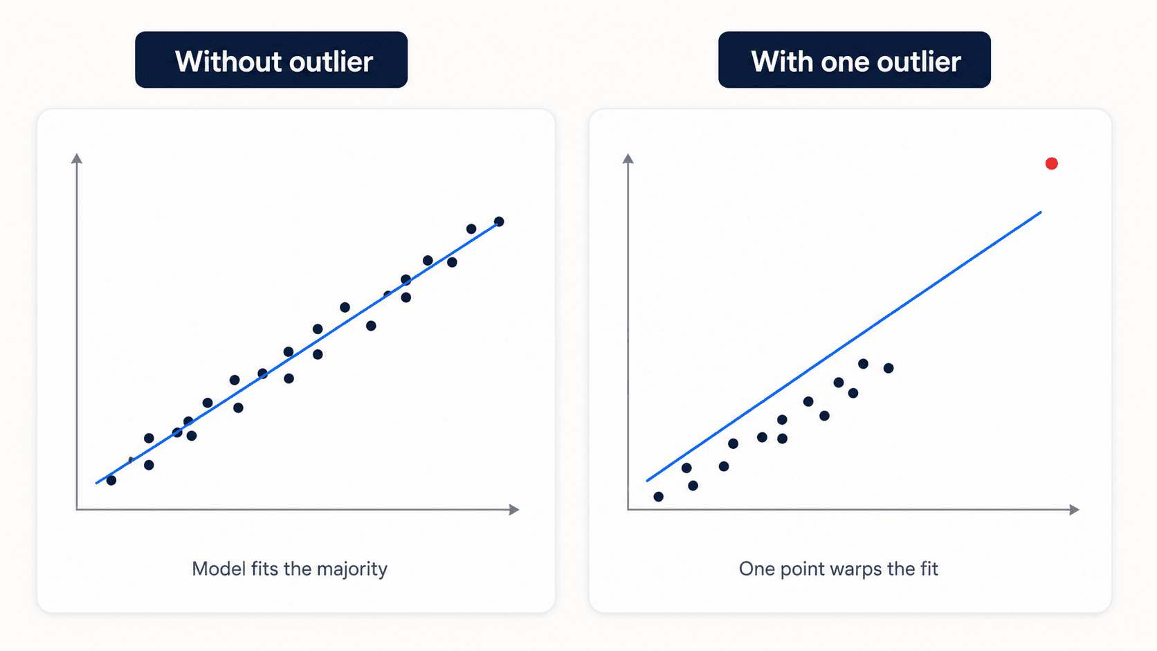
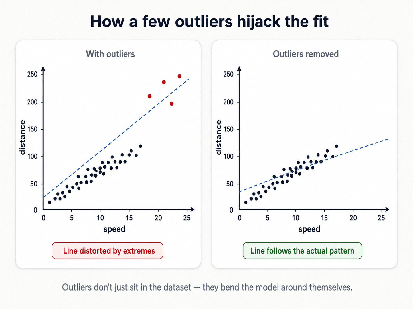
The first question is not "how do I remove them?" — the first question is "do they mean something?"
The decision tree:
- Are they meaningful? Sometimes outliers are the signal. Fraud detection lives entirely in the outliers — they're the fraud. Anomaly detection generally. Sensor failure detection. In all these cases, you keep them and make them the focus.
- Are they a category in their own right? Sometimes the right move is to add an
is_outlierboolean feature so the model can learn from their presence without being distorted by their values. - Are they just errors / noise? Remove or impute.
How to Detect Outliers
Two approaches:
Statistic-based. Compute a metric per row and threshold it.
- Z-score:
|x − μ| / σ > 3flags everything more than 3 standard deviations from the mean. Simple, fast, works on roughly Gaussian features. - Interquartile range (IQR): anything below
Q1 − 1.5·IQRor aboveQ3 + 1.5·IQR. This is exactly the box-plot whisker rule from the five-number summary above. More robust than the Z-score because it doesn't assume Gaussian — Q1 and Q3 don't get pulled by extreme values.
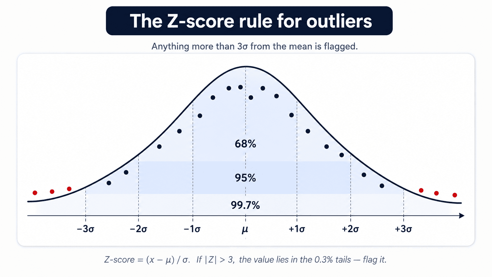
Both are prone to error when the data itself isn't roughly normal — they flag legitimate observations as anomalies just because the assumption breaks. My professor's preference (and mine in practice) is model-based detection for anything serious.
Model-based. Train a model that learns what "normal" looks like, then flag anything the model can't explain.
- Isolation Forest — trees that isolate anomalies in few splits.
- One-class SVM — treats normal data as one class, outliers as the rejected region.
- Elliptic Envelope — assumes Gaussian and finds the points outside a fitted ellipse.
These are more robust because they learn the actual distribution of your data, not a global statistic.
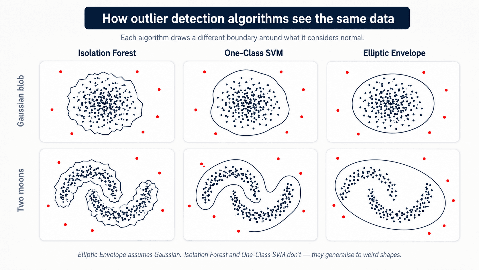
IsolationForest is the one I reach for first — it scales well, doesn't assume any specific distribution, and the API is honest about the fit/transform contract: scikit-learn
from sklearn.ensemble import IsolationForest

iso = IsolationForest(
    contamination=0.02,   # expected fraction of outliers
    random_state=42,
).fit(X_train)            # fit ONLY on train

# Predict: -1 means outlier, 1 means inlier
outlier_mask = iso.predict(X_train) == -1
You can then either drop the outlier rows (X_train[~outlier_mask]) or keep them and add an is_outlier boolean column for the model to learn from — see the next section.
What to Do With Them
- Remove — if outliers are under 1% of the dataset and clearly errors.
- Cap (winsorise) — clip values to the 1st / 99th percentile. The outlier becomes the boundary value, which most models handle fine.
- Impute — replace with the mean / median / a model-predicted value.
- Flag — add an
is_outliercolumn so the model can learn from the presence of an extreme value without being biased by its actual magnitude. Great with tree-based methods.
The "remove" option breaks down if outliers are spread across many columns of the dataset, because you'll end up dropping most of your rows. Then prefer capping or flagging.
6. Null Values
Most ML algorithms refuse to consume NaN directly. You have to decide what NaN means before you decide what to do with it.
MCAR vs MNAR — The Framing That Matters
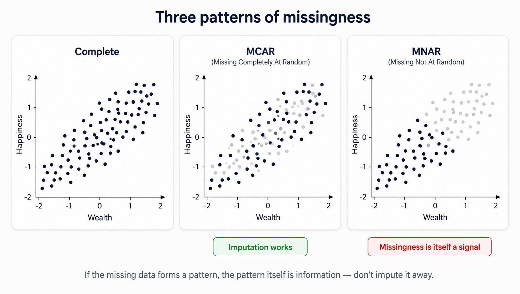
Three situations, very different treatment. This is Rubin's taxonomy, and every scikit-learn imputer assumes you've thought about which one you're in:
- MCAR (Missing Completely At Random) — the absence carries no signal. The fact that
ageis missing for some rows tells you nothing about the person. The nulls are basically noise. Example: a random technical glitch drops a few values. - MAR (Missing At Random) — the absence is predictable from other observed variables, but not from the missing value itself. Example: income is missing more often for one age group than another — once you know the age, the missingness is random. Imputing using other features works well here.
- MNAR (Missing Not At Random) — the absence is signal. The reason the value is missing depends on the value itself. Example: high-income people decline to report income. Sensor downtime correlated with the condition you're trying to detect.
FIMD
How to tell them apart: look at the distribution of nulls across other features. If the rows with null age look just like the rest of the dataset, it's MCAR. If the rows with null age are systematically older / from one country, it's MAR or MNAR — and you have to dig to know which.
For MCAR: impute (if many) or remove (if few).
For MAR: impute using the other features that explain the missingness (multivariate methods shine here).
For MNAR: add a MissingIndicator feature so the model can learn from the presence of nulls. Don't just impute and lose the signal — the absence is the signal.
Imputation Strategies
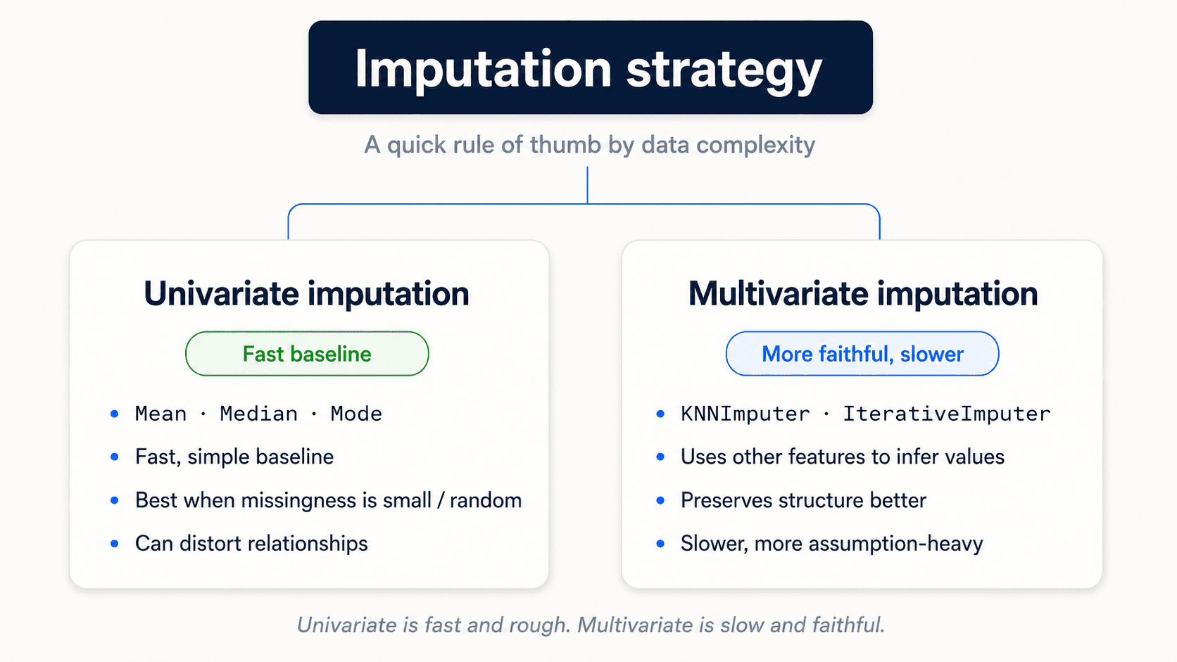
Univariate — uses only information from the column itself.
- Numerical: mean or median. Prefer median when outliers are present (it's robust).
- Categorical: most-frequent value, or a constant string like
"Missing". The constant strategy is often better than imputing the mode, because it lets the model learn that "Missing" itself is a meaningful category.
Fast, simple, good baseline. Use it when nulls are a small fraction of the column.
from sklearn.impute import SimpleImputer

# Numerical — median is robust to outliers
num_imputer = SimpleImputer(strategy="median")

# Categorical — two options
cat_imputer  = SimpleImputer(strategy="most_frequent")
cat_missing  = SimpleImputer(strategy="constant", fill_value="Missing")
Want to flag where the imputation happened? Pass add_indicator=True and SimpleImputer will append a binary column per imputed feature — free MissingIndicator semantics inside any pipeline.
imputer = SimpleImputer(strategy="median", add_indicator=True)Multivariate — uses information from the other columns.
The intuition: imagine a house dataset where one row is missing bathrooms. A univariate imputer fills it with the dataset's median — say, 2 bathrooms. But if that row describes an 8-bedroom mansion, two bathrooms is absurd. Multivariate imputers look at the other features in that row (8 bedrooms, big lot, expensive zip code) and predict a sensible value from them.
The trick: imagine you have 10 columns and one of them has nulls. The rows where that column ISN'T null become your training set — you treat the column you want to fill as the target and the other 9 as features, then learn a model that predicts it.
IterativeImputer— model the missing column as a function of the others, predict the value.KNNImputer— find the K most similar rows that aren't missing this column, use their average.
More accurate but slower. Reach for multivariate when the missing volume is large enough that mean-imputation visibly biases the column, or when the missingness has clear predictors.
💡 If a column has so many nulls that imputation would hallucinate most of it (say over 50%), drop the column entirely. Bad information is worse than no information. The column isn't telling you anything.
7. Other Preprocessing Concepts
A handful of transformations that come up often enough to be worth a section:
Skewness in the target variable. Many models (linear regression especially) assume roughly normal residuals. If your target is heavily skewed — income, house prices, time-to-event — apply log(x) or a Box-Cox transformation to symmetrise it before training. Exponentiate predictions back at inference time. This change alone can shift a model from "broken" to "good". SciPy
Binning (bucketisation). Reduce the cardinality of categorical features by grouping similar levels. Country with 200 distinct values → Continent with 6. The model has less to learn, you have less of a sparsity problem, and the underlying signal is usually still there.
Discretisation. Turn a continuous feature into a categorical one. KBinsDiscretizer carves a column into K equal-width or equal-population bins. Useful when you suspect the relationship between the feature and the target is non-linear and bin-by-bin — age → age_bucket often beats raw age in linear models. scikit-learn
Typing. Dates should be dates, floats should be floats, categories should be categories. Garbage typing → garbage models. This sounds trivial; in practice it eats hours.
8. The Whole Process, in One Checklist
If you read nothing else, read this:
- Frame the problem. Is this even an ML problem? What outcome am I predicting? What features can I collect? What's my budget for errors?
- Find data. And verify it's representative of what you'll see in production.
- Clean. Fix errors, handle outliers, handle nulls, address bias.
- Encode. Turn categories into numbers (ordinal / one-hot / target depending on cardinality).
- Scale. If your algorithm is distance-based or coefficient-based.
- Fit-transform on train, transform-only on test. Every transformer, every time, no exceptions.
CANNOT PUT FITon test data. - Now you can model.
Why You Should Always Build a Pipeline
Pipeline and ColumnTransformer aren't just code aesthetics — they're how you make leakage structurally impossible:
- Cross-validation stays honest. Each CV fold fits preprocessing only on that fold's training portion. No statistics from the validation fold ever leak in.
- The same transformations apply at prediction time.
pipe.predict(new_data)runs the exact same stepspipe.fit(...)saw — no chance of forgetting one in production. - You can tune preprocessing and model together with
GridSearchCVover the whole pipeline. - Less code, fewer bugs. One
pipe.fit(X_train, y_train)instead of orchestrating eight transformers by hand.
The Complete Leakage-Free Pipeline
from sklearn.compose import make_column_transformer
from sklearn.pipeline import make_pipeline
from sklearn.impute import SimpleImputer
from sklearn.preprocessing import StandardScaler, OneHotEncoder
from sklearn.linear_model import LogisticRegression
from sklearn.model_selection import cross_val_score

numeric_features     = ["age", "salary", "sqft_living"]
categorical_features = ["boro", "zipcode"]

numeric_pipe = make_pipeline(
    SimpleImputer(strategy="median", add_indicator=True),
    StandardScaler(),
)

categorical_pipe = make_pipeline(
    SimpleImputer(strategy="constant", fill_value="Missing"),
    OneHotEncoder(handle_unknown="ignore"),
)

preprocess = make_column_transformer(
    (numeric_pipe, numeric_features),
    (categorical_pipe, categorical_features),
)

pipe = make_pipeline(preprocess, LogisticRegression(max_iter=1000))

# Cross-validate the ENTIRE pipeline, not just the model
scores = cross_val_score(pipe, X, y, cv=5, scoring="accuracy")
print(scores.mean())

# Fit once on all training data, evaluate once on held-out test
pipe.fit(X_train, y_train)
print(pipe.score(X_test, y_test))
⚠️ Cross-validate the entire pipeline, not just the model. If you preprocess before calling cross_val_score, your validation folds leak into the training folds and your scores are inflated. The whole point of Pipeline is to push preprocessing inside the CV loop.
The Golden Rule: Fit on Train, Transform Everything
Every scikit-learn transformer in this post — scalers, encoders, imputers, anomaly detectors — has two methods. The way you call them is the single most important rule in preprocessing, so I'll spell it out carefully:
fit()— the transformer learns the transformation from the data. ForStandardScaler, this means computing the mean and standard deviation. ForMinMaxScaler, it's the min and max. ForOneHotEncoder, it's the list of categories. ForSimpleImputer, it's the median or mode.transform()— the transformer applies what it learned. It doesn't re-learn anything.fit_transform()— does both in one call. Convenient shortcut for training data.
Now the rule:
⚠️ Fit ONLY on training data. Then transform both train and test. If you fit on the test set, you've leaked test statistics into your "unseen" data and your evaluation is no longer honest. You have no idea how the model will behave in production.
What does that mistake actually look like? Visually:
![Three side-by-side scatter plots titled 'The same test data, three different fates'. Each card shows dark navy circles (training set) and red triangles (test set). Card 1 'Original data' shows both sets plotted on their raw scale (Feature 0 from -10 to 15, Feature 1 from -15 to 5), with train and test in overlapping regions. Card 2 'Correctly scaled' shows both sets after scaler.fit_transform(X_train) + scaler.transform(X_test) — both fit inside [0, 1.2] × [-0.2, 1.0] with the same relative positions preserved. Card 3 'Improperly scaled (data leakage)' shows the test set shifted to a completely different location after scaler.fit_transform(X_test) was incorrectly called — the test distribution has been centered around its own mean, breaking the relationship to the training data. Green pill under card 2: 'Same distribution preserved'. Red pill under card 3: 'Test set hallucinated as centered'. Caption: 'fit() learns the mean and std from data. Call it on the test set and you've quietly leaked test statistics into your evaluation.'](/_next/image?url=%2Fimages%2Fblog%2Fml-from-scratch%2Fdata-cleaning%2Ffit-transform-leakage.png&w=3840&q=75)
In code:
from sklearn.preprocessing import StandardScaler

scaler = StandardScaler()

# Train: fit + transform
X_train_scaled = scaler.fit_transform(X_train)

# Test: ONLY transform — the scaler already learned mean and std from train
X_test_scaled = scaler.transform(X_test)
I wrote it in my notes in capitals: CANNOT PUT FIT on test data. You make decisions using training data; you only ever evaluate on test data. No inspection, no fitting, no tuning on test. The test set is your one-shot honest measurement of how the model behaves in production, and you only get to spend it once.
Common Traps That Quietly Wreck Models
I keep a mental checklist of mistakes I've made — and seen others make — at least once. scikit-learn
- Fitting
StandardScaleron the whole dataset beforetrain_test_split. Test statistics leak into training. Your CV looks great, production tanks. - Using test data to decide which outliers to remove. You can't peek at test data to make preprocessing choices — that's still leakage.
- Target encoding before cross-validation. The category means already contain
y. Either put the encoder inside the pipeline or use cross-fold target encoding. - Treating zip codes as numbers.
98004isn't quantitatively bigger than98001. Always treat numeric-looking IDs as categories unless the magnitude really means something. - Ordinal-encoding nominal categories. Borough names don't have an order. Encoding them as 0/1/2/3 fabricates a fake distance the model will happily learn.
- Dropping every row with a
NaNwithout asking why. If missingness is meaningful (MNAR), you just erased the signal. - One-hot encoding a 200-level zip code feature. You've added 200 sparse columns and broken your linear model. Use target encoding.
- Assuming tree models need scaling. They don't. Splits use relative order, not magnitude.
- Cross-validating only the model. If preprocessing leaks, the CV score lies. Wrap everything in a
Pipeline.
🔑 Preprocessing isn't glamorous, but it's where models quietly succeed or fail. Get this right and the fanciest algorithm gets easier. Get it wrong and the algorithm just learns your mistakes faster.
💡 The single sentence that survives every exam, code review, and production incident: whatever you do to training data, you must be able to do to future data using only what was learned from training data. If you can't, you've leaked.
Next up — Part 3: Feature Engineering — Picking the Features That Actually Matter. Cleaning makes the data correct. Feature engineering makes it useful.