
Table of Contents
- 1. Two different things: evaluation vs validation
- 2. Four kinds of problem, four kinds of metric
- 3. Parameters vs hyperparameters — a short detour before the metrics
- 4. Classification — the confusion matrix is where every metric is born
- 5. Accuracy
- 6. Precision and recall — the two questions that matter
- 7. F1 — one number to balance them
- 8. MCC — the fair one under imbalance
- 9. Cohen's Kappa — better than random?
- 10. Specificity — the negative-class twin of recall
- 11. Reading the metrics — what each number is actually telling you
- 12. How metric choice maps to a real product question — the spam example
- 13. Multi-class — one-vs-rest, micro vs macro
- 14. When your dataset is imbalanced — your toolkit
- 15. Scoring (regression) — measuring how far off
- 16. RMSE — Root Mean Squared Error
- 17. MAE — Mean Absolute Error
- 18. R² — Coefficient of Determination
- 19. Choosing between RMSE, MAE, and R²
- 20. Probability models — when the output isn't a label
- 21. The threshold is a knob
- 22. The ROC curve
- 23. AUC — the area under ROC
- 24. Double density plots — easier to explain than ROC
- 25. Always evaluate the final model with classification metrics
- 26. Clustering — when there is no target
- 27. Compactness — the core idea
- 28. Silhouette
- 29. Other clustering metrics worth knowing
- 30. Useful sanity checks
- 31. The honest workflow
Last update: June 2026. All opinions are my own.
Machine Learning from Scratch · Part 4/12
There's a classic ML trap that everyone falls into once. You build a model to detect a disease present in 1% of patients. It reports 99% accuracy. You celebrate. Then you realise it achieves that score by predicting "healthy" for everyone — it has never once detected the disease.
The model is useless. The metric lied.
This post is about not getting fooled. It covers what evaluation actually means, the four kinds of ML problem and what to measure for each, and how to read each metric without being tricked by accuracy on imbalanced data, a high R² that hides a bad model, or an AUC that doesn't translate to anything a stakeholder can act on.
A note on scope: this is the full first half of Session 7-8 — every metric on the slides, including the ones for regression, probability, and clustering. The other half (cross-validation, train/validation/test splits, bias-variance, bootstrap, significance) lives in Part 5.
Two different things: evaluation vs validation
People mix these constantly. Worth pinning down:
- Model evaluation — how good is the model on data? You pick a score (accuracy, F1, RMSE, whatever) and assign it to your model. This is what this post is about.
- Model validation — will the model still be good in production? The process of making sure your evaluation generalises. Cross-validation is the practical tool. (Part 5 covers this.)
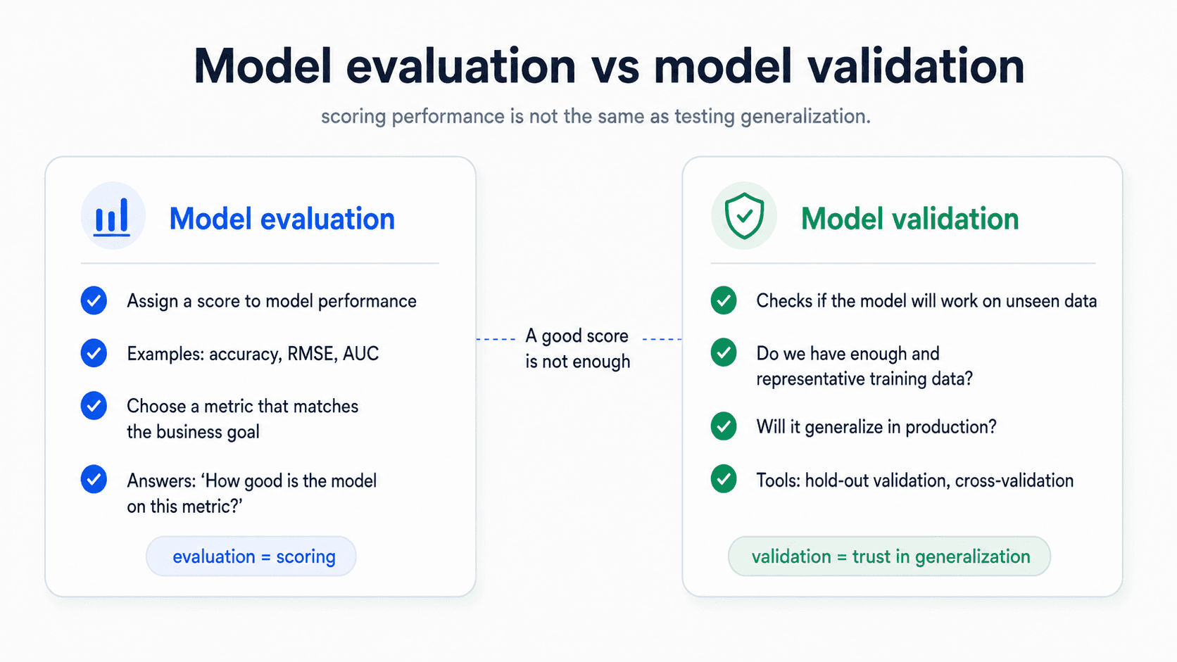
You can have a model that evaluates beautifully but doesn't validate (overfit). You can have one that validates but evaluates poorly (under-fit on a hard problem). You need both.
The other thing the lecturer kept hammering: the metric you pick has to be correlated with what the business actually cares about. Churn → did they leave the company? Fraud → did they steal money? Accuracy on its own doesn't translate to a business outcome — you have to be the one who connects them.
🔑 The metric you pick is the thing your model will optimise for. Pick the wrong metric and you'll optimise the wrong thing — and worse, you won't notice. The single biggest mistake people make in ML is not picking the metric carefully before they train.
Four kinds of problem, four kinds of metric
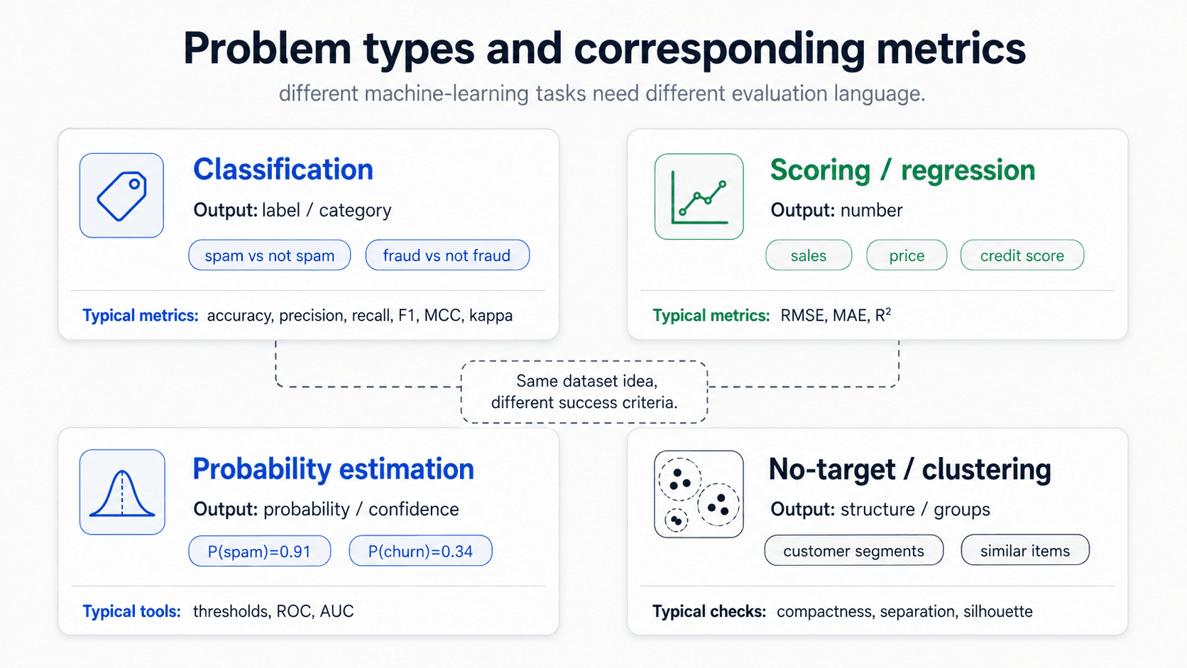
Different problems need different metrics. Before you reach for accuracy, figure out which kind of problem you're solving:
- Classification — assign labels (categories) to observations. Binary (spam / not spam) or multi-class (digit recognition). You can always turn a binary classifier into a multi-class one. Confusion-matrix-based metrics.
- Scoring / Regression — predict a number. House prices, time to event, customer lifetime value. RMSE, MAE, R².
- Probability estimation — like classification, but the model outputs a probability for each class instead of a hard label. Allows threshold tuning, ROC curves, double-density plots.
- No-target problems / clustering — no outcome to predict. Apriori (recommendation systems), clustering, association rules, nearest neighbour. Compactness-based metrics like Silhouette.
The four families share one rule: what you measure has to match what the model is being asked to do. A regression model with a great accuracy is a category error; a classifier with a great RMSE is the same mistake going the other way. Pick the metric family first, then pick the metric inside the family.
Parameters vs hyperparameters — a short detour before the metrics
One quick distinction from my notes that matters once you start picking metrics. There are two kinds of things you can change about a model:
- Model parameters — the values the model learns from the data. Weights in a linear model. Coefficients. Split points in a decision tree. Fitted values. You don't set these — the training process does, by minimising some loss on the training set.
- Hyperparameters — the values you choose around the training process.
kin k-NN,max_depthin a tree, regularisation strengthλ, learning rate, the architecture of a neural net. These are knobs you turn before training to control how the training goes.
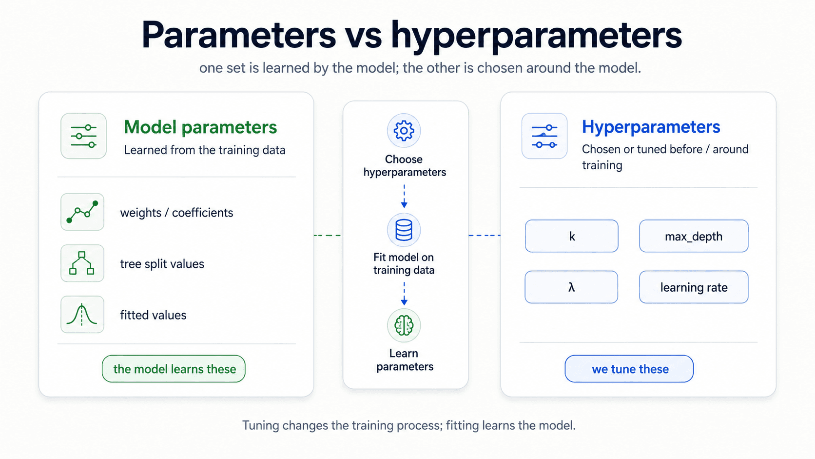
This distinction matters here because the metric you pick is what tells you which hyperparameter setting is best. Two trees with different max_depth will both fit the training data; the metric on held-out data tells you which one to keep. So everything in this post — accuracy, F1, MCC, RMSE, AUC, Silhouette — is also the language you'll use to tune hyperparameters. The actual tuning machinery (cross-validation, grid search) is the job of Part 5; here the question is which number do we even look at when we compare two configurations.
Classification — the confusion matrix is where every metric is born
Almost every classification metric is a different way of dividing one small table. It counts what actually happened against what the model predicted:
| Predicted + | Predicted − | |
|---|---|---|
| Actually + | True Positive (TP) | False Negative (FN) |
| Actually − | False Positive (FP) | True Negative (TN) |
Four numbers. Once you have these, every metric in this post is just one ratio or another. Internalise this matrix — every metric in classification flows from it.
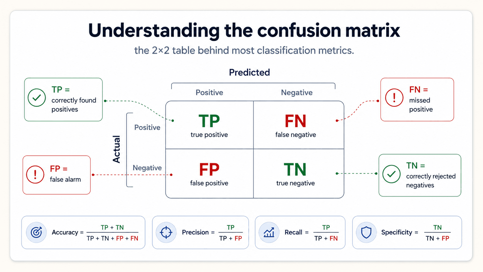
Why don't we just report the matrix and stop? Because four numbers don't summarise to one score. You can't say "is model A better than model B" by glancing at two matrices side by side. You need a single number. The rest of this section is about which single number to pick.
Accuracy
The most common starting point. The fraction of predictions you got right:
Between 0 (failed at everything) and 1 (perfect).
Accuracy is fine as a baseline. It's intuitive, easy to explain, and on roughly balanced datasets it tells you something useful.
Where accuracy lies: imbalanced classes
The lottery example from my notes. Suppose you're predicting whether someone wins a lottery — a rare event, say 0.01% of tickets. A model that always predicts "false" (no win) is going to be right 99.99% of the time, because almost no one wins.
99.99% accuracy. Useless model. Has learned nothing.
Same with predicting fraud (rare), disease detection (rare), churn (often rare), security breaches (rare). On any imbalanced dataset, accuracy is fundamentally misleading.
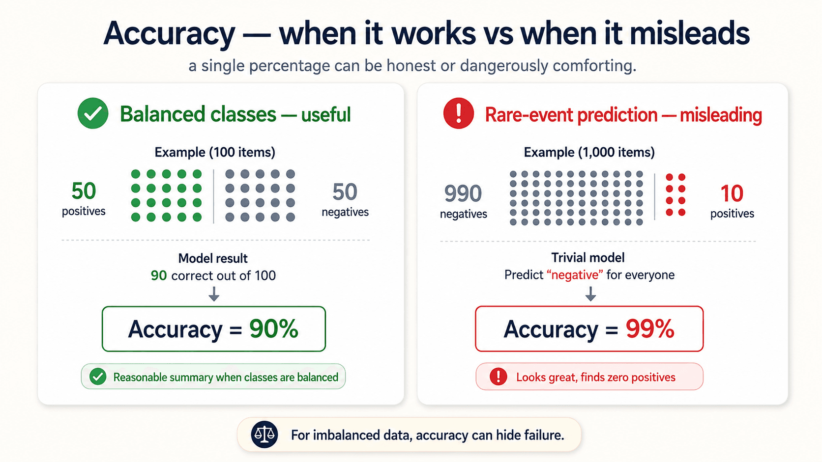
⚠️ Never use accuracy for imbalanced classes. The classic trap: a model that always predicts the majority class scores great on accuracy and has learned nothing. The confusion matrix exposes this in one glance; accuracy hides it.
Where accuracy lies: asymmetric costs
Sometimes the cost of FP and FN are radically different.
- COVID tests: missing a real case (FN) is much worse than a false alarm (FP). You'd rather quarantine ten healthy people than miss one sick person. The optimal model is heavy on FP, light on FN.
- Sentencing decisions: convicting an innocent person (FP) is much worse than a guilty person getting off (FN). The optimal model is heavy on FN, light on FP — Blackstone's ratio.
Accuracy treats FP and FN symmetrically. It can't see this asymmetry. You need precision and recall.
Precision and recall — the two questions that matter
Two complementary questions about the model:
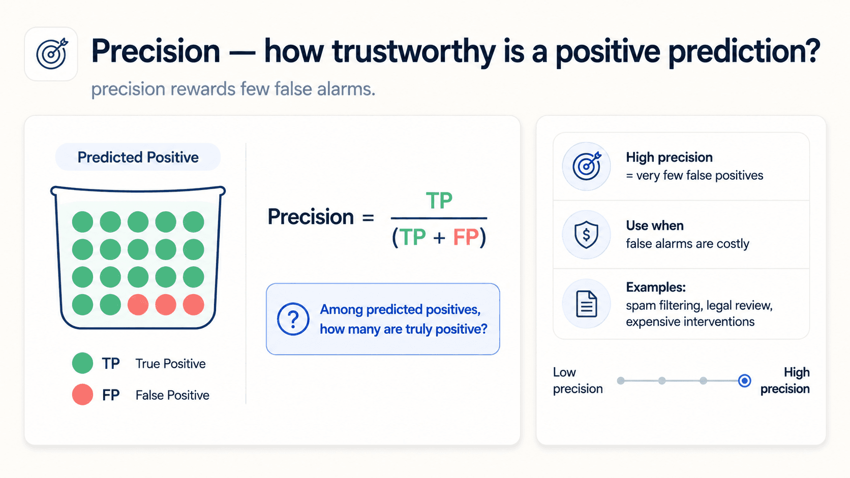
Precision — of everything I predicted positive, how much actually is? The measure of confirmation: when my model raises its hand, how often is it right?
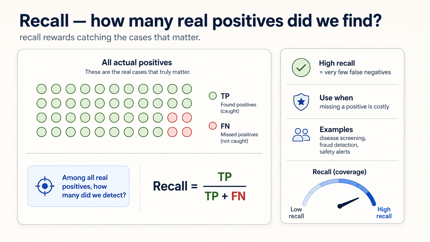
Recall — of everything that is positive, how much did I catch? The measure of utility: how much of what I needed did I find?
Which one matters more? Depends on the cost of mistakes.
The covid example again, more precisely. You want high recall — catch every actual case. A miss (FN) is catastrophic; false alarms (FP) just mean a few more PCR tests for healthy people.
The spam-filter example. You want high precision — when you flag an email as spam, you'd better be right. A miss (real email in spam folder) is much worse than spam slipping through.
The principle, in one line: let the cost of mistakes determine the metric. There's no universally right balance, only the right one for your problem.
The trade-off
You can't maximise both at once. The decision threshold gives you a sliding bar:
- Move it right (only predict positive when very confident) → precision goes up, recall goes down. You become picky.
- Move it left (predict positive on the slightest signal) → recall goes up, precision goes down. You catch more, including more false alarms.
You can trick precision to 1.0 by only flagging the cases you're 100% sure about — but then your recall is terrible because you miss most of the positives. Conversely you can trick recall to 1.0 by flagging everything — but then precision is roughly the prevalence rate.
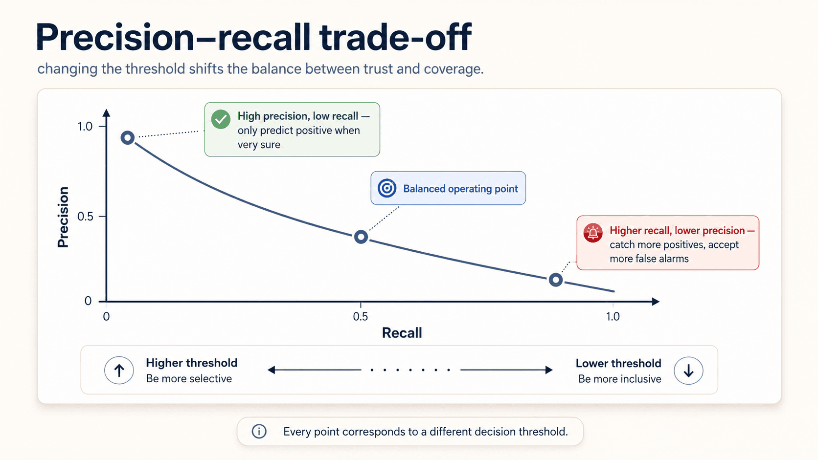
There's no free lunch. Pick the balance that matches your costs.
F1 — one number to balance them
When you want a single number that captures both:
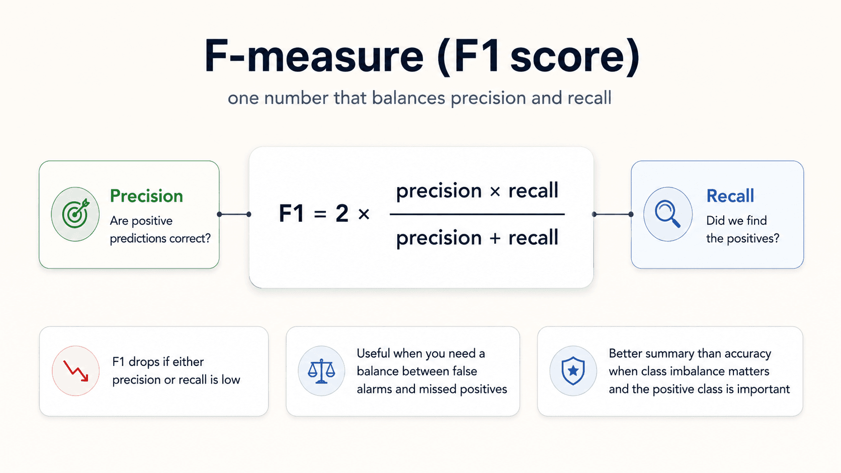
The harmonic mean of precision and recall. The reason it's harmonic instead of arithmetic: the harmonic mean is much more sensitive to the lower value. A model that drives one of them down will see F1 drop hard.
In other words, you can't game F1 by maximising one and ignoring the other. It penalises imbalance between precision and recall.
When to use F1: when you want a single balanced number and the costs of FP and FN are roughly similar.
The caveat (again): F1 is also not ideal under heavy class imbalance. It's better than accuracy, but it still ignores TN. For imbalanced data, reach for MCC.
MCC — the fair one under imbalance
Matthew's Correlation Coefficient. The metric that doesn't lie.
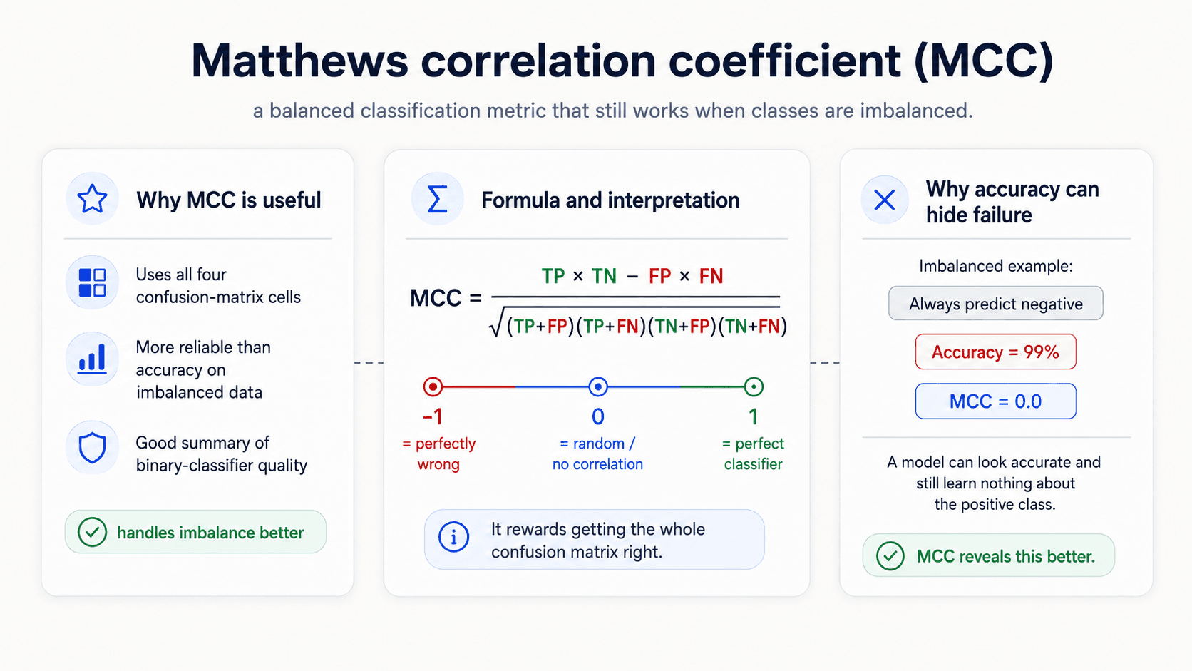
Three properties make it special:
- Range: −1 (perfectly wrong) through 0 (random) to +1 (perfect). No metric on a 0–1 scale tells you whether the model is doing worse than random; MCC does.
- Uses all four cells. Most metrics ignore one or more cells (accuracy ignores nothing but treats FP and FN symmetrically; precision ignores TN; recall ignores TN and FP). MCC uses TP, TN, FP, and FN.
- Fair under imbalance. It only scores high when the model does well across all four quadrants — a model that just predicts the majority class can't fool it. It does not care whether your dataset is balanced.
The killer example from my notes — three confusion matrices side by side, same dataset of 351 patients (24 actually sick, 327 actually healthy):
- Predict "no" for everyone: Accuracy = 0.932, MCC = 0.0. The accuracy looks great. MCC tells the truth — the model learned nothing.
- Predict "yes" for everyone: Recall = 1.0, MCC = 0.0. Recall says perfect detection. MCC sees through it — it caught every positive but only by flagging every negative too.
- Predict everything correctly: MCC = 1.0 — and you only get MCC = 1 when FP and FN are both zero.
🔑 A degenerate classifier on imbalanced data can show Accuracy 0.932 and Recall 1.0 — and MCC 0.0, telling you what you needed to know: the model learned nothing.
Use MCC whenever your data is imbalanced and you need to know whether the model is actually picking up signal.
Cohen's Kappa — better than random?
Another metric for the imbalanced case. Cohen's Kappa measures how much better your model is doing than random guessing weighted by the class frequencies.
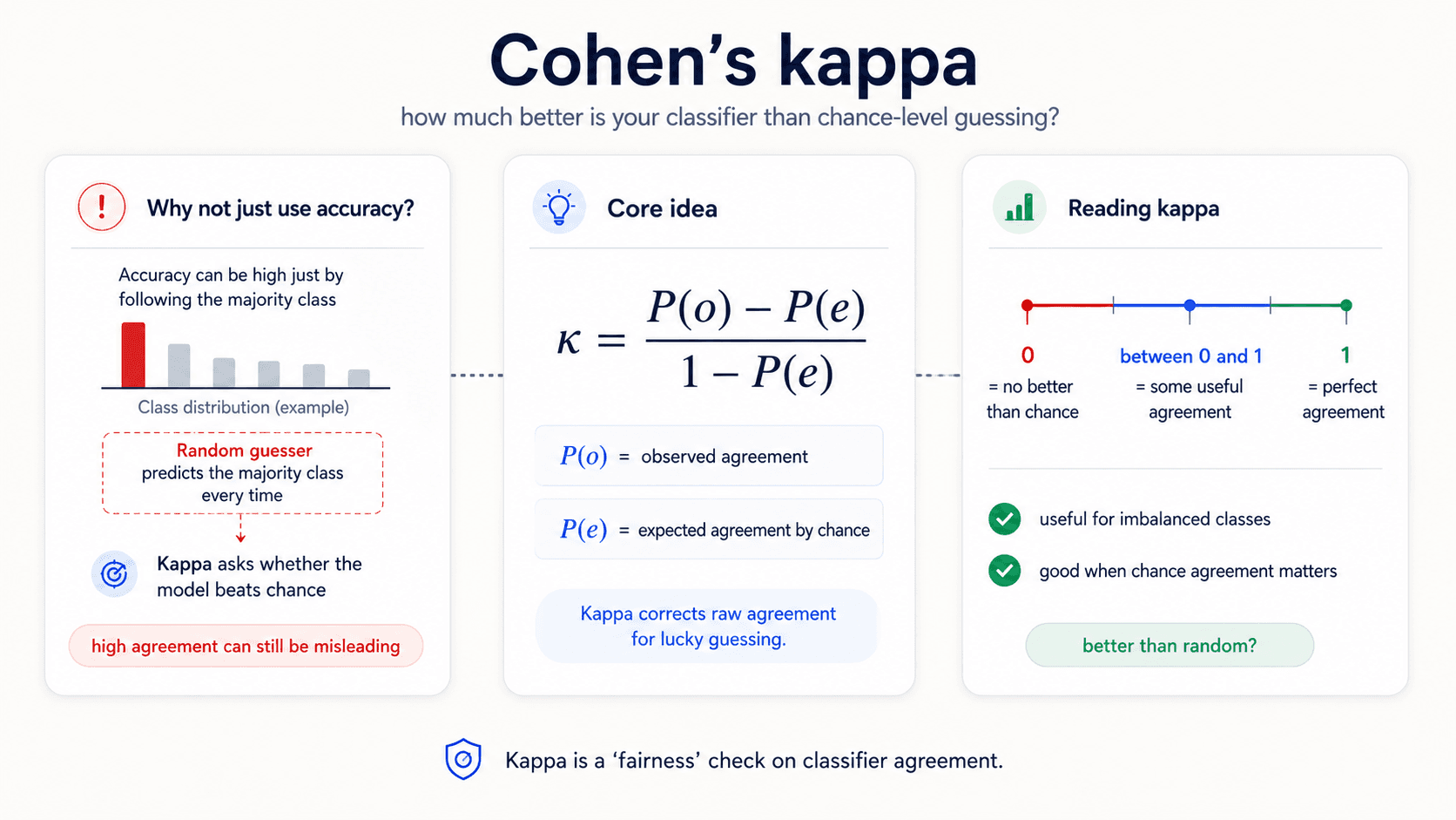
Where is the observed agreement (your model's accuracy) and is the agreement you'd expect by chance from a random model guessing according to the class distribution.
- — the model is no better than guessing at the marginal rate.
- — perfect agreement with the labels.
- — worse than guessing (yes, possible).
The intuition: if your dataset is 90% class A and 10% class B, a model that randomly picks based on those proportions would get 82% accuracy by chance. Kappa tells you whether you're meaningfully above that floor.
When to reach for Kappa: when you want to know whether the model's accuracy is genuinely better than a dumb baseline, accounting for class imbalance. Especially common in inter-rater agreement studies (medical diagnoses, content moderation labels).
Specificity — the negative-class twin of recall
Recall asks of all the actual positives, how many did I catch? The mirror question is of all the actual negatives, how many did I correctly leave alone? That's Specificity — also called the True Negative Rate.
When you'd reach for it: domains where leaving the healthy / innocent / non-spam alone matters as much as catching the positives. A spam filter that quarantines real emails is failing on specificity even if its recall on spam is great. A covid test that quarantines healthy people is failing on specificity even if it catches every infection.
In symmetric terms: recall protects the positive class; specificity protects the negative class. A complete picture often needs both, especially in medical and security applications where both error directions have a cost.
Reading the metrics — what each number is actually telling you
The most useful thing about classification metrics isn't the formulas — it's the intuition of what the number is saying about the model. From the notes:
| Measure | Formula | Example value | What it's telling you |
|---|---|---|---|
| Accuracy | 0.9214 | Overall, the model is predicting the correct class in 92.14% of cases, missing in 7.86% | |
| Precision | 0.9187 | In 8.13% of cases, the model is including false predictions of the positive class | |
| Recall | 0.8778 | The model is missing 12.22% of the positive cases | |
| Specificity | 0.9496 | The model is missing 5.04% of the negative cases |
Notice the framing in the right column — it's not "Precision = 0.9187," it's "8.13% of my positive predictions are wrong." That's the version a stakeholder understands. Practice translating the numbers into that sentence.
How metric choice maps to a real product question — the spam example
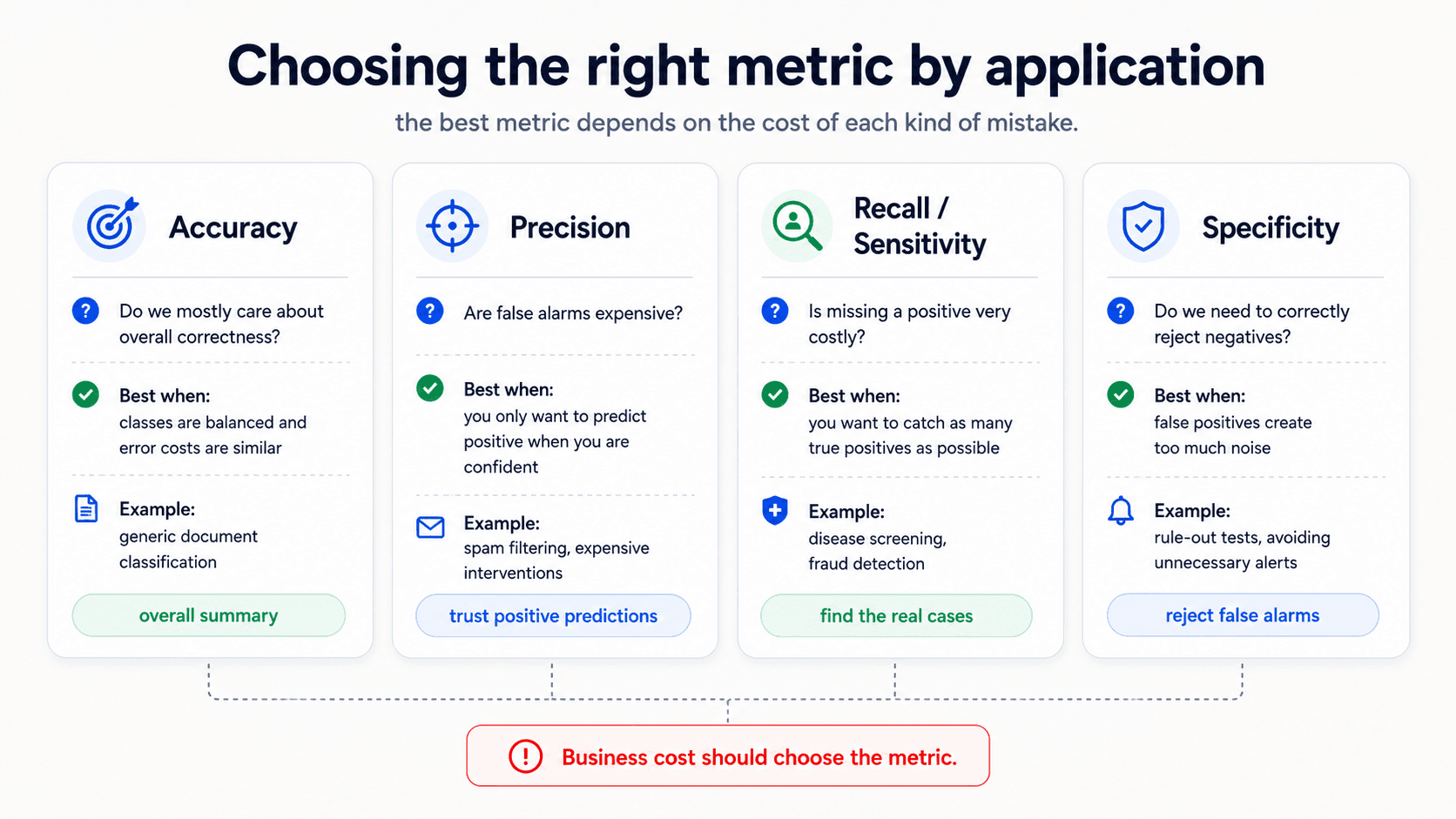
When you're talking to a non-technical stakeholder, they're not going to ask for precision and recall. They're going to express a business need in plain language, and your job is to translate that into the right metric. The table from my notes does exactly that:
| Measure | What the stakeholder says | The follow-up question that exposes the trade-off |
|---|---|---|
| Accuracy | "We need most of our decisions to be correct." | Can we tolerate being wrong 5% of the time? And do users see spam-marked-as-email and email-marked-as-spam as equivalent? |
| Precision | "Most of what we marked as spam had darn well better be spam." | That guarantees most of what is in the spam folder is in fact spam, but isn't the best way to measure what fraction of the user's legitimate email is lost. Maybe we really want good specificity. |
| Recall | "We want to cut the amount of spam a user sees by a factor of 10 (eliminate 90% of the spam)." | If 10% of the spam gets through, will the user see mostly non-spam mail or mostly spam? Will this result in a good user experience? |
| Specificity | "We must be at least three nines on legitimate email; the user must see at least 99.9% of their non-spam email." | Will the user tolerate missing 0.1% of their legitimate email, and should we keep a spam folder the user can look at? |
The lesson: a single sentence from a stakeholder usually has a metric hiding inside it. The trick is to surface it with the follow-up question that makes the trade-off explicit.
Multi-class — one-vs-rest, micro vs macro
In multi-class problems you still have a confusion matrix, but it's K×K instead of 2×2. The metrics generalise in two main ways:
One-vs-rest decomposition. Compute precision / recall / F1 for each class separately by treating it as a binary problem ("class A vs everything else"). You get one score per class.
Averaging.
- Macro average — average the per-class scores equally. Treats all classes as equally important regardless of size. Use when minority classes matter.
- Weighted average — weight by class size. Use when overall accuracy on the population is what you care about.
- Micro average — pool all the TPs, FPs, FNs across classes, then compute one score. Equivalent to accuracy for many metrics. Use when you don't care which class the error was on.
The choice depends on whether minority classes carry equal weight, or larger classes dominate. In practice: macro for fairness audits, weighted for product metrics, micro when you don't care.
When your dataset is imbalanced — your toolkit
The notes have a clean list of moves you can make when the dataset is the problem, not the model. Before you blame the algorithm, run through these:
- Collect more data. The boring answer. Often the right one.
- Change the metric. Use MCC, Kappa, or read the confusion matrix directly. Stop reporting accuracy.
- Resample with bootstrapping. Draw the minority class with replacement until both classes are balanced.
- Generate synthetic samples. SMOTE and its cousins — interpolate new minority examples between existing ones.
- Change the algorithm. Trees (Random Forest, Gradient Boosting) handle imbalance better than logistic regression out of the box. Trees still need care with imbalance, but they're less catastrophic.
- Change the approach entirely. Instead of classifying, treat it as anomaly detection — learn what "normal" looks like, flag everything else. This is often the right move at extreme imbalance ratios (1:1000 and worse).
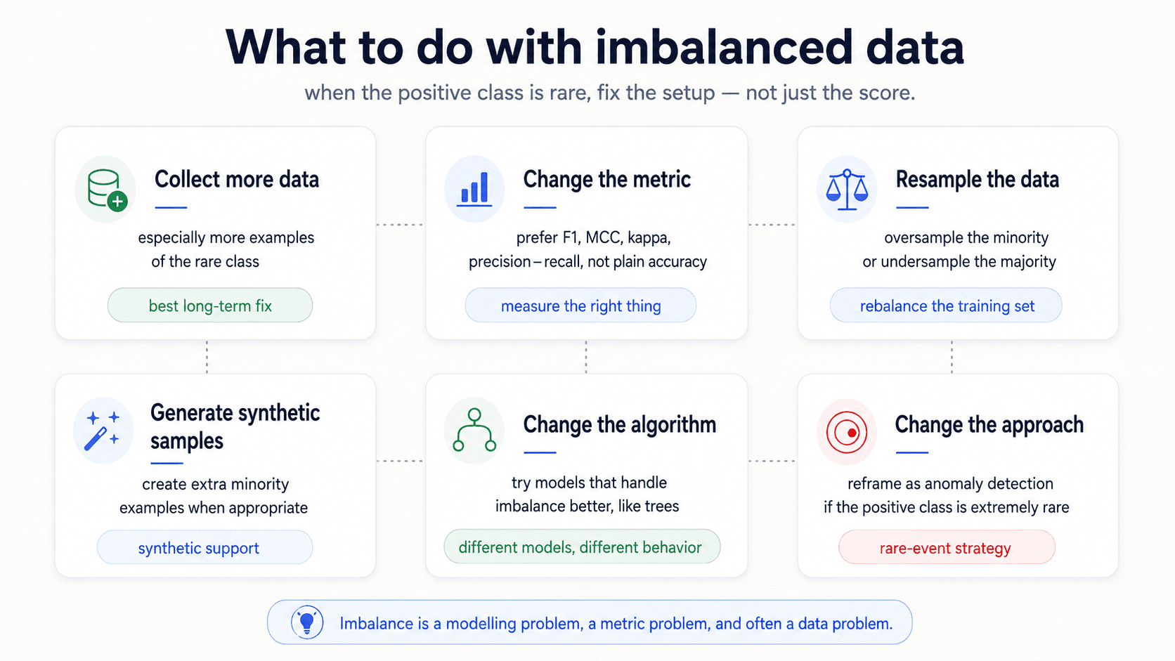
(Source: Tactics to combat imbalanced classes, which is what the lecturer pointed at on the slide.)
Scoring (regression) — measuring how far off
A different question — how far off? instead of right or wrong?
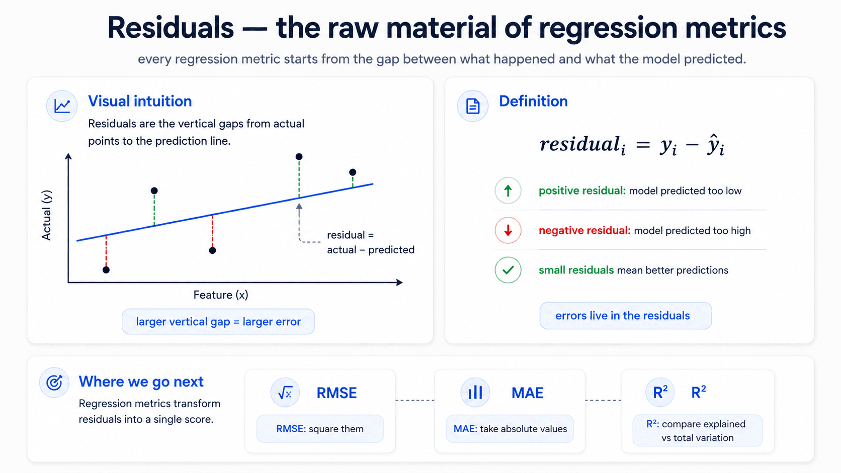
The whole regression-metric family is built on one quantity: the residual, which is just the difference between the prediction and the actual value.
Every regression metric is some way of squashing the vector of residuals into a single number. The difference between RMSE, MAE, and R² is just how you do the squashing.
An optimal model is a model with low residuals. Big-residual rows are the rows the model is most wrong about. If you understand the residuals, you understand the model.
RMSE — Root Mean Squared Error
The most common goodness-of-fit measure for regression.
Read it inside-out:
- Compute each residual.
- Square it.
- Take the mean across all rows.
- Square root to get back to the original units.
Why squared? Two reasons. First, the absolute value would also work, but squaring is differentiable everywhere — which matters when you're optimising with gradients. Second, squaring penalises large errors disproportionately: if one residual goes from 10 to 100, its contribution to the sum goes from to . The big mistakes dominate the metric, which is what you usually want — getting one prediction wildly wrong is much worse than getting ten predictions slightly off.
Why root? So the number is in the same units as . If is in dollars, RMSE is in dollars. You can read it as "the typical prediction error, in the same currency as the prediction." That makes it explainable to non-technical stakeholders, which MSE alone is not.
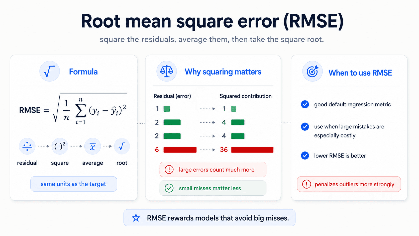
RMSE is interpreted, roughly, as the standard deviation of the prediction error. Same units as the target, big errors weighted heavily, easy to compare across models trained on the same dataset.
MAE — Mean Absolute Error
Like RMSE without the squaring.
Penalises errors linearly. A 10× larger residual contributes exactly 10× as much to the metric.
That makes MAE more robust to outliers than RMSE — one wildly wrong prediction won't dominate the metric the way it would with squaring. Use MAE when:
- The dataset has a few extreme outliers you don't want to over-punish.
- The cost of error is roughly linear in the error size (a 100 mistake, not 100×).
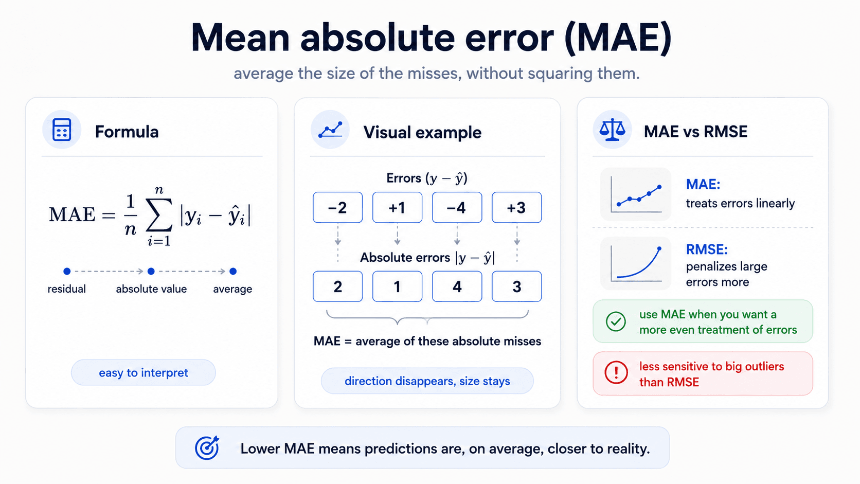
When not to use MAE: when the cost of error is non-linear and big mistakes are especially bad. Then squaring (RMSE) reflects the cost structure better.
The note from my deck: don't make absolute error the project goal. Report it if you want, but optimising MAE tends to give models that "get the aggregates right" less reliably than RMSE-optimised ones. If you only optimise MAE, the model can systematically over- or under-shoot for a sub-population in a way that squared-error optimisation would have caught.
R² — Coefficient of Determination
The metric that's on a 0-to-1 scale instead of in your target's units. The fraction of variance the model explains.
Breaking that down:
- TSS = total sum of squares = . The variance of the target without your model — how scattered the values are around their mean.
- RSS = residual sum of squares = . The variance the model couldn't explain.
- is the fraction of the variance the model did explain.
Read the boundaries:
- — perfect prediction, RSS = 0.
- — model is no better than predicting the mean.
- — model is worse than predicting the mean. Yes, this is possible if your model is badly miscalibrated or overfit.
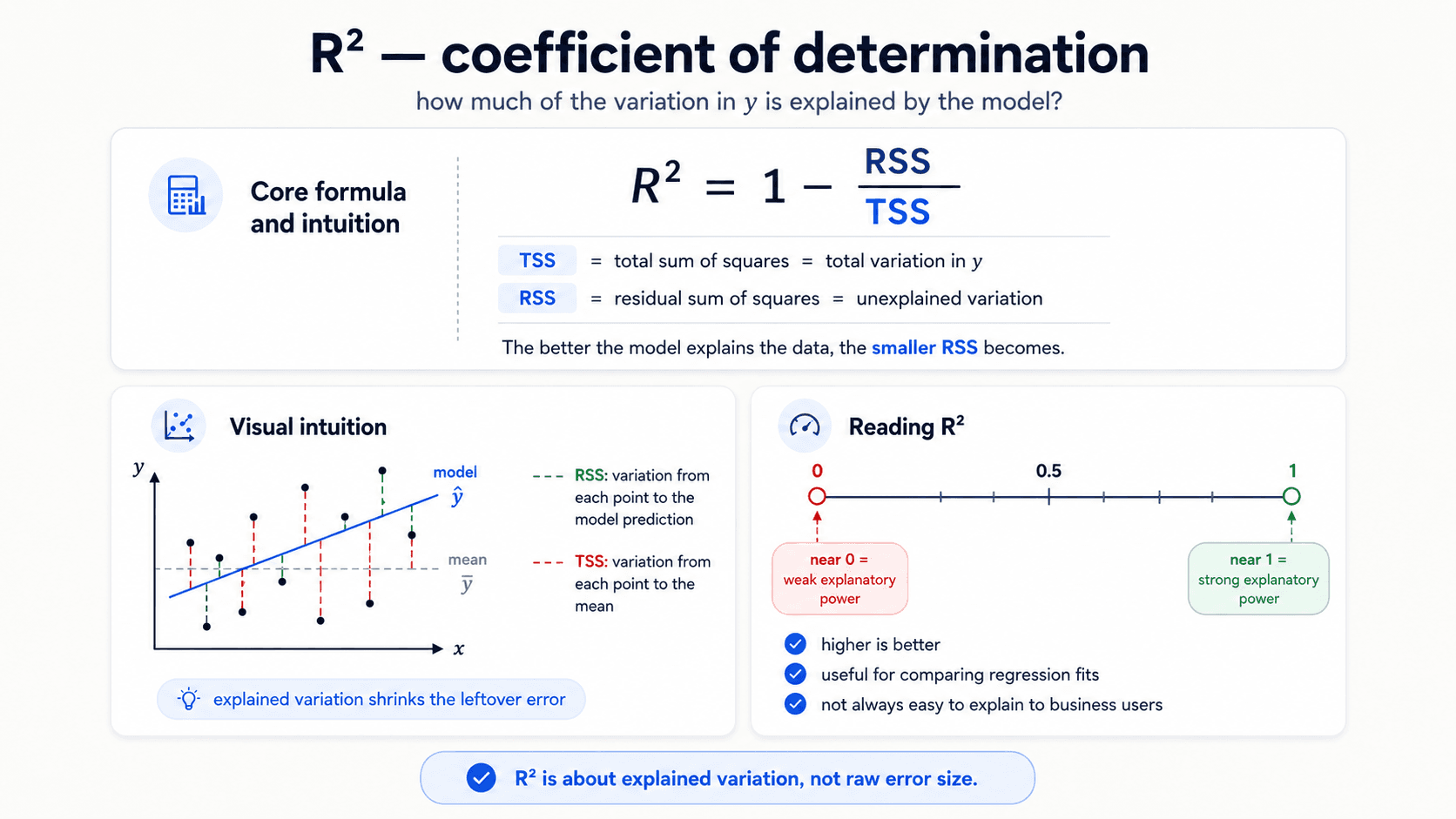
The caveat from the lecturer: R² is hard to explain to the business. "We explain 87% of the variance in customer lifetime value" doesn't translate to a dollar amount or a decision. RMSE in dollars does. R² is a model-comparison metric; RMSE is a stakeholder-communication metric.
Choosing between RMSE, MAE, and R²
A small decision table:
- Want the same units as the target so a non-technical reader can read it? → RMSE or MAE.
- Want big mistakes punished disproportionately? → RMSE.
- Worried about outliers dominating the metric? → MAE.
- Want one comparable score across models trained on different datasets? → R² (because it's unitless).
- Reporting to a business stakeholder? → RMSE (most explainable).
You don't have to pick one. Most regression reports include RMSE and R² together — RMSE for the units, R² for the comparison.
Probability models — when the output isn't a label
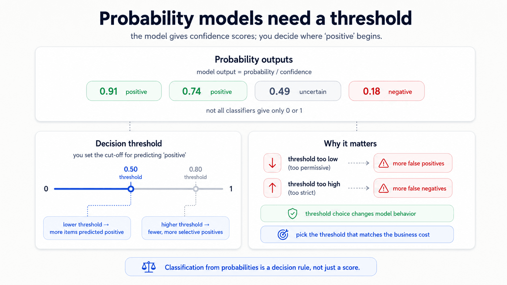
So far, every classification metric has assumed the model outputs a hard label. But many models — logistic regression, Naïve Bayes, neural nets — actually output a probability instead. "I am 97% sure this is positive."
The lecturer's exact words: probability models give you a degree of confidence on the prediction. Naïve Bayes doesn't output 0 or 1 — it outputs something like "97% probability of class A, 3% probability of class B."
That confidence is information. And it raises a question that didn't exist in the hard-label case: where do you put the threshold?
The threshold is a knob
By default, the threshold is 0.5 — anything above 0.5 is predicted positive, anything below is negative. But the threshold is a knob you can turn. Where you put it changes the model's behaviour dramatically:
- High threshold (e.g., 0.9). Only predict positive when very confident. Precision goes up, recall goes down. Use when false positives are expensive — fraud accusation, spam quarantine, anything where a wrong "yes" is costly.
- Low threshold (e.g., 0.3). Predict positive on the slightest signal. Recall goes up, precision goes down. Use when false negatives are catastrophic — covid screening, security breaches.
The exact framing from my notes: imagine the model says "51% sure this is positive, 49% sure it's negative." For covid, you want to flag that as positive — false alarms are cheap, missing real cases is expensive. So you set the threshold low. For a fraud accusation that will freeze someone's account, you probably want to require 95%+ confidence before triggering — set the threshold high.
A subtle point that's easy to miss: the threshold is a model-deployment decision, not a model-training decision. The model itself outputs probabilities. The threshold turns those probabilities into a decision, and that's where the business cost asymmetry enters the system. It's the most important hyperparameter you'll set after the model is trained.
The ROC curve
Once threshold is a knob, you can sweep it from 0 to 1 and plot the trade-off. That's the ROC curve — also called the Receiver Operating Characteristic curve, or the True Operating Characteristic curve.
For each threshold value, you compute two things:
- True Positive Rate (TPR) = recall = . On the y-axis.
- False Positive Rate (FPR) = . On the x-axis.
Each threshold gives you one point in (FPR, TPR) space. Sweep all thresholds, you get a curve.
An ideal model hugs the top-left corner (TPR = 1, FPR = 0 — catches everything, false-alarms nothing). A random model is the diagonal line (TPR = FPR — same hit rate as the false-alarm rate). A model worse than random sits below the diagonal.
ROC is not a metric — it's a curve. To get a single number for model comparison, you take the Area Under the Curve, or AUC.
AUC — the area under ROC
- AUC = 0.5 — the model is random.
- AUC = 1.0 — the model is perfect.
- AUC > 0.5 — better than random by some amount.
The intuition: AUC is the probability that, if you randomly pick one positive example and one negative example, the model assigns the positive one a higher probability score than the negative one. Higher AUC = the model's score actually separates the two classes.
The caveats from the lecturer — and these matter:
- AUC doesn't have a clean business intuition. "Our AUC is 0.87" doesn't translate to a decision the way "we miss 12% of fraud cases" does. Difficult to explain to non-technical stakeholders.
- The threshold you pick from the ROC curve is local to your problem. It doesn't transfer to a different classifier on the same data or to the same classifier on a different dataset.
- ROC is for choosing the threshold, not for evaluating the final model. Once you've committed to a threshold, evaluate the final model with classification metrics (accuracy, precision, recall, F1) at that threshold. AUC is a means; classification metrics are the end.
When to use AUC: model selection, especially when you'll choose the operating threshold later. When not to use it: as the headline production metric, because at production time you've committed to a threshold and what you actually care about is precision and recall at that threshold.
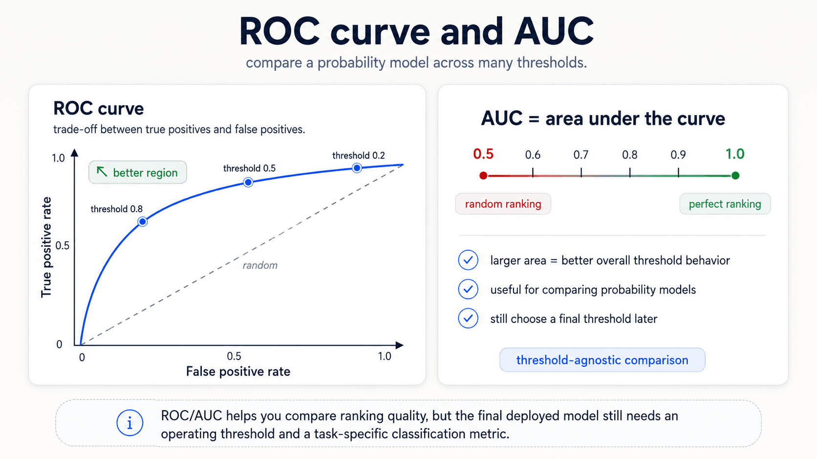
If you need a single value summary and have to pick one, F1 (or precision/recall together) is the better headline than AUC. AUC is for the model-selection step; the headline number for the deployed model should be at the chosen threshold.
Double density plots — easier to explain than ROC
The complementary visualisation. Plot the model's predicted probabilities, with separate density curves for the actual positives and actual negatives:
- One curve = the distribution of scores for items that are spam.
- The other curve = the distribution of scores for items that are not spam.
A great model has the two curves separated — actual positives clustering near 1.0, actual negatives clustering near 0.0. A bad model has them overlapping in the middle.
Where you put the threshold is a vertical line on this plot. Move it right, you correctly classify more negatives but misclassify positives that fell below the line. Move it left, you catch more positives but pick up false alarms from the negative tail.
Why this is more useful than ROC for explaining a model to stakeholders: you can point at the overlap and say "this is where the model is unsure." A stakeholder understands "the model can't tell these apart" more readily than they understand a curve in TPR/FPR space.
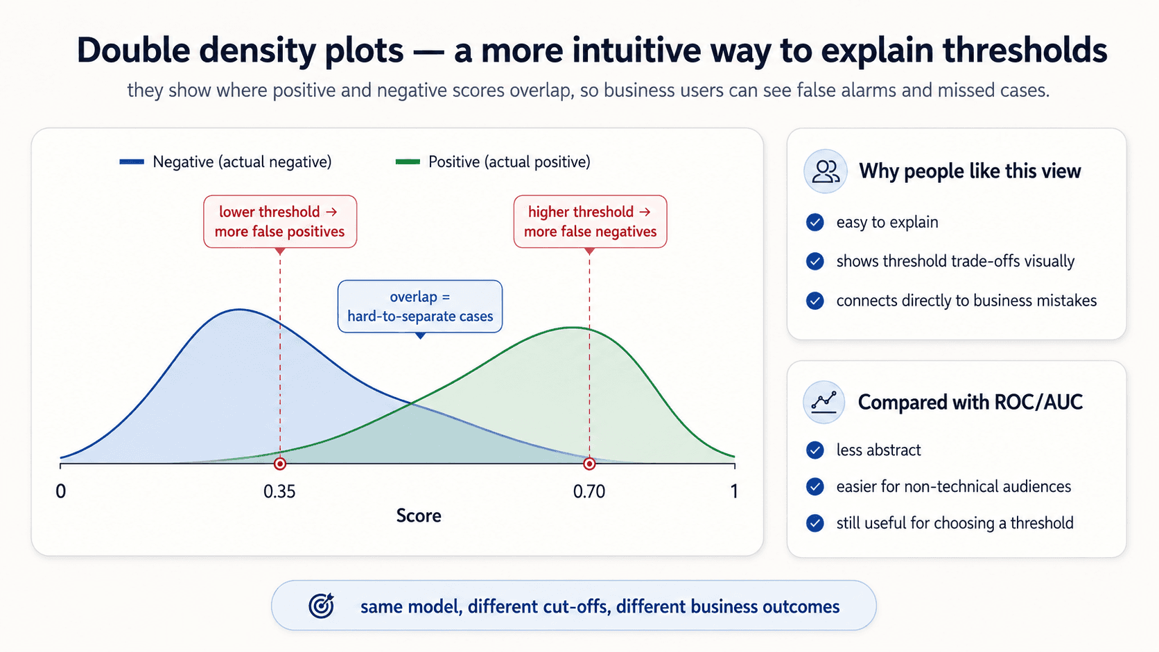
In practice: use double density plots for stakeholder conversations and intuition; use the ROC curve + AUC for the technical model selection.
Always evaluate the final model with classification metrics
A note from my deck that's worth repeating: even when you're working with a probability model and you've used ROC/AUC to pick a threshold, the final model you ship is a classifier — it outputs hard labels at the chosen threshold. Evaluate the final model with classification metrics at that threshold (accuracy / precision / recall / F1 / MCC / specificity, whichever is right for the problem). ROC is a tool you use to get to that point, not the report you hand in at the end.
Clustering — when there is no target
In unsupervised clustering, the model has no target variable. You can't compute accuracy, precision, F1, or RMSE because there are no labels to compare against. So how do you measure quality?
You measure structural properties of the clustering itself: how compact each cluster is, how separated the clusters are from each other.
The general principle: clustering metrics measure how compact your clusters are and how distinct they are from one another.
Compactness — the core idea
A good clustering has:
- Small intra-cluster distance — points within the same cluster are close to each other.
- Large inter-cluster distance — points in different clusters are far apart.
Concretely: mean intra-cluster distance must be smaller than mean inter-cluster distance. If it isn't, your clusters aren't really clusters — they're overlapping blobs.
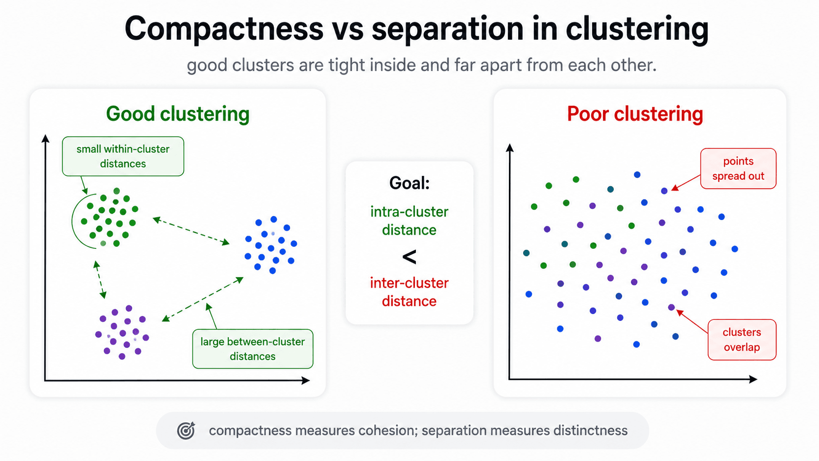
This single rule covers a surprising amount of intuition. If you can answer "are the points inside each cluster close to each other?" and "are the clusters themselves far apart?", you can usually tell whether a clustering is reasonable without any formal metric.
Silhouette
The most common single-number metric for clustering quality. The Silhouette coefficient combines cohesion (intra-cluster compactness) and separation (inter-cluster distance) into one number per point, then averages across all points.
- near +1 — the point is much closer to its own cluster than to any other. Good.
- near 0 — the point is on the boundary between clusters. Ambiguous.
- near −1 — the point is closer to a different cluster than to its own. The clustering has the wrong assignment.
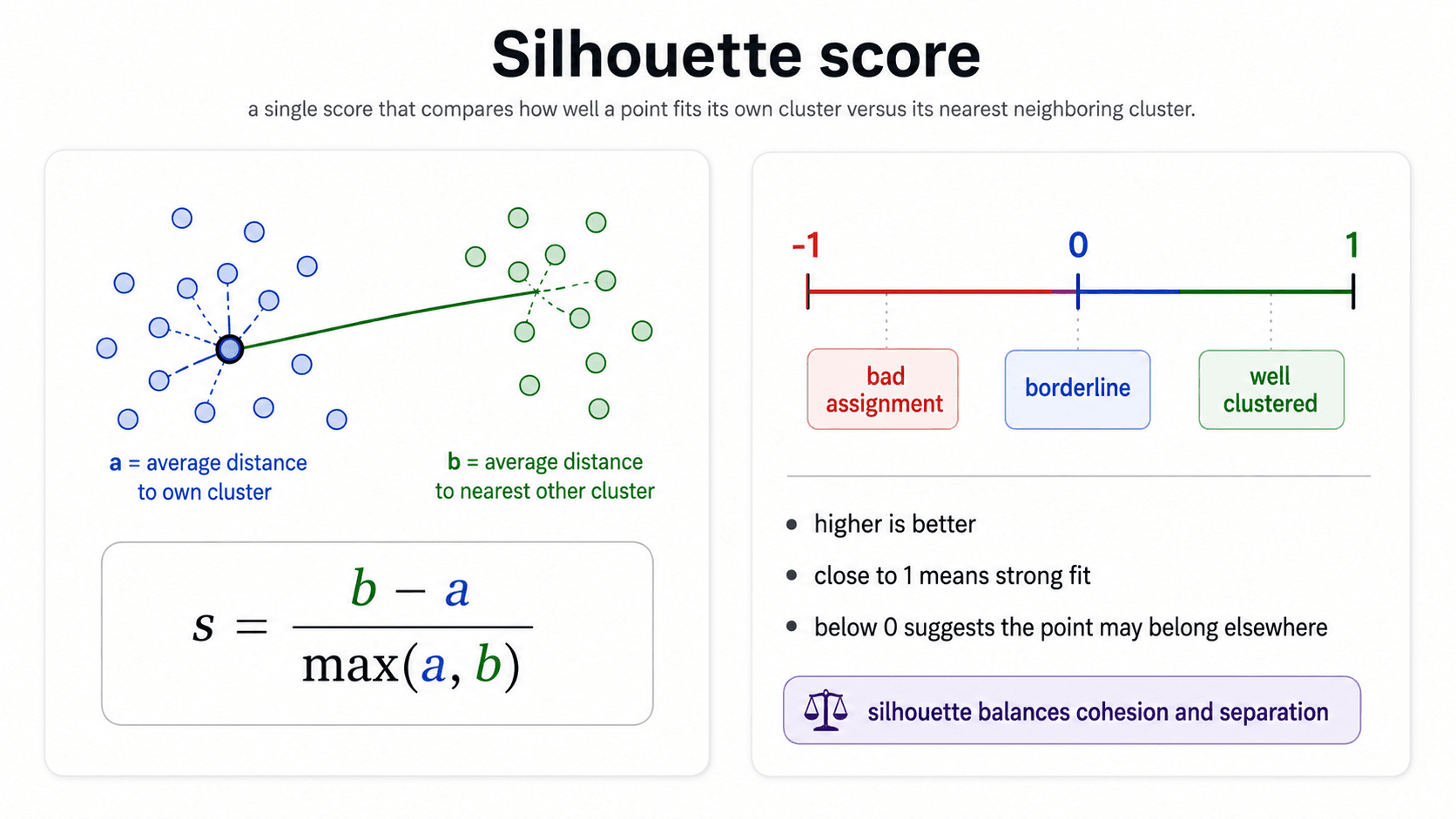
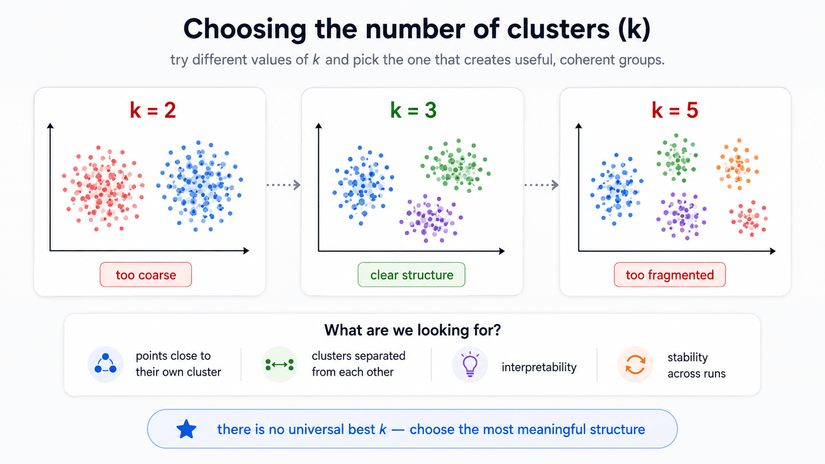
You report either the per-point silhouette scores (in a plot, to see which clusters are clean and which are mushy) or the average silhouette across the dataset (one summary number). Pick the value of (number of clusters) that maximises the average silhouette.
Other clustering metrics worth knowing
- Davies-Bouldin Index — average similarity between each cluster and its most similar one. Lower is better.
- Calinski-Harabasz Score — ratio of between-cluster dispersion to within-cluster dispersion. Higher is better.
- Clustering-as-classification. If you happen to have labels (you held them out, you weren't training on them), you can evaluate the clustering as if it were a classifier by mapping each cluster to its majority label and computing the usual metrics. But do not use labels to drive the clustering itself — they're only for evaluation after the fact.
Useful sanity checks
Before you reach for any single metric, two cheap visual checks catch the most common clustering failures:
- Clusters with very few samples — probably noise that wandered off into its own group. Usually means is too high.
- Clusters with too many samples — the algorithm couldn't find structure, so it dumped everything together. Usually means is too low (or the algorithm is the wrong choice for the data shape).
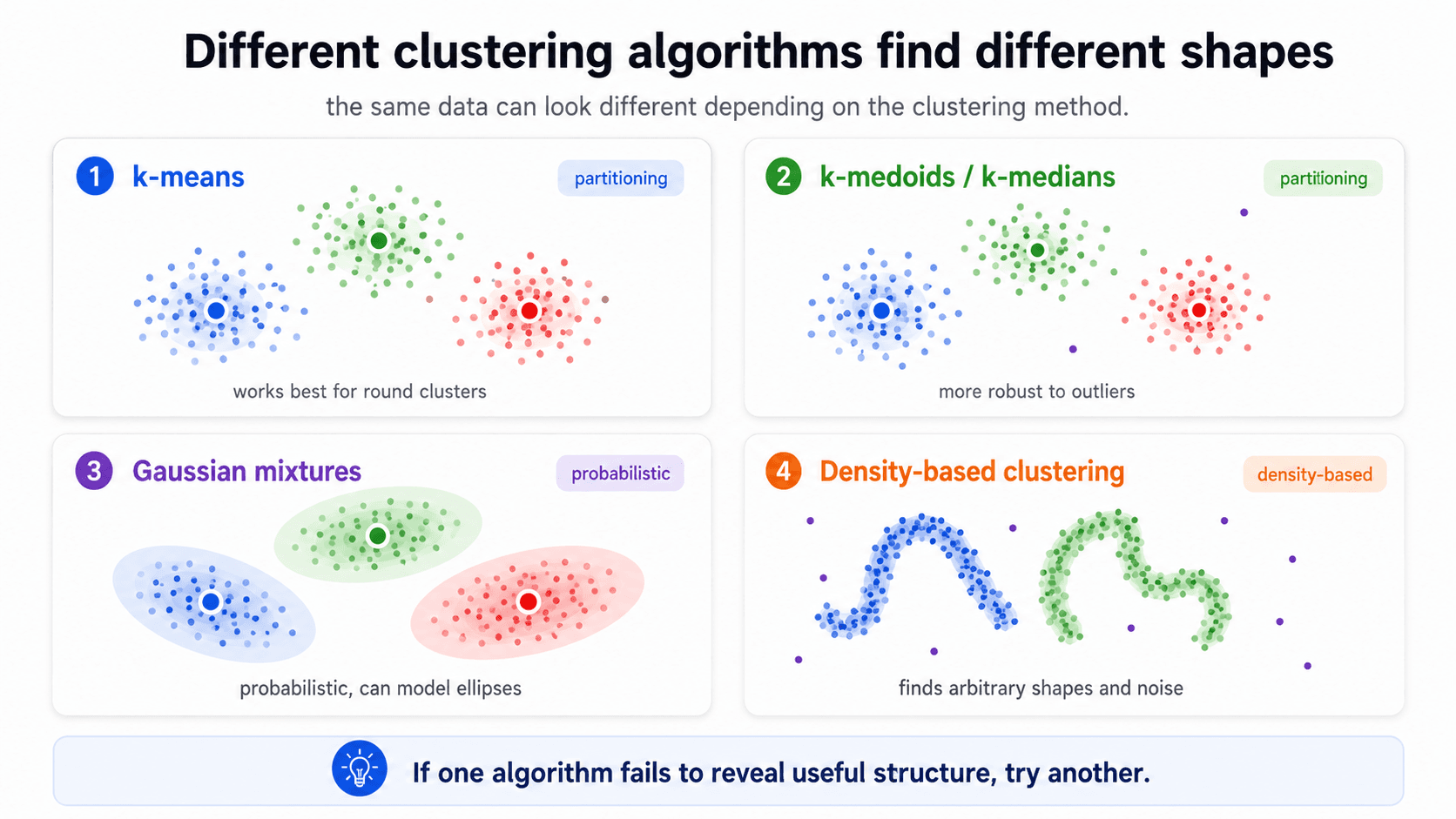
And the obvious one: try different algorithms. K-means, K-medoids, K-medians, Gaussian Mixture Models, density-based clustering (DBSCAN, HDBSCAN). Each makes different assumptions about cluster shape and density. If K-means gives you nonsense, the data probably isn't blob-shaped — try DBSCAN.
The honest workflow
If you take one thing from this post:
- Figure out which kind of problem you have — classification, regression, probability estimation, clustering. The metric family follows from that.
- Start from the confusion matrix (for classification) or the residuals (for regression) to ground yourself in what the errors actually look like.
- Distrust accuracy on imbalanced data. Default to MCC or Kappa when you're worried.
- Choose precision vs recall by the cost of mistakes. Use F1 for a balanced single number; MCC under imbalance.
- For regression, RMSE for the headline; MAE if outliers worry you; R² for cross-model comparison.
- For probability models, the threshold is the most important hyperparameter you set after training. Use ROC/AUC to pick it, then evaluate the final classifier with classification metrics at that threshold.
- For clustering, check compactness and separation; Silhouette is the default single-number metric. Try different algorithms before blaming the data.
- For multi-class, pick macro / weighted / micro based on whether minorities matter.
If you pick the metric after training, you'll end up optimising for whichever metric makes your model look best — not for what actually matters.
Next up — Part 5: Cross-Validation & Model Validation. Now that we have metrics, we need to use them honestly. That means knowing whether the score we measured will hold up in production — which is what cross-validation, train/validation/test splits, and the bias-variance trade-off are for.