
Table of Contents
- 1. Four common model problems
- 2. Bias and variance — what they actually mean
- 3. Training error vs test error — the gap is the diagnosis
- 4. The problem with a single train/test split
- 5. Cross-validation — the fix
- 6. Cross-validation variants — k-fold, LOOCV, repeated k-fold
- 7. The 3-way split — train, validation, test
- 8. After model selection — retrain on all the data
- 9. Bootstrap — for small samples and confidence intervals
- 10. Significance testing — is the improvement real?
- 11. Distribution drift — what the test set can't catch
- 12. The honest workflow, version 2
Last update: June 2026. All opinions are my own.
Machine Learning from Scratch · Part 5/12
Part 4 was about picking the right metric — the language you use to score a model. This post is about using that metric honestly — so the number you compute on your dataset actually predicts how the model will behave in production.
A model can score 99% accuracy on your laptop and 75% in production. Not because the model is bad — because the evaluation was unreliable. Validation is the discipline of making sure that doesn't happen.
This post covers:
- The four kinds of model problem — bias, variance, overfitting, nonsignificance — and how to recognise them.
- The bias-variance trade-off — the U-shape that decides the quality of every model.
- Why a single train/test split is a coin flip, and how k-fold cross-validation fixes it.
- The 3-way train / validation / test split for hyperparameter tuning, and why you retrain on all the data afterwards.
- Bootstrap for small samples and confidence intervals.
- Significance testing — is the improvement real or noise?
- Distribution drift — what changes in production that the test set can't catch.
Four common model problems
Before we get to validation tools, it helps to know what we're validating against. From my notes, there are four distinct ways a model can fail — and not every bad result means the same thing.
- Bias — systematic error. The model is too simple to capture the pattern in the data. It misses the main signal.
- Variance — oversensitivity. The model reacts too strongly to small fluctuations in the training data. Tiny changes in the input produce wildly different predictions.
- Overfit — features the model learned that exist in the training data but don't generalise to the population. The cousin of high variance.
- Nonsignificance — the model was built on an assumed relationship that doesn't actually hold in the general population. The signal you thought was there isn't.
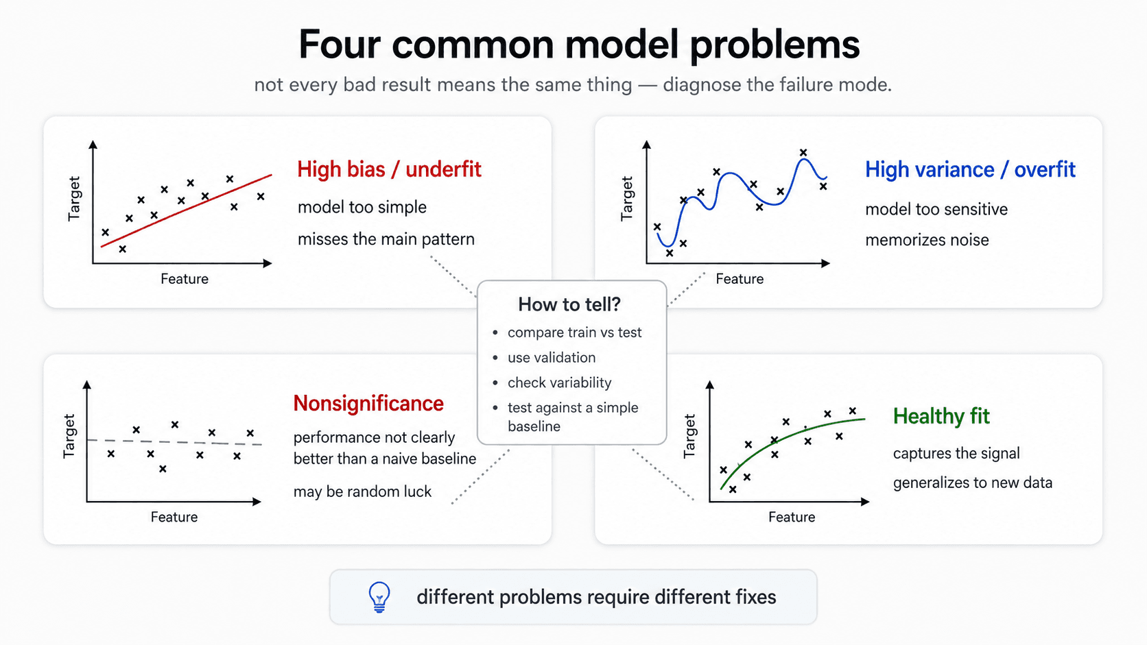
These are the failure modes validation is designed to catch. Bias and variance you diagnose by looking at the gap between training and test error. Overfit you confirm with cross-validation. Nonsignificance you check by comparing your model to a naive baseline and asking is this difference even real?
Bias and variance — what they actually mean
The terms get used loosely in conversation. In this context they mean specific things.
Variance — sensitivity to training data
A model with high variance gives wildly different predictions for slightly different inputs.
Example. You're predicting credit score. Someone aged 37, all other features average — your model says 0.7. A near-identical person aged 39 — same job, same income, same everything else — your model says 0.1. That huge swing for a tiny input change is variance. The model isn't learning the pattern; it's memorising the training points and panicking when the input doesn't match one exactly.
High variance is the signature of overfitting. The model has hugged the training data so tightly that it can't generalise. When it sees a new example, even one similar to what it trained on, it doesn't understand the pattern and gives weird predictions.
The visual: a regression curve that snakes through every training point individually. Training error is zero. Test error is awful.
Bias — systematic under-fitting
The opposite. A model with high bias can't even fit the training data. It gives you a default — an average — instead of learning anything.
The visual: a straight horizontal line through clearly curved data. Or a linear regression on a relationship that's obviously non-linear. Training error is high; test error is also high (often similar to training).
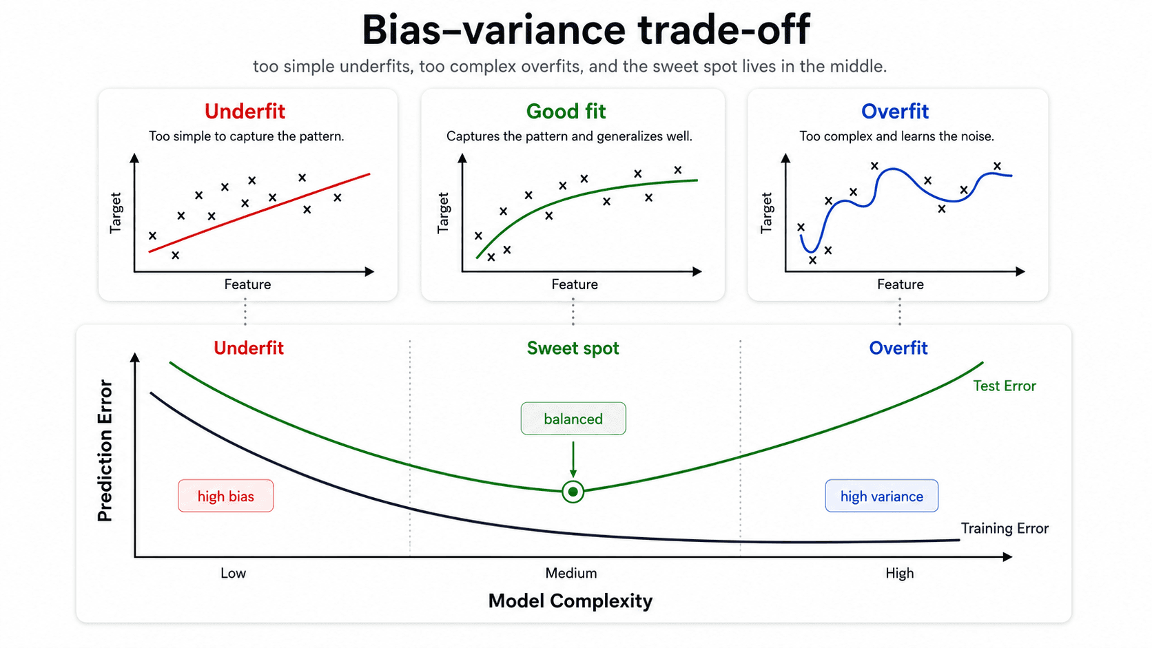
The trade-off
Make the model more complex → training error drops, variance grows. Make it simpler → variance drops, but bias grows. You can't drive both to zero at the same time. The job is to find the balance.
The key picture: plot training error and test error against model complexity.
- Training error drops monotonically. Always. The more flexible the model, the better it can fit the training set.
- Test error is U-shaped. It drops at first (the model is learning the pattern), bottoms out, then rises (the model starts memorising noise).
The minimum of the test-error curve is the sweet spot. The training error tells you nothing about where this minimum is. You can drive training error to zero with a complex-enough model — that doesn't mean it's good.
💡 Training error always goes down. Test error is U-shaped. The trade-off between bias and variance is the entire game.
Training error vs test error — the gap is the diagnosis
The relationship between training error and test error is itself the diagnostic.
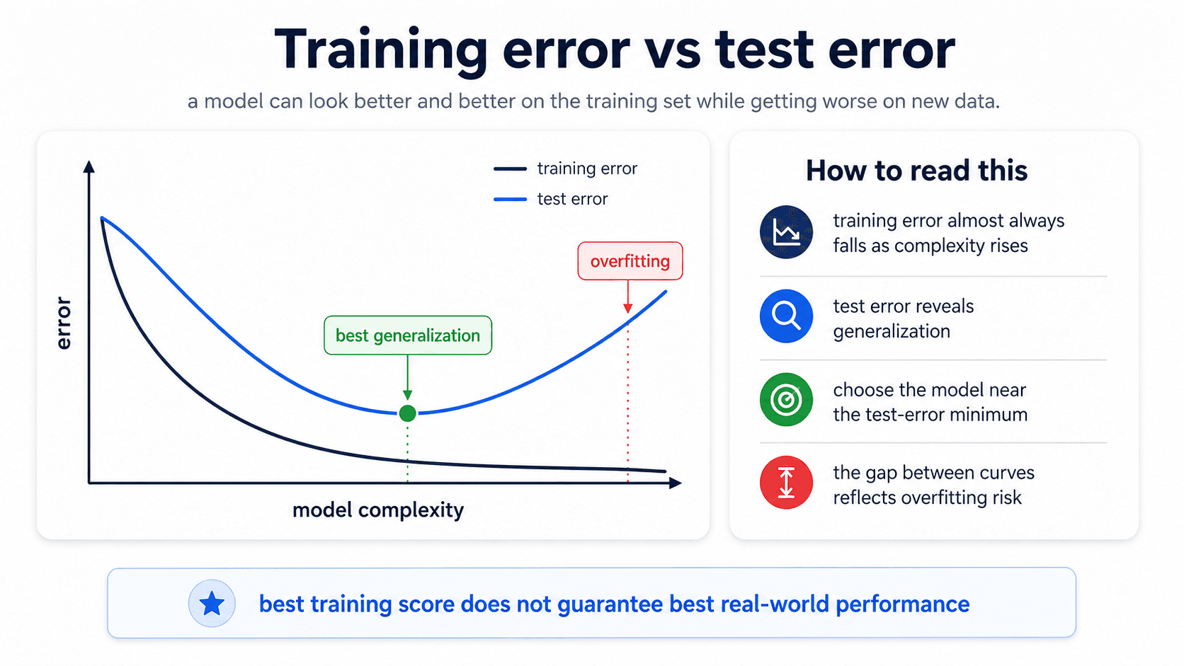
Read the picture:
- Both errors are high. Bias problem — the model is too simple. Make it more flexible.
- Training error is low, test error is high. Variance problem — overfitting. Simplify the model or add regularisation.
- Both errors are low and similar. Healthy fit. Ship it.
- Both errors are flat and similar to a naive baseline. Nonsignificance — the model isn't really learning. Check whether the features have any relationship to the target at all.
The gap between train and test is the signal. If they move together, the model is honest. If they diverge, the model is memorising.
The problem with a single train/test split
The standard ML workflow you learn first:
- Split your data 80/20.
- Train the model on the 80%.
- Evaluate on the 20%.
- Report the test score.
This works — most of the time. The problem is the randomness of the split.
Imagine you're predicting Titanic survival. The split is random. What happens if, by chance, all the first-class passengers ended up in your training set and the test set is mostly third-class? Your model looks brilliant on train (the easy cases) and terrible on test. Not because the model is bad — because the split was unlucky.
The reverse is also true. With a lucky split — easy cases in test, hard ones in train — your model looks 90% accurate. You deploy it. In production: 75%.
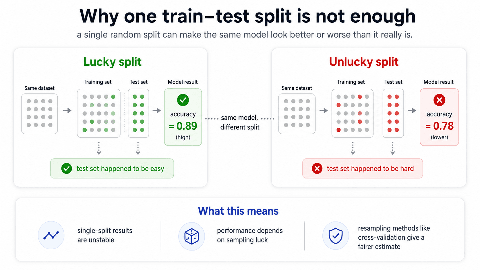
⚠️ With the same model and the same dataset, just changing the random seed of the train/test split can change your reported score by 5-10 percentage points. A single split is a coin flip.
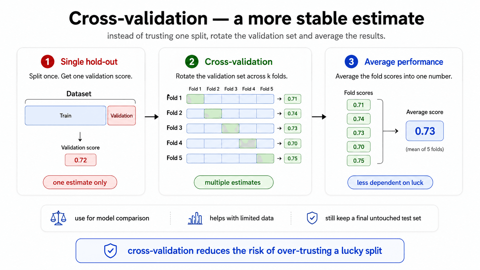
Cross-validation — the fix
The solution: do the splitting many times, average the results.
This is k-fold cross-validation. The process:
- Split your training data into
kequal-sized folds (typicallyk = 5or10). - For each fold
iin 1..k:- Train the model on the other k-1 folds.
- Evaluate it on fold
i.
- Average the k scores.
By doing this k times, every data point gets to be in the validation set exactly once, and you're never tricked by a single lucky / unlucky split. The output is something like "accuracy 85% ± 1%" — the average score, plus the spread.
from sklearn.model_selection import cross_val_score
scores = cross_val_score(model, X_train, y_train, cv=5)
print(f"{scores.mean():.3f} ± {scores.std():.3f}")
That ± 1% is critical. It tells you how stable the model is. If the spread is huge (say, 60-95% across folds), the model is unstable and your headline accuracy is meaningless. If the spread is tight (84-86%), you can actually trust the number.
🔑 Cross-validation gives you the average performance of your model AND its variance. Both matter. Don't quote a single accuracy number — quote a range. "My model is 85% ± 1%" is honest. "My model is 85%" is hiding something.
Why CV scores drop compared to single-split scores
The cross-validation score is usually lower than a one-shot train/test score. Reason: each CV fold only uses k-1/k of the data for training (say, 80% if k=5), so each individual model is trained on slightly less data than your final model will be.
That's fine. The CV score is the honest estimate of generalisation; the higher single-split score was probably an artefact of a lucky split.
Cross-validation variants — k-fold, LOOCV, repeated k-fold
K-fold isn't the only resampling scheme. Different variants trade off computation, stability, and how much data each individual model gets to train on.
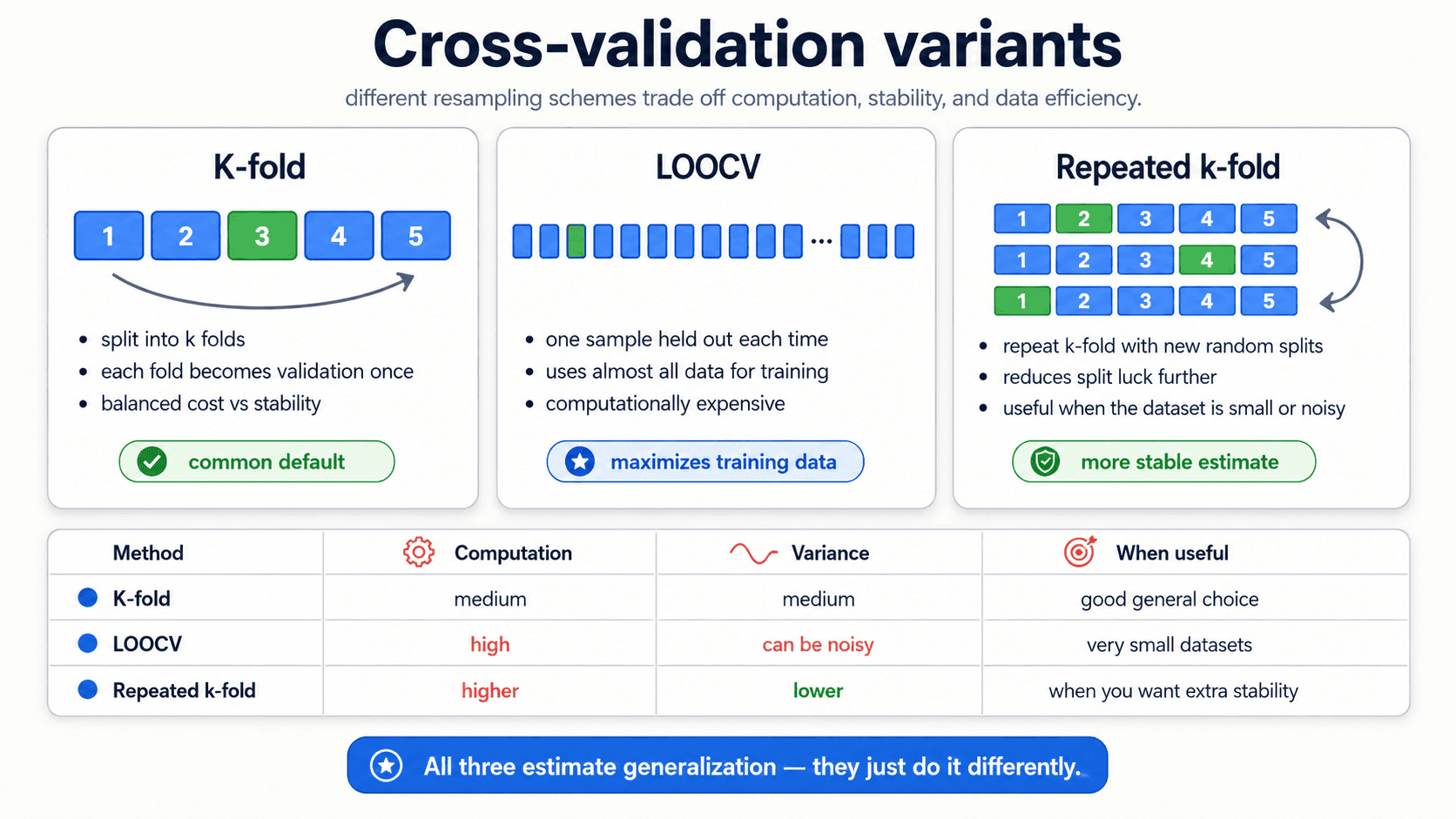
- K-fold. The default. Split into
k = 5ork = 10folds, rotate the validation fold. Balanced cost and stability. Use this unless you have a specific reason not to. - LOOCV (Leave-One-Out Cross-Validation). The extreme case where
k = n— each individual observation gets to be the validation set once. Maximises the training data each model sees, but the fold scores can be noisy and the cost is high (you fit the modelntimes). Useful when the dataset is very small. - Repeated k-fold. Run k-fold multiple times with different random splits, average across all of them. Reduces the dependence on which particular folds you happened to draw. Useful when the dataset is small or noisy and you want a more stable estimate.
In practice: start with 5-fold or 10-fold. Reach for repeated k-fold if the fold-to-fold variance is uncomfortably large. Reach for LOOCV only on small datasets where you can afford the computation.
The 3-way split — train, validation, test
The next subtlety. Suppose you're choosing between Ridge and Lasso, and you also want to find the optimal λ for each.
You can't just train each version and check the test set, because:
- You're going to evaluate 25 values of
λfor Ridge, 25 for Lasso → 50 model variants. - If you score all 50 on the test set and pick the best, you've selected against the test set. Your test score is now contaminated — it's not measuring generalisation, it's measuring which model happens to fit your specific test split best.
The fix: split into three sets.
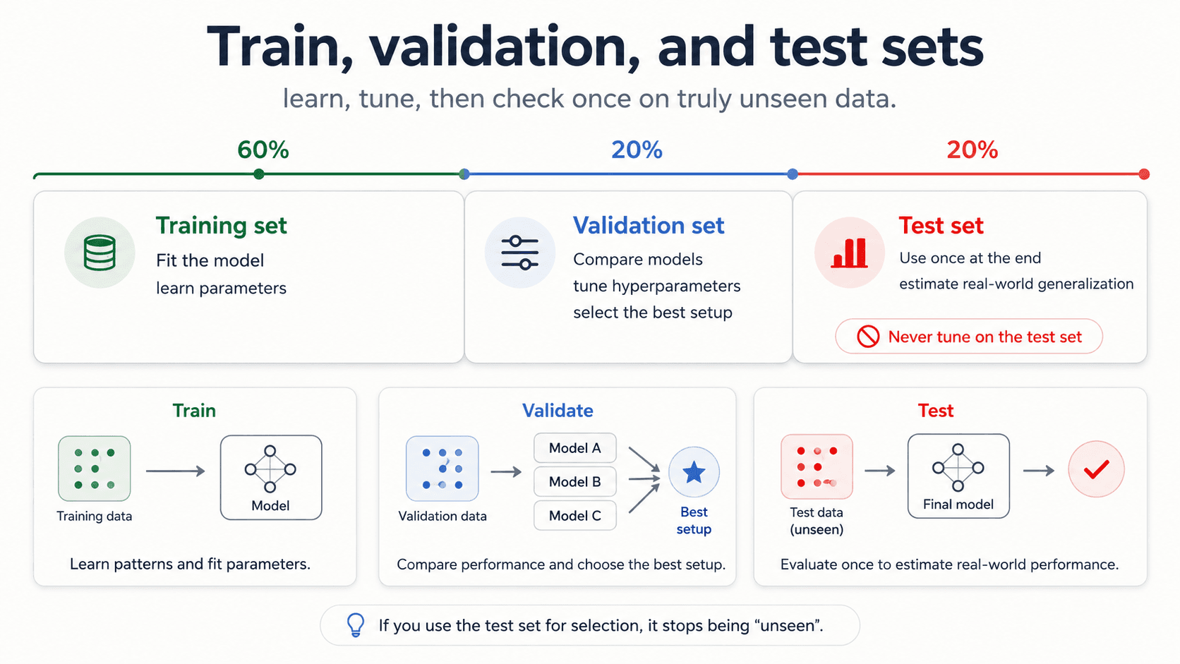
- Training set — fit candidate models.
- Validation set — pick the best one. Try as many configurations as you want. The validation set is where hyperparameter tuning happens.
- Test set — the final, one-shot honest measurement. You touch it once at the end, after you've picked the final model. Never touch it again.
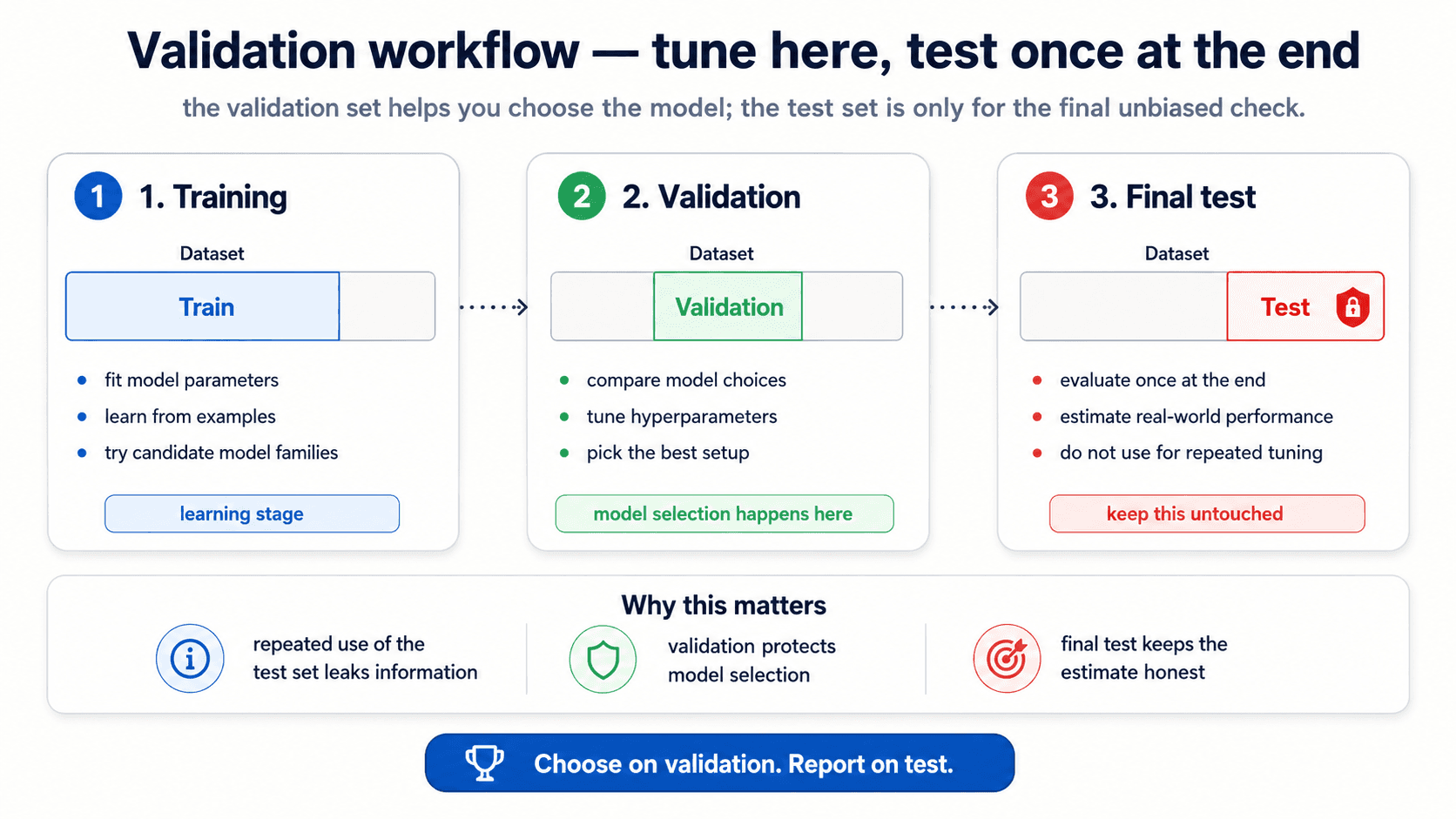
In practice you usually combine train + validation into the CV pool (so the validation step is k-fold CV on the training data), and the test set is genuinely held out from start to finish.
from sklearn.model_selection import train_test_split, GridSearchCV

# 1. Carve out test set first — never look at it during selection
X_dev, X_test, y_dev, y_test = train_test_split(X, y, test_size=0.2)

# 2. Tune hyperparameters via CV on the dev set
grid = GridSearchCV(model, param_grid={'alpha': [0.001, 0.01, 0.1, 1, 10]}, cv=5)
grid.fit(X_dev, y_dev)

# 3. ONE final measurement on the test set
final_score = grid.score(X_test, y_test)
⚠️ Every time you peek at the test set during model selection, you contaminate it. The test set is your only honest measure of generalisation — spend it once.
After model selection — retrain on all the data
A subtle step that's easy to skip. Once cross-validation has told you which hyperparameter setting is best, you don't ship the model from the best fold. You ship a freshly-trained model that uses all the available training data with those hyperparameters.
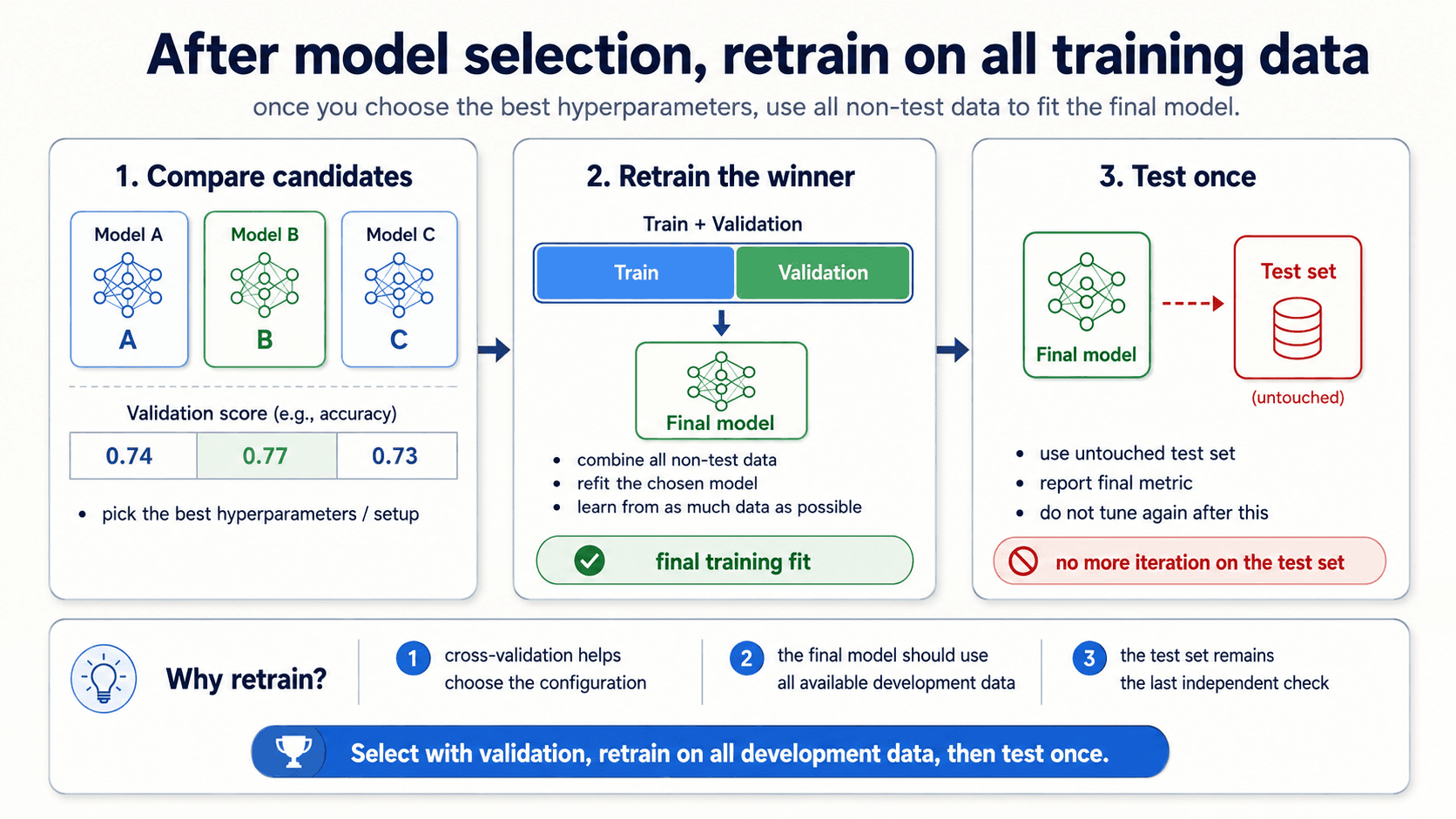
The logic: cross-validation gave you an estimate of how well a given configuration generalises. The actual model you trained inside each fold was on a smaller subset of the data. Now that you've decided which configuration to ship, you let it learn from everything you've got — that gives you the best model the data can produce. Then you measure it once on the untouched test set.
The mental model is:
- Use cross-validation on (train + validation) to pick the configuration.
- Refit the chosen configuration on all of (train + validation).
- Measure once on test.
- Ship.
Step 2 is the one beginners forget. The model that goes into production is not one of the fold-models; it's a final fit on the whole non-test dataset.
Bootstrap — for small samples and confidence intervals
What if your dataset is too small to even do cross-validation reliably? Or you want a confidence interval around a summary statistic — the mean, the median, the accuracy — without making distributional assumptions?
That's where the bootstrap comes in. The idea: instead of theorising about what the sampling distribution looks like, simulate it by resampling from the data you have.
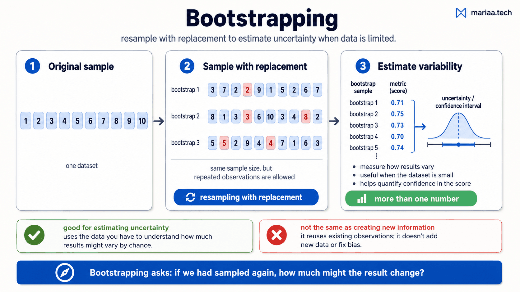
The recipe, from my notes:
- Start with your sample — say, 5 measurements: .
- Generate a new "bootstrap sample" by drawing 5 elements with replacement from the original. (Repeats are fine — the same number can appear twice or not at all.)
- Compute the statistic you care about on this bootstrap sample (the mean, the model's accuracy, whatever).
- Repeat 2-3 thousands of times. Each repetition gives you one value of the statistic.
- The distribution of those values is the bootstrap distribution of your statistic. The 5th and 95th percentiles give you a 90% confidence interval. The standard deviation gives you a standard error.
When to reach for bootstrap:
- Small sample size (typically n < 40-50) — too little data to fit a parametric distribution.
- Estimating a confidence interval around any summary statistic.
- Quantifying uncertainty in a score without making assumptions about its distribution.
What bootstrap is not: it's not creating new information. It uses the data you have to estimate how variable your results are across plausible alternative versions of that same data. If your sample is biased, bootstrap will give you a confident estimate of the biased answer. Garbage in, confident-looking garbage out.
Significance testing — is the improvement real?
You ran two models. Model A got accuracy 0.78. Model B got 0.79. Is B better?
Maybe. Maybe it's just noise — variance in the cross-validation folds, randomness in the train/test split, lucky sampling. A higher number alone isn't proof. You need evidence that the difference is unlikely to have happened by chance.
That's what significance testing does. The traditional framing uses a p-value:
- Set up the null hypothesis — "there's no real difference between A and B; the observed gap is random."
- Compute the probability of seeing a gap at least this big if the null were true. That's the p-value.
- If the p-value is small (commonly < 0.05), you reject the null — there's evidence the difference is real.
- If it's large, you can't distinguish the observed gap from chance.
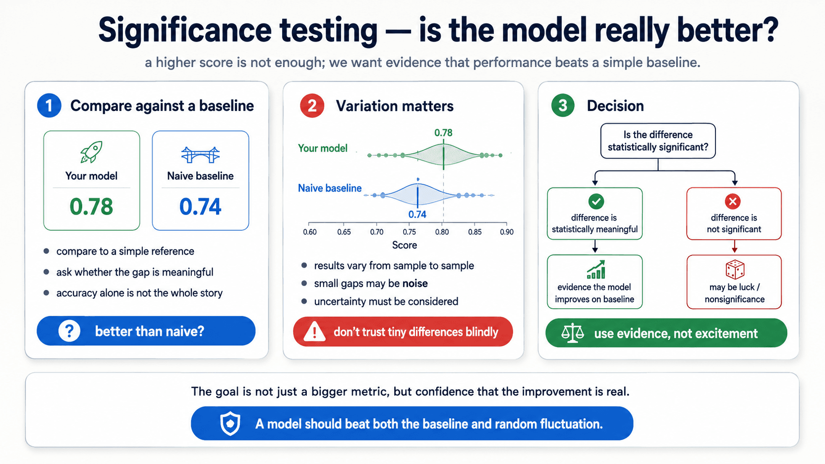
In ML practice, two specific moves matter:
- Compare against a naive baseline. Before you celebrate 78% accuracy, ask: what does a model that always predicts the majority class score? What does a model that picks at random get? If "your" model is barely better than these, the improvement might be nonsignificance.
- Look at the spread, not just the mean. Cross-validation gives you
0.78 ± 0.03. The naive baseline gives you0.74 ± 0.04. The means differ by 0.04 — but the spreads overlap. Is that "significant"? Run a t-test on the per-fold scores and find out.
The lesson, in one sentence: a higher score is not enough; you want evidence the improvement isn't random fluctuation.
Distribution drift — what the test set can't catch
One thing the test set can't catch, no matter how careful your validation: the production data changing over time.
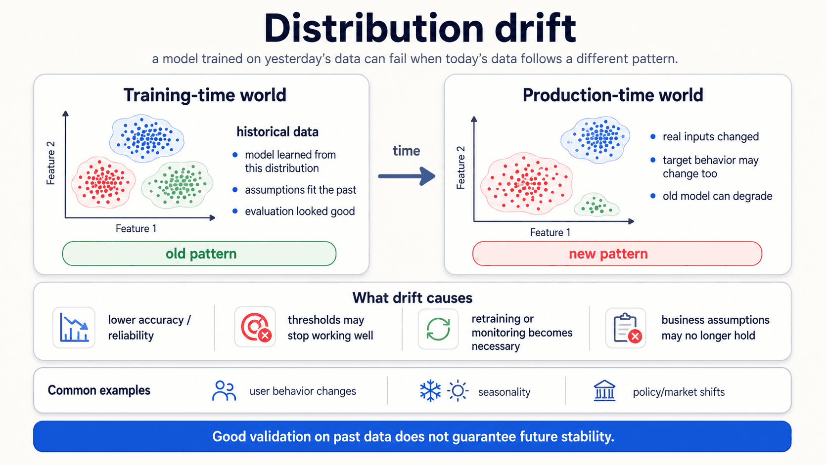
Most ML methods assume that the data distribution is stationary — meaning, what the model trained on is what it'll see at inference. In practice, distributions change. New customer demographics, new product categories, seasonality, regulatory shifts, a competitor that just launched.
When the production distribution drifts away from the training distribution, the model's accuracy degrades. Sometimes slowly, sometimes overnight. The model didn't get worse — the world changed under it.
What drift causes:
- Lower accuracy and reliability on the metric you trained for.
- Thresholds stop working. A spam threshold tuned for last year's spam doesn't catch this year's.
- Business assumptions break. A churn model that learned "customers who don't log in for 30 days will leave" stops working when product behaviour changes.
Common drivers:
- User behaviour changes — products, interactions, demographics.
- Seasonality — holiday traffic, end-of-quarter effects, weather.
- Policy or market shifts — a regulation, a competitor, a recession.
The fix is monitoring: track the model's metric in production, retrain when it drops. We won't go deep here, but it's worth knowing the term and the discipline. It's the reason every production ML system needs retraining infrastructure — the model is never done; it's just current.
The honest workflow, version 2
A unified picture of how to actually evaluate and validate a model in practice:
- Pick your metric before you train based on the cost of mistakes (Part 4).
- Diagnose the failure mode: bias, variance, overfit, or nonsignificance. Each has a different fix.
- Carve out a test set at the start and never touch it.
- Do hyperparameter selection with k-fold CV on the remaining data. Report the mean ± std, not a single number.
- Pick the model at the bottom of the U-curve. Smallest test error, not smallest training error.
- Retrain the chosen configuration on all the development data before shipping.
- Bootstrap when the sample is too small for stable CV, or when you need a confidence interval.
- Significance-test against a naive baseline. A higher score isn't evidence — beating noise is.
- Touch the test set once for a final, honest score.
- Monitor in production — distributions drift; retrain when they do.
Next up — Part 6: Naïve Bayes. A classifier that has no business working as well as it does — and a great mental model for anyone who wants to think probabilistically.