
Table of Contents
- 1. Feature selection vs. dimensionality reduction
- 2. Why high dimensions hurt
- 3. PCA: the map of Italy
- 4. Principal components are recipes
- 5. When PCA is pointless
- 6. PCA vs LDA
- 7. Two things that quietly break PCA
- 8. The maths sketch
- 9. How many components?
- 10. Kernel PCA
- 11. End-to-end on the Wine dataset
- 12. The workflow
- 13. Takeaways
Last update: June 2026. All opinions are my own.
Machine Learning from Scratch · Part 10/12
Part 9 used kernels to add dimensions. This post does the opposite — remove dimensions to make data more useful.
Feature selection vs. dimensionality reduction
Two ways to shrink a dataset:
- Feature selection — drop irrelevant features. You keep your originals.
- Dimensionality reduction — transform first, then drop dimensions in the new space.
| Feature selection | PCA | |
|---|---|---|
| What it returns | Subset of original features | New axes (blends of features) |
| Interpretability | Preserved | Reduced |
| Mechanism | Drops columns | Rotates, then drops dimensions |
| Methods | Chi-Square, Lasso | PCA, Kernel PCA, LDA |
In PCA we don't remove individual features. We create new dimensions formed as linear combinations of the originals.
Why high dimensions hurt
Imagine looking for a friend in a one-storey house, then a ten-storey building, then a skyscraper. Each new floor multiplies the rooms. That's what adding a feature does — the search space inflates, the data gets sparse, distance-based methods stop meaning much.
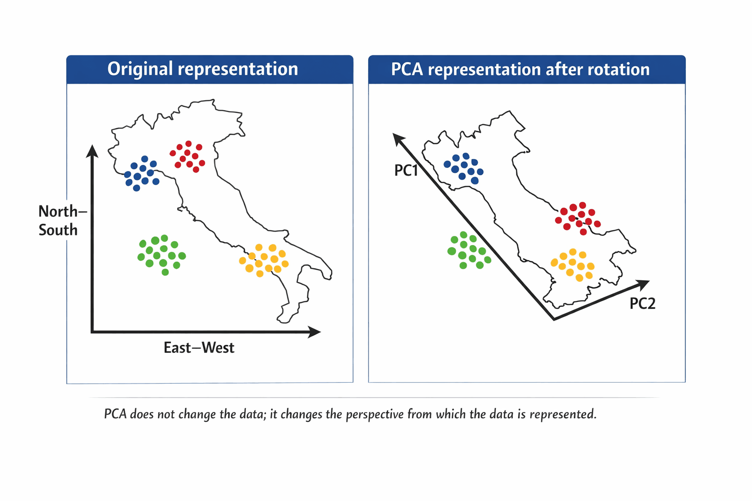
PCA: the map of Italy
Italy on the usual North–South / East–West grid. The points spread diagonally — the axes are valid, but they don't describe the structure.
Rotate the map slightly. The points don't move. Distances don't change. The perspective does. Suddenly each region clusters along one axis.
| Italy example | PCA meaning |
|---|---|
| Original map orientation | Original feature space |
| N–S and E–W axes | Original variables |
| Rotating the map | Changing the coordinate system |
| Better-separated regions | Structure becomes clearer |
| New axes after rotation | Principal components |
💡 PCA finds this rotation automatically. It compresses by combining correlated features. No correlations → nothing to compress.
Principal components are recipes
Each PC is a fixed blend of the original ingredients — a bit of income, a dash of age, a pinch of zipcode.
PC₁ = w₁·x₁ + w₂·x₂ + … + wₚ·xₚ
PCA orders them:
- PC₁ — most variability of any possible blend.
- PC₂ — most remaining variability, uncorrelated with PC₁.
- PC₃ — same idea, uncorrelated with PC₁ and PC₂.
You get the same number of PCs as you had features. The reduction is your call afterwards — keep the top K.
Do say: "PCA creates new dimensions from combinations of the original variables."
Don't say: "PCA selects the best original features." That's feature selection, not PCA.
The explainability tax. Every PC blends your features. Your model now runs on 0.3·income + 0.6·age + 0.2·zipcode + …. Don't use PCA when explainability is the deliverable — reach for Lasso or RF feature importance.
When PCA is pointless
PCA bundles correlated features. So:
⚠️ No correlations → no compression. You'll end up with as many components as features, each carrying the same variance.
PCA is a technique, not an algorithm. It transforms; it doesn't predict.
PCA vs LDA
PCA ignores the target — it's unsupervised. If you have labels and want axes that maximise class separation, that's LDA (Part 11).
| PCA | LDA | |
|---|---|---|
| Target labels? | No | Yes |
| Maximises | Total variance | Class separation |
| Used for | EDA, compression, viz | Classification prep |
Two things that quietly break PCA
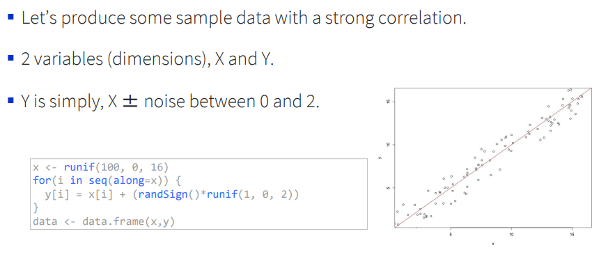
Scaling. A feature in the thousands (income) will dominate a feature in single digits (age) by magnitude alone — like a loud speaker drowning out a quiet one. Always scale first.
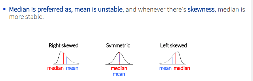
Skewness. Variance is a poor summary for skewed data. Log or Box-Cox transform first.
The maths sketch
PCA is built on the covariance matrix Σ — a p × p matrix of feature-pair covariances, with variances on the diagonal.
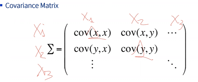
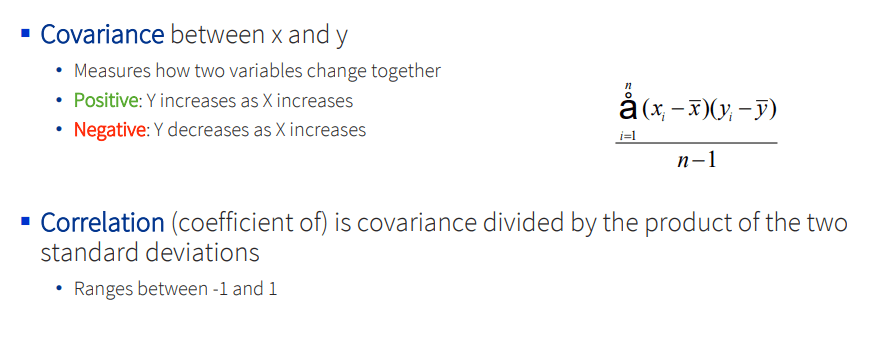
Stats refresher. PCA only really uses two ideas: variance (how spread out a feature is, around its mean) and covariance (how two features move together). Correlation is just covariance scaled to [−1, 1].
The spectral decomposition theorem: any symmetric matrix factors as Σ = U · Λ · U⁻¹, where U's columns are the eigenvectors and Λ's diagonal holds the eigenvalues.
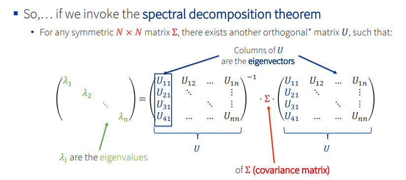
The eigenvectors are the principal components. The eigenvalues are the variance each one captures.
How many components?
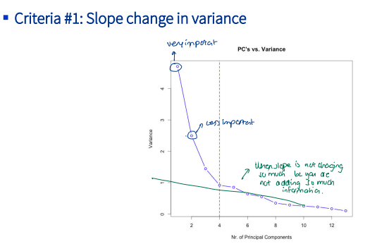
PCA can't decide for you. Four criteria:
1. Elbow on the scree plot. Drop fast, then flatten — keep what's to the left of the bend.
2. Cumulative variance. Pick a target (often 90–95%) and read off how many PCs you need.
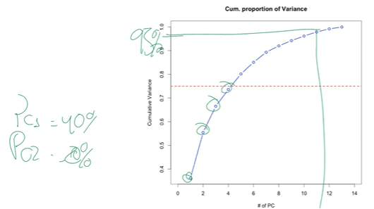
3. Eigenvalue > 1 (Kaiser). Keep PCs whose eigenvalue exceeds 1 (they carry more variance than the average original feature did).
4. Cross-validation. Treat K as a hyperparameter, train downstream, pick the K with best CV score.
from sklearn.decomposition import PCA
pca = PCA(n_components=0.95)   # keep enough PCs to hit 95% variance
X_reduced = pca.fit_transform(X_scaled)
Kernel PCA
Same kernel trick as Part 9. By default PCA finds linear combinations; a kernel makes them non-linear. Rarely worth it in practice — autoencoders are usually a better tool for wild non-linear structure.
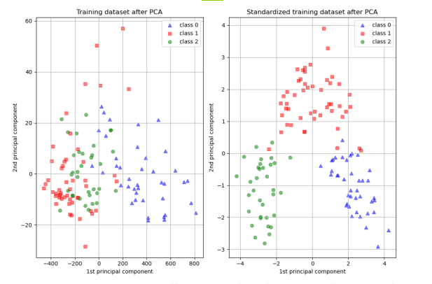
End-to-end on the Wine dataset
13 chemical features, 3 cultivar classes, no labels used by PCA:
from sklearn.datasets import load_wine
from sklearn.preprocessing import StandardScaler
from sklearn.decomposition import PCA
import matplotlib.pyplot as plt

X, y = load_wine(return_X_y=True)
X_scaled = StandardScaler().fit_transform(X)        # 1. scale
pcs = PCA(n_components=2).fit_transform(X_scaled)   # 2. project to 2D

plt.scatter(pcs[:, 0], pcs[:, 1], c=y, cmap="viridis")
plt.xlabel("PC1"); plt.ylabel("PC2"); plt.show()
Variance explained: PC1 ≈ 36%, PC1+PC2 ≈ 55%, first 7 PCs ≈ 90%. The three cultivars separate cleanly in PC1–PC2 space — even though PCA never saw the class labels.
This isn't always the case. When class structure is orthogonal to maximum-variance directions, LDA wins. That's Part 11.
The workflow
- Drop the target. PCA is unsupervised.
- Scale on training only. Fit
StandardScaleron train, transform train + test. - Fit PCA on the scaled training set.
- Pick K — scree, cumulative, or CV.
- Transform train + test, fit your downstream model.
⚠️ Fit the scaler and PCA on train, then transform validation/test with the fitted objects. Re-fitting on test = leakage.
Takeaways
- PCA combines correlated features into uncorrelated PCs.
- PC₁ holds the most variance, each later PC the most remaining.
- Needs correlated, scaled, roughly-normal data.
- Costs explainability — features become blends.
- It's unsupervised. Supervised cousin is LDA.
- It's preprocessing, not prediction.
Where I use PCA: before clustering or viz on high-D data; as preprocessing when many features are correlated; for EDA — PC1 vs PC2 often shows structure you can't see raw.
Where I don't: when explainability matters, or when features aren't correlated.
Next — Part 11: LDA & QDA — Supervised Projection. Same projection idea, this time using the labels.