
Table of Contents
- 1. What is Machine Learning?
- 2. Learning = Representation + Evaluation + Optimization
- 3. First idea: Generalization is what counts
- 4. Cross-validation in one sentence
- 5. The curse of dimensionality
- 6. Feature engineering is the key
- 7. More data beats a cleverer algorithm
- 8. Data alone is not enough — GIGO principle
- 9. More data is good but data alone is not enough
- 10. Learn many models, not just one
- 11. Types of ML learning systems
- 12. Main challenges of machine learning
- 13. Hyperparameter tuning and model selection
- 14. The five things to remember
Last update: June 2026. All opinions are my own.
What is Machine Learning?
A field of study that gives computers the ability to learn from data without being explicitly programmed.
ML systems automatically learn programs from data.
- A machine learning algorithm is a piece of code that tries to give computers the ability to learn.
- Only implement ML if the solution genuinely is machine learning — a rule-based system is faster to build, easier to debug, and won't drift on you.
- ML is the field of study that gives computers the ability to learn without being explicitly programmed to.
So how do we make a computer program learn?
💬 A computer program learns from experience E with respect to a task T and a performance measure P, if its performance on T improves with experience E.
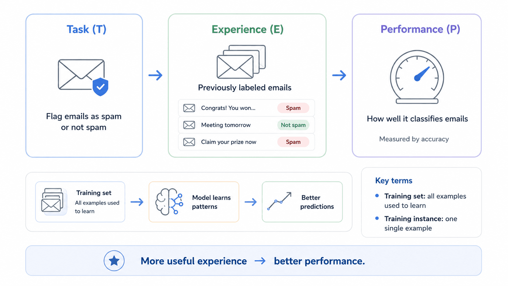
For example, your spam filter is an ML program that — given examples of spam emails (flagged by users) and regular emails — can learn to flag spam.
The examples that the system uses to learn are called the training set, and each training example is called a training instance or sample.
In this case:
- The task T is to flag spam for new emails.
- The experience E is the training data.
- The performance P needs to be defined — e.g. the ratio of correctly classified emails. This performance measure is called accuracy, and it's often used in classification tasks.
💡 If you download a copy of Wikipedia, your computer has a lot more data — but it isn't suddenly better at any task. That isn't machine learning.
What is learning? Three different steps — and in this series we focus only on representation.
Learning = Representation + Evaluation + Optimization
Every ML algorithm — every single one we'll cover in this series — decomposes into three pieces. This framing comes from Pedro Domingos's A Few Useful Things to Know About Machine Learning paper, and it's the lens I use to compare algorithms.
Think of machine learning as: choose what kind of solution you allow → decide how to judge it → find the best one.
1. Representation — "What kind of model are we allowed to use?"
This is the space of possible solutions. You're telling the computer: "You can only search for answers inside this family of models."
| Problem | Representation choice |
|---|---|
| Data looks like a straight-line relationship | Linear regression |
| Data has complex curves | Decision tree, Random Forest, neural network |
| Text classification | Naïve Bayes, SVM, neural network |
| Image recognition | Convolutional neural network |
That family of allowed models is called the hypothesis space. For example, if we choose linear regression, the hypothesis space is all possible straight lines. The model can choose different slopes and intercepts, but it cannot suddenly become a decision tree.
2. Evaluation — "How do we know if a model is good?"
Once we have a family of possible models, we need a way to score them. That's the evaluation metric.
| Task | Possible evaluation metric |
|---|---|
| Predict house price | Mean squared error, mean absolute error |
| Classify spam / not spam | Accuracy, precision, recall, F1-score |
| Predict if patient has disease | Recall may be more important than accuracy |
| Recommend products | Ranking score, click-through rate |
Evaluation answers "what are we trying to improve?" Suppose the real house price is €300,000. Model A predicts €310,000; Model B predicts €500,000. The evaluation metric tells us Model A is better because its error is smaller.
The metric you pick is the thing your model will optimise for — so picking the wrong one means optimising the wrong thing. (Part 4 — Classification Metrics goes deeper on this.)
3. Optimization — "How do we find the best model?"
We know the family of allowed models, and we know how to judge them. Optimization is the search procedure we use to move through the family and find the one with the best score.
| Model / situation | Optimization method |
|---|---|
| Linear regression | Gradient descent or closed-form solution |
| Neural network | Gradient descent / backpropagation |
| Decision tree | Greedy splitting search |
| Rule-based models | Combinatorial search |
Optimization is not the score itself — it's the process used to improve the score. (Your slides might say "optimization metric"; the more accurate term is optimization method or algorithm.)
A simple analogy: buying a dress
| Step | Choice | Maps to |
|---|---|---|
| Representation | "I'll only consider black dresses, size M, under €100." | The set of dresses you allow into the search. |
| Evaluation | "I'll judge each one on comfort, price, style, quality." | The score you use to rank them. |
| Optimization | "I'll go shop by shop, filter online, sort by rating, try the best ones first." | The procedure for finding the winner. |
Machine learning example: house prices
Suppose we want to predict house prices.
Step 1: Representation. We choose linear regression. That means the model has this form:
price = a × size + b
The model is only allowed to learn straight-line relationships. So the space of solutions is all possible lines — for example:
price = 2,000 × size + 50,000
price = 2,500 × size + 20,000
price = 1,800 × size + 100,000
Each one is a possible model.
Step 2: Evaluation. We choose an error metric, for example Mean Squared Error. This tells us how bad the predictions are. Example:
| Model | Prediction error |
|---|---|
| Line A | 50,000 |
| Line B | 10,000 |
| Line C | 80,000 |
The evaluation metric says Line B is better.
Step 3: Optimization. Now the algorithm needs to find the best values of a and b. It may use gradient descent.
💬 Gradient descent, in one sentence: "Try a line, calculate the error, adjust the line slightly, check if the error improves, repeat."
So optimization is the mechanism that moves from a bad line to a better line.
Where do these "things" fit?
Your slides may list these three terms:
Space of solutions
Evaluation metric
Optimization metric
The last one is slightly misleading. The cleaner mapping:
Space of solutions     →  Representation
Evaluation metric      →  Evaluation
Optimization method    →  Optimization
In plain English:
| Thing in your slides | Where it fits | What it really means |
|---|---|---|
| Space of solutions | Representation | The possible models the learner can choose from |
| Evaluation metric | Evaluation | The score/loss used to say if a model is good or bad |
| Optimization method | Optimization | The algorithm used to search for the best model |
Avoid the phrase "optimization metric" unless a professor specifically uses it — the standard terms are optimization method, optimization algorithm, or loss function being optimized. Optimization is the search procedure, not the score itself.
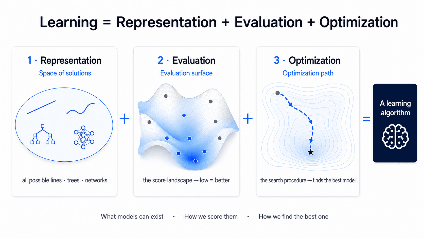
The diagram above is trying to show one thing:
Representation + Evaluation + Optimization = Learning algorithmThree shapes, each standing for one of the pieces.
First shape — Space of solutions. This is all the possible models. For example:
all possible lines
all possible trees
all possible neural networks
That belongs to representation.
Second shape — Evaluation surface. This represents the error/score landscape. Some models are good, some models are bad. The low points are usually better if we are minimising error.
That belongs to evaluation.
Third shape — Optimization path. The dashed blue path shows the search process. The model starts somewhere on the surface, then moves step by step toward a better place (the lowest point).
That belongs to optimization.
One-sentence summary
💬 Choose the kind of model you allow (representation), choose how to measure if it is good (evaluation), and use a search procedure to find the best version of that model (optimization).
First idea: Generalization is what counts
🔑 What you care about is how your algorithm works with new data. You already know what happened with the training data — what matters is whether the model can learn from that and use it to predict new data.
Example: customer churn
Imagine you create a model to predict customer churn and it gets 99% accuracy. Is that really what you want? Not necessarily — you care about how the algorithm works on new data. In the training data you already know what happened (which customers left and which stayed); the important thing is whether the model can use that past data to predict what will happen with future customers.
What is generalization?
The fundamental goal of machine learning is to generalize beyond the examples in the training set. The model should not only perform well on the data it has already seen — it should also perform well on data it has never seen before.
Generalization means how well your model behaves on new data. It's difficult because during training you only have past data — you're trying to use past examples to make predictions about future examples. The key thing to avoid: overfitting.
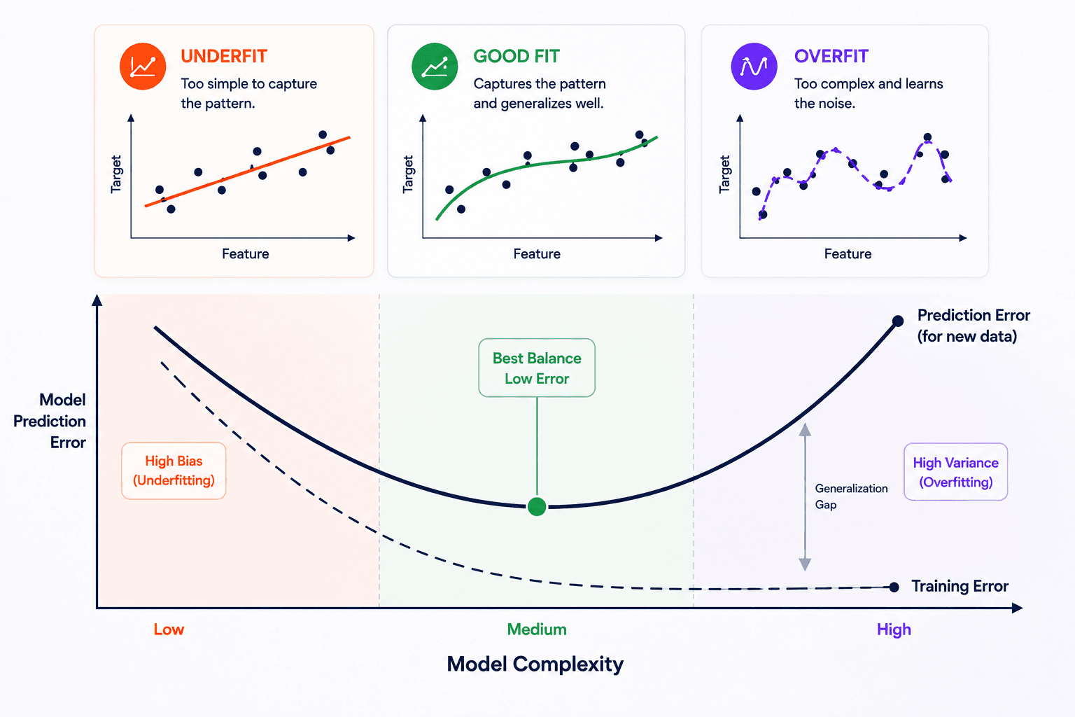
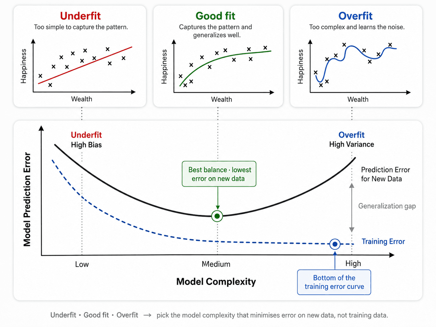
Underfit vs overfit
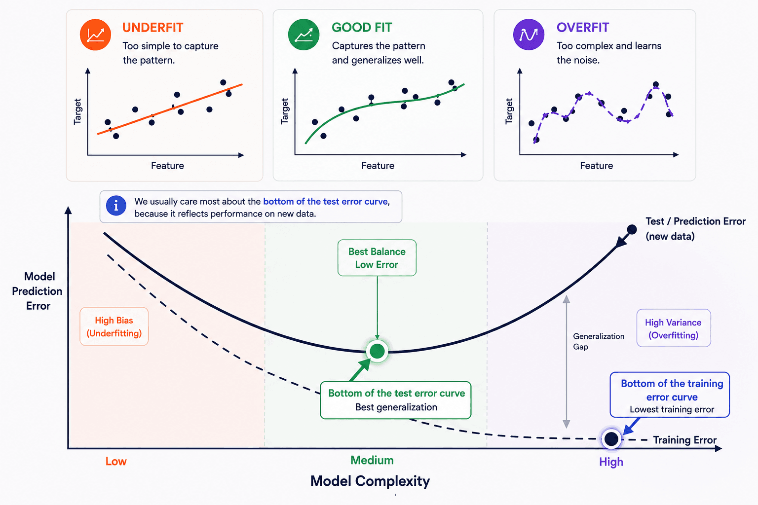
Two failure modes sit on either side of the sweet spot:
- Underfitting — the model is too simple to capture the real relationship. High error on training data and on new data. The straight line in the leftmost panel above.
- Overfitting — the model memorises the training data instead of learning the general pattern. Near-zero error on training data, but high error on new data. The wiggly curve in the rightmost panel.
You're hunting for the middle: complex enough to capture the real pattern, not so complex that it starts modelling noise.
Worked example: predicting happiness from wealth
To make this concrete, imagine you want to predict a person's happiness from their wealth. The relationship may not be a simple straight line — let's walk through the three model choices from the diagram.
Model complexity
- A linear model — underfit. First, you suspect a linear relationship and fit a straight line. It captures part of the trend, but misses the actual shape of the data. High error on training, high error on new data. That's underfitting — the model is too simple.
- A quadratic model — good fit. Then you fit a gentle curve. This is flexible enough to capture more of the real pattern but not so flexible that it bends to every point. Both training error and test error drop. This is the sweet spot.
- A complex model (neural net) — overfit. Now you throw a deep neural network at it. The training error may go to zero — the model passes through every point. Looks great. But it has memorised the noise and random details, not the underlying relationship. The first new data point it sees, the prediction is wild. That's overfitting.
Train error vs test error
A good model should have low error on both training data and test data.
With overfitting, you usually see this:
- Training error: very low, maybe almost zero.
- Test error: high.
That means the model learned the training examples too specifically and failed to generalize.
The role of dataset size
The larger your dataset, the less you usually worry about overfitting — the model has more examples to learn from, so it's harder for it to simply memorise every one.
However, overfitting can still happen, especially with very complex models. Even with large datasets, you still need to evaluate the model properly.
💡 Practical note: the larger your dataset and the smarter your feature engineering, the less you have to worry about overfitting. Big datasets give the model enough signal that the noise can't dominate. A few thousand examples? Worry. A few million? Less worry.
Overfitting has many faces
The same problem shows up in different costumes depending on the learner:
- A linear learner has high bias — when the frontier between two classes is not a hyperplane, the learner cannot induce it.
- Decision trees don't have this problem because they can represent any Boolean function. But they can suffer from high variance: decision trees learned on different training sets generated by the same phenomenon are often very different, when in fact they should be the same.
- Contrary to intuition, a more powerful learner is not necessarily better than a less powerful one — a model that can learn complex patterns can also learn the noise, the outliers and the accidental coincidences in the training data. Sometimes the simpler model generalises better precisely because it can't fit the noise.
That's why you need a way to estimate, before you ship, how the model will behave on data it hasn't seen. The standard answer is cross-validation — and that's where we go next.
Cross-validation in one sentence
Cross-validation is an evaluation technique to see how good your model is when put to production.
Randomly dividing your training data into (say) ten subsets, holding out each one while training on the rest, testing each learned classifier on the examples it did not see, and averaging the results.
We'll go deeper into this in Part 5 of this series, which is dedicated to cross-validation.
The curse of dimensionality
💬 The core idea. As you add features, the search space grows very quickly. If the added features are irrelevant or noisy, the model has more space to search but no more useful signal.
The example
Suppose you have two datasets:
- A: 10,000 instances and 100 features.
- B: 10,000 instances and 10,000 features.
Which one has more information?
Dataset B has more columns, but it does not automatically contain more useful information. More features help only when they are relevant, measured well, and connected to the thing you want to predict.
💡 The nuance: irrelevant features don't remove the raw data you already have. But they reduce the useful signal-to-noise ratio — they add noise, make distances less meaningful, and spread the same examples through a much larger space.
Why extra dimensions hurt
Each feature acts like a new axis. One feature is a line, two features are a plane, three features are a volume, and many features create a high-dimensional search space.
With the same number of rows, adding dimensions makes the data more sparse — nearby examples become harder to find, clusters become less obvious, and the model has more opportunities to fit noise instead of real patterns.
Add irrelevant features → search space gets bigger → data becomes sparse → patterns are harder to learn.
Take house prices. With one informative feature — size_in_m2 — your model searches along a line. Add location and it searches over a plane. Add owner_name, colour_of_the_front_door, month_of_purchase and the search space balloons into a high-dimensional volume — with the same number of data points scattered inside it.
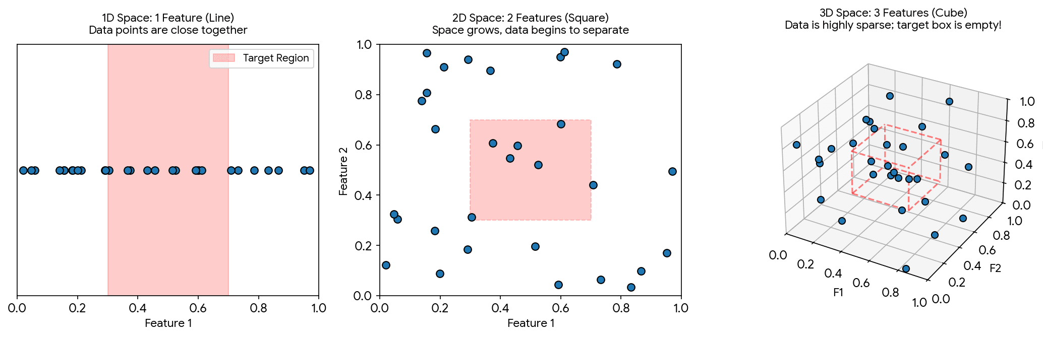
How to read the diagram:
- 1 feature: the model searches along a line. A small interval can still contain several examples.
- 2 features: the model searches over a plane. The same per-feature interval becomes a much smaller square.
- 3 features: the model searches through a volume. The same per-feature interval becomes an even smaller cube.
How fast does space grow?
If each feature is divided into k bins and you have d features, the number of possible cells in feature space is:
With a fixed number of examples n, the average examples per cell is n / kᵈ. As d grows, this average drops very quickly — most cells end up empty.
| Dimensions d | Cells (k = 10) | Intuition |
|---|---|---|
| 2 | 100 | Still manageable |
| 3 | 1,000 | Space grows quickly |
| 10 | 10,000,000,000 | Most cells empty unless data is huge |
Or, more concretely: imagine dropping a coin and having to find it. Along a 10-metre line, easy. In a 10 × 10 m grid (100 m²), harder. In a 10 × 10 × 10 m room (1,000 m³), much worse. In a 100-dimensional space, it's effectively unfindable — even with a huge dataset.
When "nearest" stops meaning nearest
The most devastating consequence is subtle: in high dimensions, the distance between any two points becomes almost equal. The closest pair and the farthest pair end up nearly indistinguishable — which means distance-based methods like K-Nearest Neighbours, k-means, and Euclidean similarity quietly stop working.
We can prove it ourselves. Generate 500 random points across different dimensions, compute all pairwise Euclidean distances, and plot the histogram:
import numpy as np
import matplotlib.pyplot as plt
from scipy.spatial.distance import pdist

np.random.seed(42)
num_points = 500
dimensions = [2, 10, 100, 1000]

plt.figure(figsize=(14, 4))

for i, dim in enumerate(dimensions):
    # Generate 500 random points in 'dim' dimensions
    data = np.random.rand(num_points, dim)

    # Euclidean distance between every pair of points
    distances = pdist(data, metric='euclidean')

    # Normalize by the max so we see the relative spread
    # (absolute distances naturally scale up with sqrt(dim))
    normalized = distances / np.max(distances)

    plt.subplot(1, len(dimensions), i + 1)
    plt.hist(normalized, bins=50, color='#1f77b4', edgecolor='k', alpha=0.7)
    plt.title(f"{dim} Dimensions")
    plt.xlabel("Relative Distance")
    if i == 0:
        plt.ylabel("Frequency")
    plt.xlim(0, 1)

plt.tight_layout()
plt.show()
What you see:
- In 2 dimensions: distances are widely spread. Some pairs are close (near 0), some far (near 1). KNN works fine.
- In 100–1,000 dimensions: the variance collapses into a sharp spike — almost every pair of points has a relative distance of roughly 0.8.
Formally, the failure is the limit theorem:
Because the gap between the worst-case outlier and the closest neighbour approaches zero, "nearest neighbour" loses its meaning in high-dimensional space.
Three ways to fight back
1. Feature selection. Keep only the variables connected to the target. Drop the rest.
2. Dimensionality reduction. Algorithms like PCA, t-SNE, or learned embeddings compress many variables into fewer useful ones while preserving the core information. We'll cover PCA properly in Part 10.
3. Use the angle, not the distance. Cosine similarity measures the angle between two vectors instead of how far apart they are. While Euclidean distance breaks down as high-dimensional points drift into empty space, cosine similarity only cares about the direction they point. It is bounded between −1 (opposite) and 1 (same direction).
import numpy as np
from sklearn.metrics.pairwise import cosine_similarity

vector_a = np.array([[1, 2, 3, 0, 1]])
vector_b = np.array([[2, 4, 5, 1, 0]])

# 1. Scikit-Learn (most common in ML pipelines)
sim_sklearn = cosine_similarity(vector_a, vector_b)
print(f"Sklearn: {sim_sklearn[0][0]:.4f}")

# 2. Pure NumPy (dot product / magnitudes)
dot = np.dot(vector_a, vector_b.T)
sim_numpy = dot / (np.linalg.norm(vector_a) * np.linalg.norm(vector_b))
print(f"NumPy: {sim_numpy[0][0]:.4f}")

# 3. PyTorch (deep learning / GPU)
import torch
import torch.nn.functional as F
ta = torch.tensor([1.0, 2.0, 3.0, 0.0, 1.0])
tb = torch.tensor([2.0, 4.0, 5.0, 1.0, 0.0])
sim_torch = F.cosine_similarity(ta, tb, dim=0)
print(f"PyTorch: {sim_torch.item():.4f}")
Why it fights the curse:
- Ignores scale. Two documents with the same word proportions but one ten times longer are treated as identical.
- Focuses on signal. In high dimensions (text, recommender systems), vectors are usually sparse — mostly zeros. Cosine evaluates whether the non-zero features point the same way.
ML libraries usually want a distance (lower = closer), not a similarity. Convert with:
The blessing of non-uniformity
The escape hatch: real data is rarely spread uniformly through the whole high-dimensional space. Examples usually concentrate near a lower-dimensional structure — a curve, a surface, a manifold. Good features help reveal that structure.
So even with 10,000 nominal dimensions, your actual data may live on something much smaller. Your job is to find the dimensions that matter.
A note on decision trees: they're relatively robust to extra features because they choose features as they split. But they're not immune — too many irrelevant columns still inflate training time, create noisy splits, and encourage overfitting.
Memory cues
| More columns ≠ more signal | Features only help when they're relevant and informative. |
| Same data + bigger space = sparsity | Fixed points spread across an exponentially larger volume. |
| Good features bring examples together | Similar instances cluster, distinct ones separate. |
| Bad features add noise | The model searches directions that don't help prediction. |
💡 One-sentence takeaway: the curse of dimensionality is what makes feature engineering matter so much. Adding many features can make an ML problem harder, unless those features carry real predictive signal — and finding the ones that do is the next idea.
Feature engineering is the key
This is the practical implication of the curse of dimensionality. If most of the work in ML is making sure your features carry signal and not noise, then the most leveraged skill in ML is feature engineering.
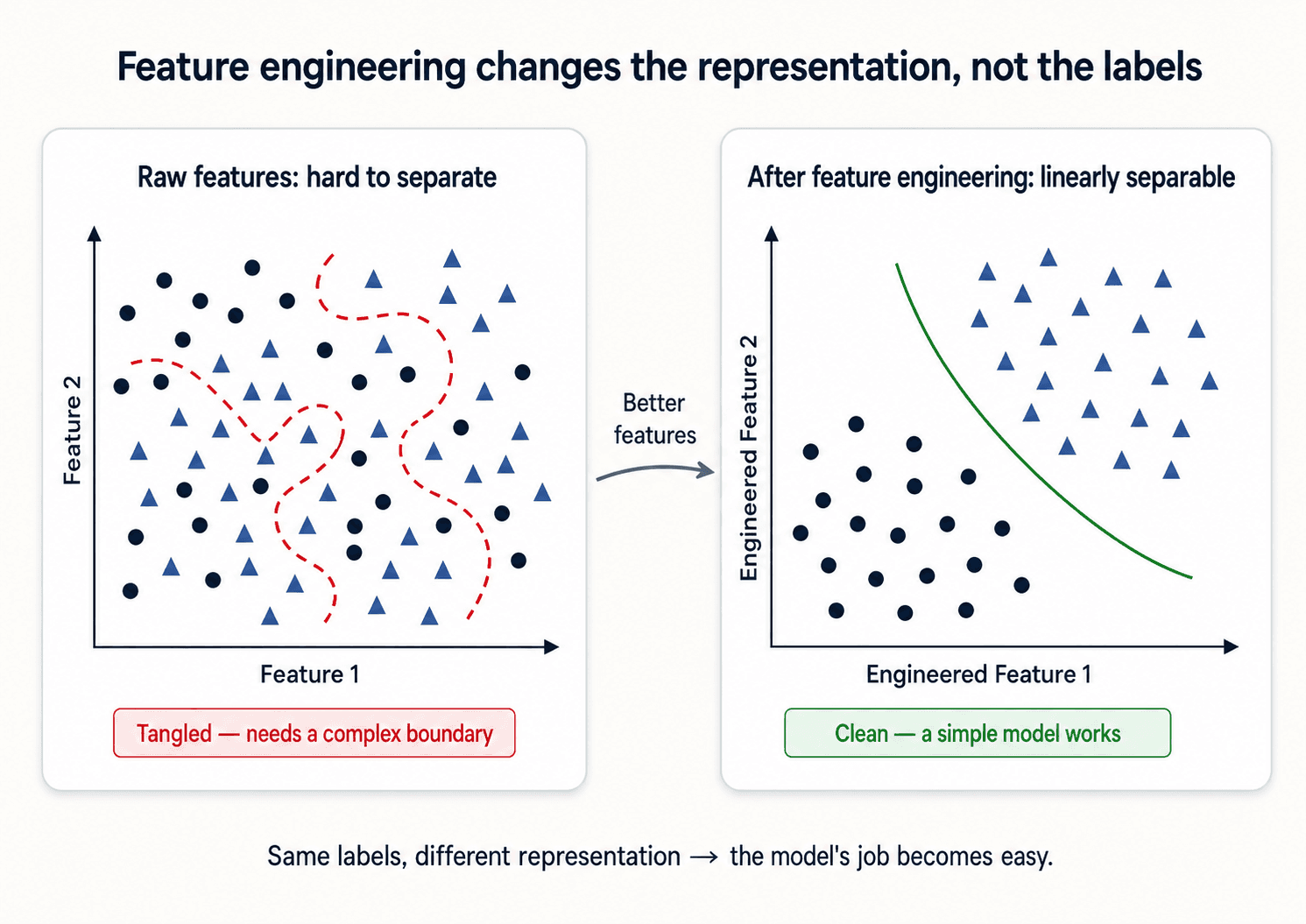
- Some machine learning projects succeed and some fail. What makes the difference? The most important factor is the features used.
- Often, the raw data is not in a form that is amenable to learning — but you can construct features from it.
- Machine learning is not a one-shot process of building a dataset and running a learner. It's an iterative process of running the learner, analysing the results, modifying the data and/or the learner, and repeating.
What that actually looks like
So how do you do it? Four concrete moves on the features themselves:
- Keep relevant features — the ones connected to the target variable.
- Remove irrelevant or duplicate features — they add noise, cost, or confusion.
- Engineer better features — combine or transform raw inputs into descriptors that represent the pattern more clearly.
- Use dimensionality reduction when needed — methods like PCA or learned embeddings summarize many variables with fewer useful dimensions.
Happy or sad faces
Take a classic example: label images of faces as happy or sad. The raw pixels are a noisy high-dimensional mess. But with the right hand-engineered features — mouth_corner_angle, eyebrow_position, eye_openness — similar emotions start clustering tightly in the search space. Bad or irrelevant features (background_colour, filename_length) just spread the same examples randomly across more dimensions.
This is the whole game: remove the irrelevant, add the relevant — and the geometry of your problem starts to work for you instead of against you.
House prices, again
Same idea. The raw column address is essentially useless to a model. But turn it into distance_to_city_centre, crime_rate, school_district_rating, and suddenly the model has signal it can actually use.
We'll spend a whole post on this — Part 3 — Feature Engineering. For now: when an ML project isn't working, the first place to look is the features.
More data beats a cleverer algorithm
Here's the most counter-intuitive result in this whole course. The classic experiment (Banko & Brill, 2001, on natural-language disambiguation):
Take four different ML algorithms. Train each one on increasing amounts of data. Plot accuracy vs training set size.
What do you get? With little data, the more sophisticated algorithm (think neural net, memory-based) wins. The simpler ones can't compete. So far, expected.
But as you keep adding data, the gap shrinks. And shrinks. By the time you've got enough data, all four algorithms converge to roughly the same accuracy — around 95%. The fancy algorithm and the simple one perform nearly identically.
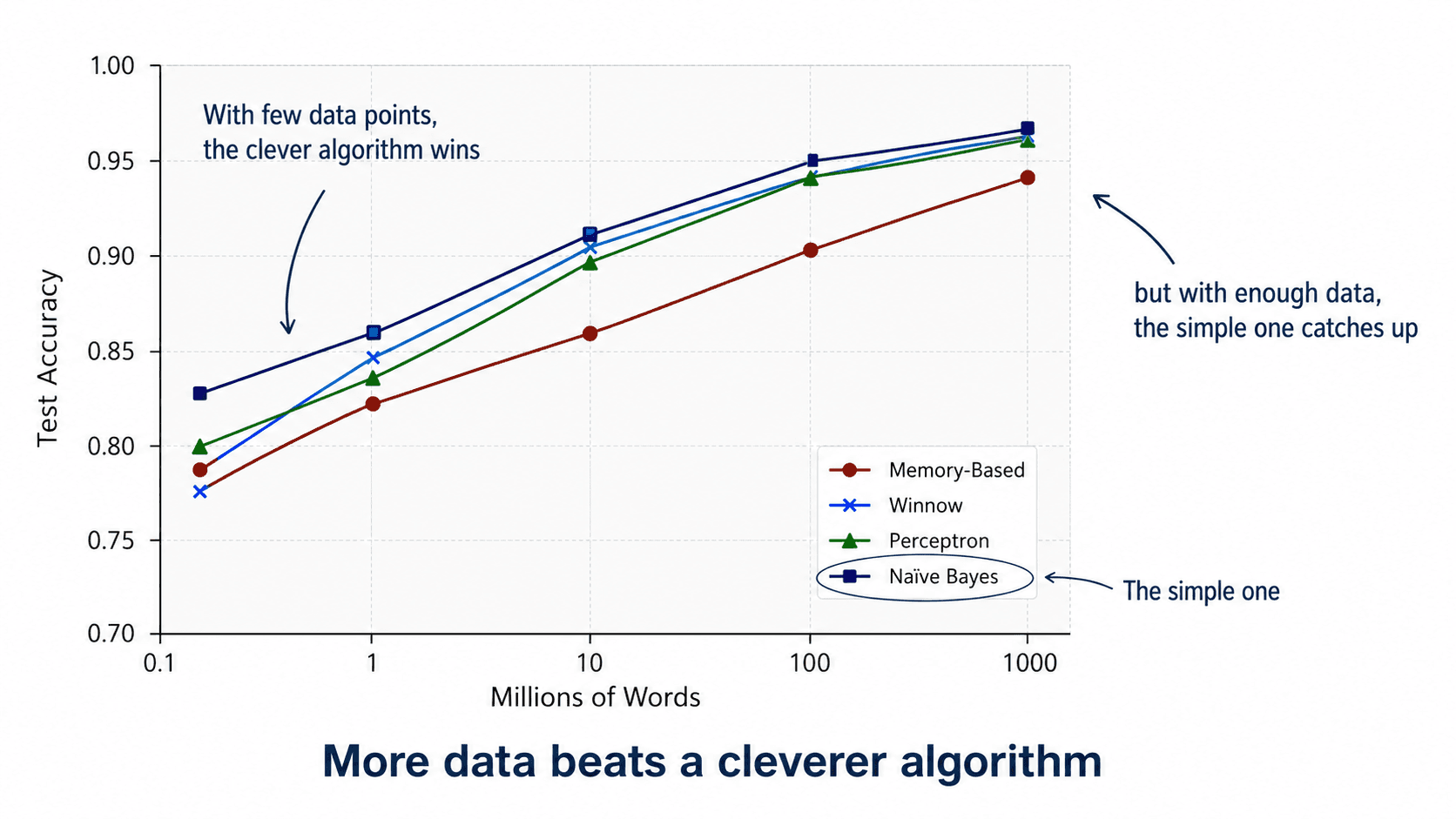
💡 More data beats a cleverer algorithm.
If you only remember one thing about the relationship between data and algorithms: more good data almost always beats a fancier model. Investing weeks in a better algorithm rarely pays off compared to investing those weeks in better data.
Data alone is not enough — GIGO principle
There's a giant asterisk on the previous point, and the asterisk is the entire reason this course is not titled "Just Get More Data".
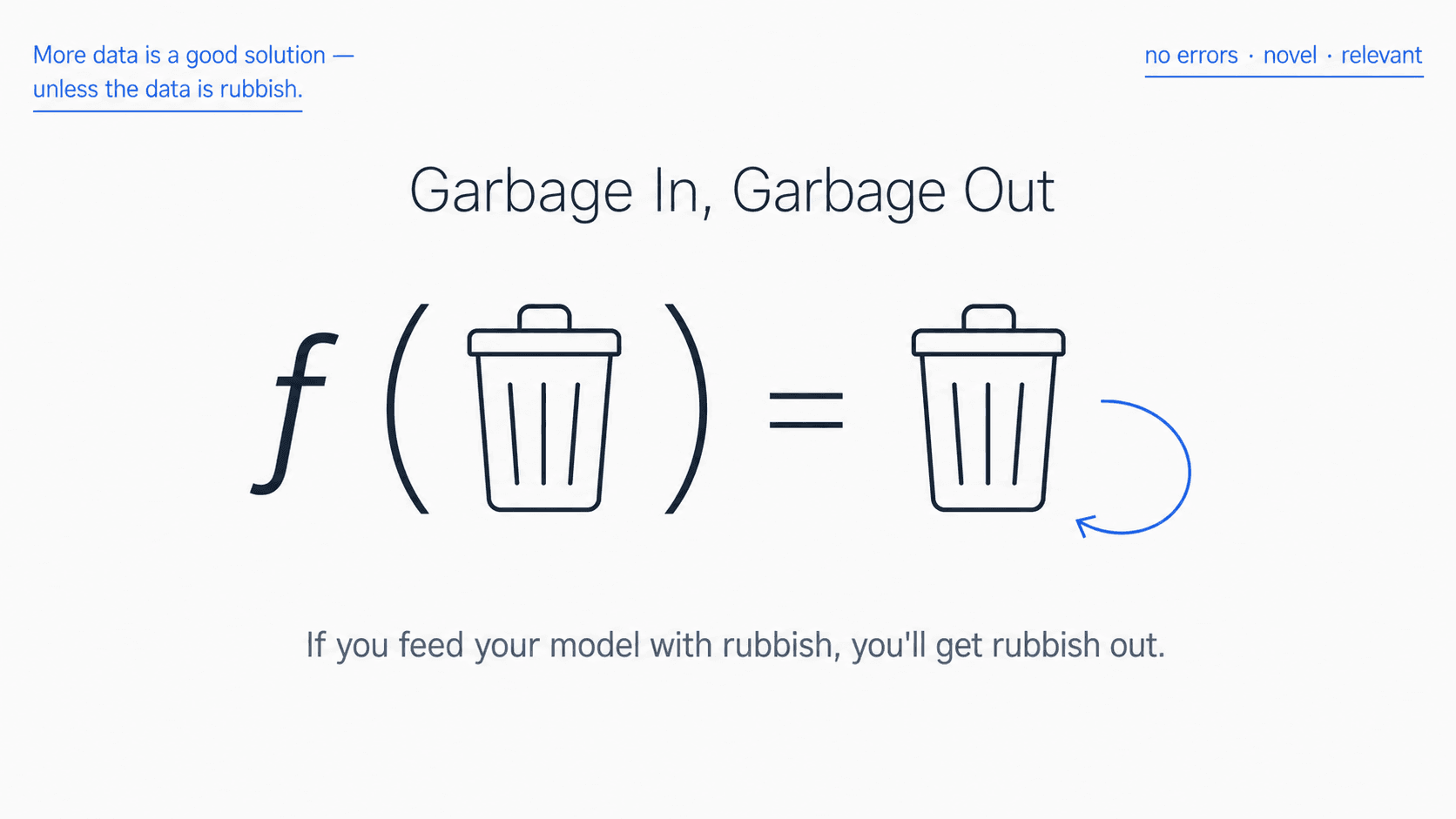
⚠️ Garbage In, Garbage Out (GIGO). More data only helps if the data is good. Data full of errors, biases, irrelevant features, or unrepresentative samples will produce a worse model the more of it you have, not a better one.
What "good data" means in practice:
- No errors. Numbers with a meaning: someone listed as
-1years old, or139. A solar-power reading of0that's actually the night-time value, not a missing one. You have to clean these up before the algorithm sees them. (We'll cover this exhaustively in Part 2 — Data Cleaning.) - Novel. If your rows are duplicates of each other (or near-duplicates), the duplicates don't add information. If you spot repeated data, discard it.
- Relevant. Data from the wrong domain (training on cats, deploying on dogs) won't help.
- Representative. Training on people from one country and deploying everywhere is the classic trap. Your training set has to look like the data you'll see in production.
So the full statement, with both halves:
💡 More data is good, but data alone is not enough.
You also need to understand the context of the model. As Domingos puts it: every learner must embody some knowledge or assumptions beyond the data it's given. Pure curve-fitting on raw numbers will only get you so far. You need to know what those numbers mean, what your stakeholders care about, and what kind of failures are catastrophic vs tolerable.
More data is good but data alone is not enough
The biggest signal that an ML project is going to work isn't the algorithm. It's the data scientist sitting down with someone who's been in the industry for 20 years and saying "so what actually matters to you?"
To create an ML model that works in the real world, you need to understand its context — four pillars that the domain expert helps you fill in:
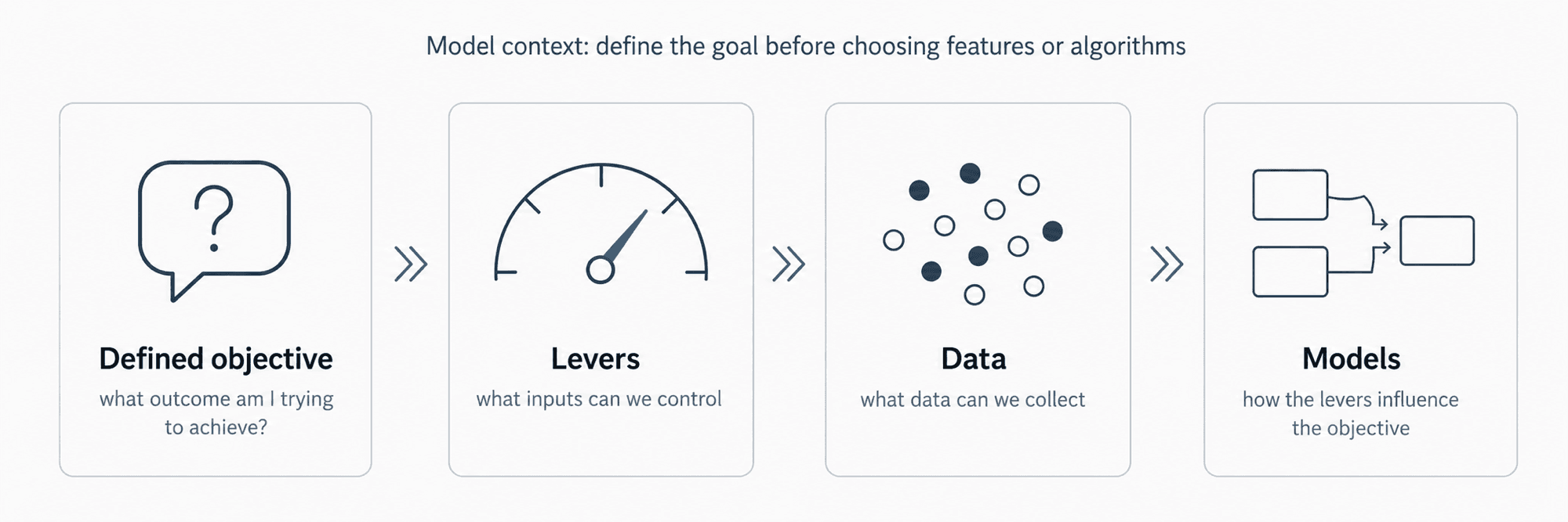
- Defined objective — what outcome are we trying to achieve?
- Levers — what inputs can we control or change?
- Data — what can we actually collect, at what cost?
- Models — how do the levers affect the objective?
Those conversations with the domain expert produce features you'd never invent on your own. The expert knows:
- Which seasonal effects matter.
- Which weird outliers are real signal and which are data-entry errors.
- Which target variable is the one the business actually cares about — versus the one you've been computing.
- Which costs are asymmetric (false negatives are worse than false positives, or the reverse).
Whenever I work on a new problem, the first thing I do is ask the domain expert what they would want to know. Then I figure out how to engineer features that answer their question. It works better than starting from the data.
Learn many models, not just one
The last big idea from Session 1, and the one that gives Random Forests their power. The no-free-lunch theorem says (informally): there is no single algorithm that's best for every problem. Different problems suit different representations.
So what's the strongest practical move? Don't pick one model. Train several, combine them.
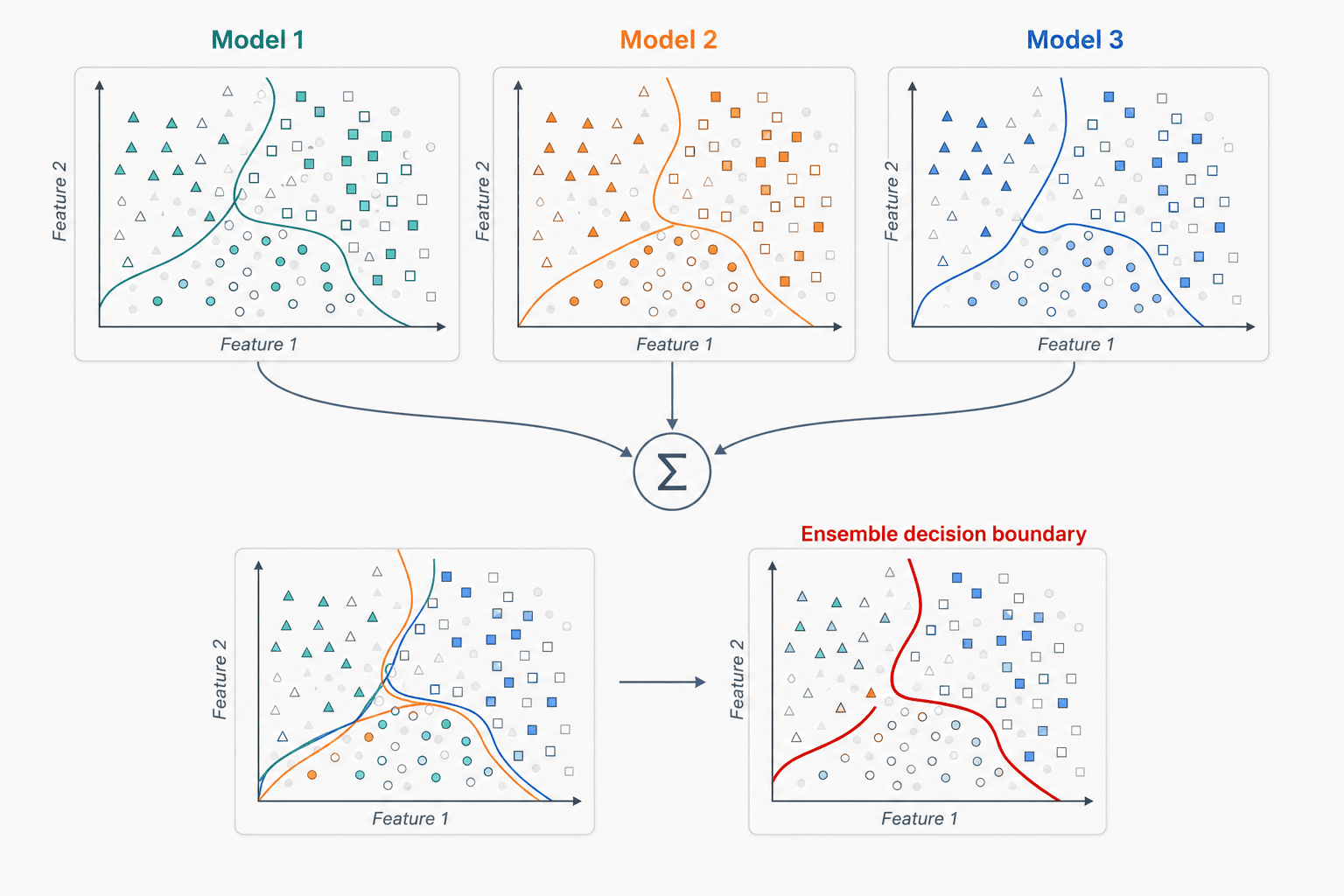
The idea of the ensemble decision boundary: imagine three different models trained on the same data. Each model is wrong in a different way (different overfit, different blind spots). If you average their predictions, the random errors tend to cancel out and the real signal reinforces.
💡 Concept of Ensemble Decision Boundary: instead of creating a single model, create several models that focus on different aspects of the data. By averaging everything together, you expect the combined result to capture all the aspects no single model could.
That's exactly the principle that powers Random Forests (Part 8): hundreds of decision trees, each trained on a different slice, averaged together.
💡 If you only remember one thing from this section: LEARN MANY MODELS, NOT JUST ONE. Combining diverse models almost always beats picking a single winner.
Types of ML learning systems
A useful taxonomy before we close. ML systems get sorted along three axes:
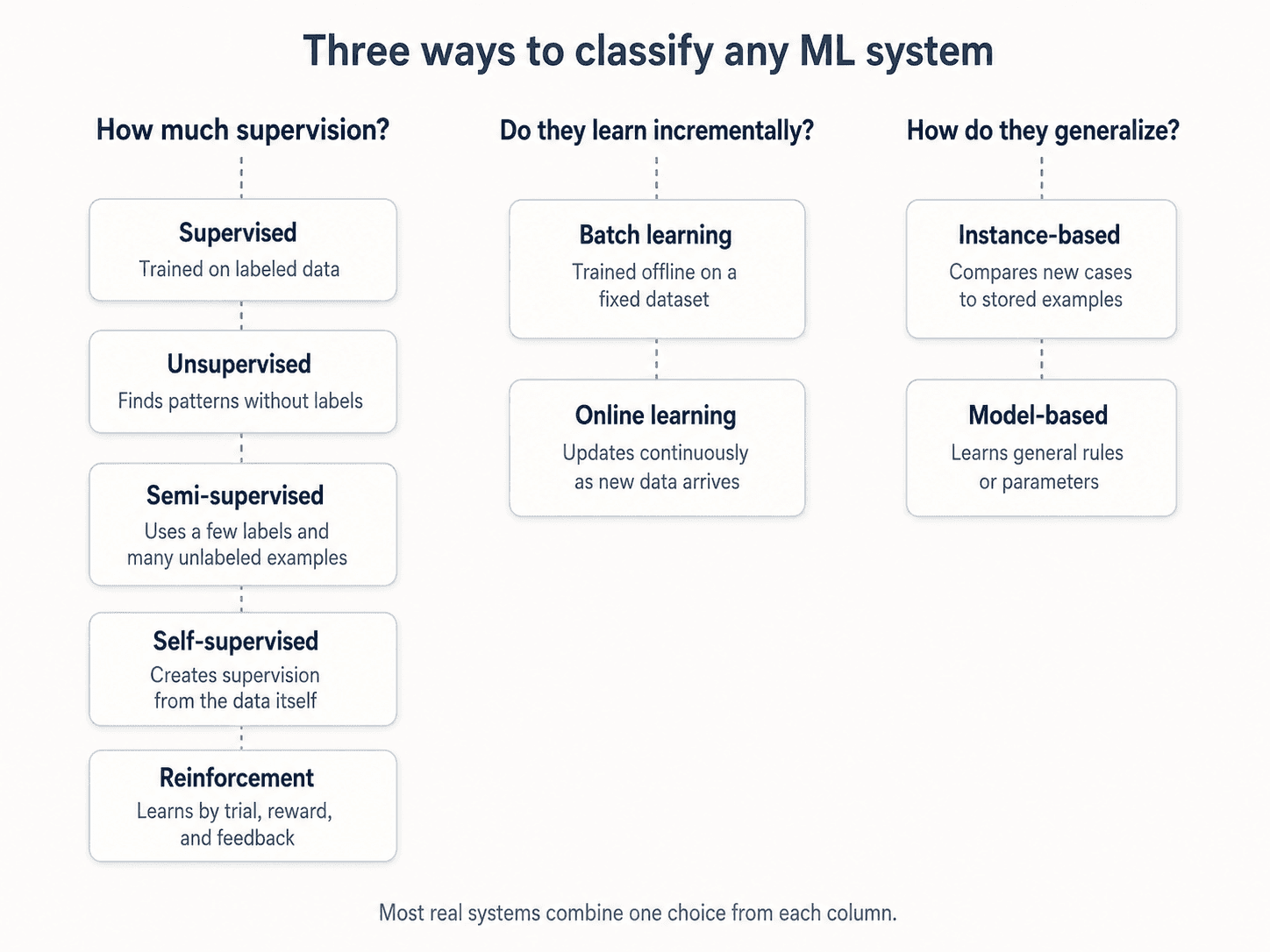
How much supervision do they get?
- Supervised — labelled examples. You know the answer for the training data; the algorithm learns to predict it. Classification, regression. The bulk of what we'll cover.
- Unsupervised — no labels. The algorithm finds structure on its own. Clustering, dimensionality reduction (PCA — Part 10).
- Semi-supervised — a small amount of labelled data and a lot of unlabelled data. Mostly useful when labelling is expensive (medical images, for example).
- Reinforcement learning — the algorithm interacts with an environment, gets rewards or punishments, and learns a policy. AlphaGo, robotics, recommendation systems. A whole different framework — covered separately in the Reinforcement Learning posts.
Do they learn incrementally?
- Batch learning — train once on the whole dataset, deploy. To incorporate new data, retrain from scratch. Most ML in practice is batch.
- Online learning — train continuously as new data arrives. Useful for systems that need to adapt fast (recommendation systems, fraud detection).
How do they generalize?
- Instance-based — store the training data and compare new examples to it. KNN (Part 12) is the canonical example.
- Model-based — fit a model with parameters; throw away the training data after fitting. Linear regression, neural nets, almost everything else.
Main challenges of machine learning
Most of the practical failure modes in ML fall into a checklist of six. We've touched on most of them — here's the full picture in one place.
1. Insufficient quantity of data
Even simple algorithms work given enough data — but you need enough. With too little data, no amount of tuning saves you.
2. Non-representative training data
If the training set looks different from the data the model will see in production, all bets are off. The model learns patterns that don't match the real cases — especially for the corners of your data (very poor or very rich, very young or very old, etc.).
Two failure modes worth distinguishing:
- Sampling noise — small samples are non-representative by chance. The model will swing with whichever random slice you happen to grab.
- Sampling bias — even large datasets can be non-representative if the collection method itself is flawed. The bigger you make a biased sample, the more confidently wrong your model gets.
The fix in both cases: make sure your training set is representative of the cases you want to generalise to.
3. Poor-quality data
If training data is full of errors, outliers, and noise (e.g., from poor-quality measurements), patterns become harder to detect and the model is less likely to perform well. The GIGO principle, applied to individual data points rather than the dataset shape.
4. Irrelevant features
The curse of dimensionality strikes again — too many wrong features hurt more than they help. The fix is feature engineering, which has three concrete steps:
- Feature selection — keep only the variables connected to the target; drop the rest.
- Feature extraction — combine or transform existing features into more informative ones (PCA, embeddings).
- Creating new features — engineer signals from raw data that the model can use directly.
5. Overfitting the training data
The model performs well on training data but fails to generalise to new cases. Happens when the model is too complex relative to the amount and noisiness of the training data.
Three fixes:
- Simplify the model — select one with fewer features, reduce the number of attributes in training data, or constrain the model.
- Gather more training data — more examples make it harder for the model to memorise noise.
- Reduce noise in the training data — fix data errors and remove outliers.
Constraining a model to make it simpler — and so reduce the risk of overfitting — is called regularisation. The amount of regularisation to apply is controlled by a hyperparameter: a parameter of the learning algorithm itself (not of the model), set before training and held constant during training.
6. Underfitting the training data
The opposite of overfitting: the model is too simple to capture the underlying structure of the data.
Three fixes:
- Select a more powerful model — more parameters, more capacity.
- Feed it better features — engineer signals the simpler model can use.
- Reduce the constraints on the model — e.g., lower the regularisation hyperparameter.
How do you know which problem you have?
Once you train your model, the only way to know how well it'll generalise is to test it on new cases. Split your data into a training set and a test set. The error rate on the test set is the generalisation error (or out-of-sample error) — it tells you how the model will behave on instances it has never seen before.
- Low training error + high generalisation error → you're overfitting.
- High training error + high generalisation error → you're underfitting.
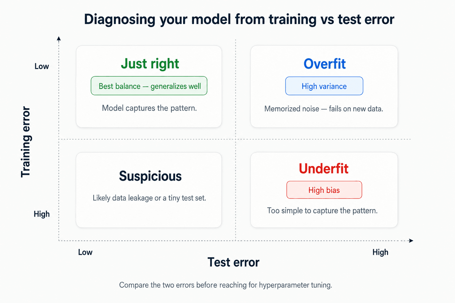
We'll go much deeper on each of these throughout the series — see Part 8 — Main Challenges in Machine Learning for the full treatment. But this six-item checklist (plus the train/test diagnostic) catches most ML projects going off the rails before they do.
Hyperparameter tuning and model selection
When you're hesitating between two models, the standard move is to train both and compare how they generalise on the test set. Simple enough. But there's a trap.
Imagine your linear model generalises better than the alternative, but you want to apply regularisation to fight overfitting. How do you choose the value of the regularisation hyperparameter?
A naive approach: train 100 models with 100 different hyperparameter values, pick the one with the lowest generalisation error on the test set (say, 5%). Ship to production — and it produces a 15% error in the wild. What happened?
You measured generalisation error on the test set many times during tuning. Each measurement nudged your choice of hyperparameter toward what fits the test set well. After 100 iterations, you've effectively overfit to the test set. The model is unlikely to generalise to truly new data — your "5% error" was an estimate from the same data you tuned on.
Hold-out validation
The fix is to hold out a slice of the training set as the validation set — and use that to compare candidate models. The test set stays untouched until the very end, used once for the final performance number.
- Training set → train model parameters.
- Validation set → decide which model and which hyperparameters.
- Test set → one final, honest measurement. No going back.
Cross-validation
If you don't have enough data for a stable validation set, cross-validation is the workaround. Instead of one validation set, use many small ones: train on most of the data, evaluate on a small held-out fold, rotate. Average the scores across folds — you get a much more accurate measure of model performance from the same dataset.
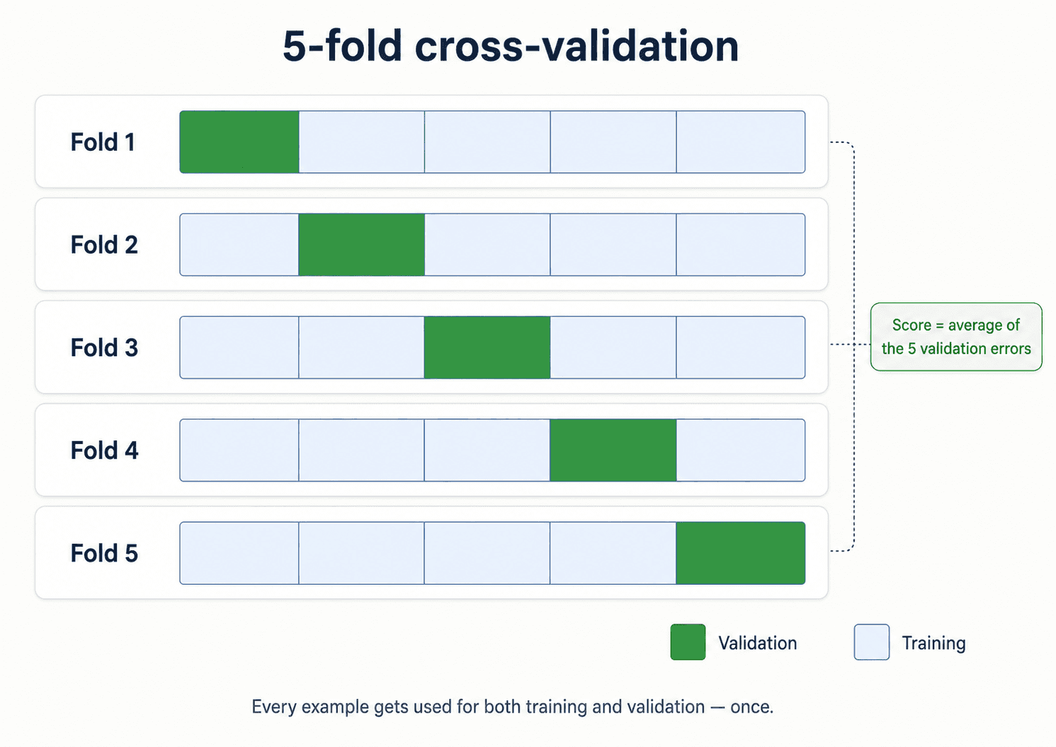
We sketched the intuition earlier in this post, and Part 5 — Cross-Validation & Probability Models is dedicated to it. The full hyperparameter-tuning playbook lives in Part 10 — Model Selection & Hyperparameter Tuning.
💡 Going deeper. Two practical-stack topics live in their own posts so this overview can stay focused:
- How do you evaluate a classifier? Accuracy, precision, recall, F1, and when to use each → Part 4 — Classification Metrics.
- What does the whole pipeline look like in code? Data acquisition → cleaning → split → train → evaluate → deploy, using the scikit-learn estimator pattern → Part 2 — Data Cleaning for the front of the pipeline, then Part 4 and Part 5 for evaluation.
The five things to remember
I'll close with the five take-homes from Session 1. If you forget everything else from this post, keep these:
- Be aware of overfitting. Your ML model should work well on new data, not just on the training set. That's the whole point.
- Feature engineer; mind the curse of dimensionality. More features isn't more information; sometimes it's strictly worse. Spend more time on which features go in, not on tuning the model.
- More features isn't always good, but more good data almost always is. Just remember the GIGO asterisk — more bad data is worse, not better.
- Combine data with expertise. A domain expert spending 30 minutes with you will produce features you wouldn't invent in a week.
- Ensemble many models. Different models make different mistakes. Averaging them cancels the random errors and keeps the real signal.
That's Session 1. The remaining 11 posts each pick one piece of this picture and go deep on it.
Next up — Part 2: Before You Model, Clean. Before You Clean, Understand.