
Table of Contents
Last update: August 2026. All opinions are my own.
Web Development · Post 1/15
Open DevTools on any website, hover over a paragraph, and look at what CSS shows you: a stack of coloured rectangles nested inside each other. That's not a debugging visual. That's actually what the browser is thinking.
The four rings
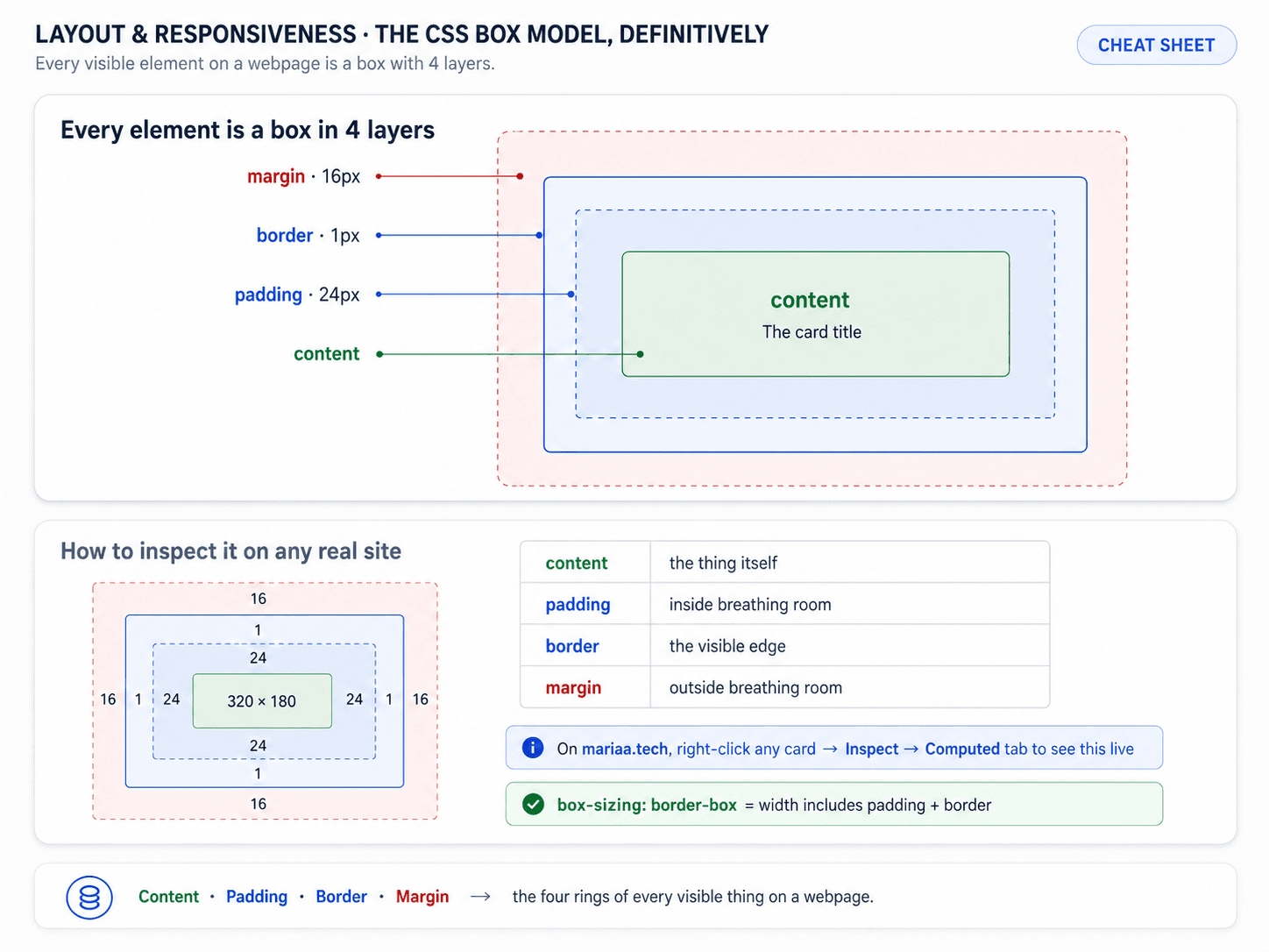
Every single element — a heading, a button, an image, a div — is a box made of four rings. From the inside out:

- Content — the text or image itself.
- Padding — space inside the border, pushing the content away from the edge.
- Border — the visible line (or invisible, if 0).
- Margin — space outside the border, pushing other elements away.
Padding is inside the box, margin is outside the box. That's the one distinction people forget the most, and it's the one that explains 80% of "why is there a gap I didn't ask for" moments.
The same idea, drawn as an actual sheet of paper so you can see where each layer lives:

The gotcha: what does width: 300px actually measure?
By default, width measures the content only. So if you write:
.card {
  width: 300px;
  padding: 20px;
  border: 2px solid black;
}
The card is not 300px wide on screen. It's 300 + 20 + 20 + 2 + 2 = 344px. Every browser has done this since 1996 and every new developer trips on it.
The fix is one line, and you'll see it in almost every modern CSS reset:
*, *::before, *::after {
  box-sizing: border-box;
}
With border-box, width: 300px means the whole visible box is 300px wide, and the content shrinks to fit. Padding and border eat into the width instead of stacking on top of it. That's what people actually mean when they set a width, so this is the default you want.
Margin collapse (the other classic)
Two vertical margins that meet don't add up — they collapse to the larger of the two. If a paragraph has margin-bottom: 20px and the next one has margin-top: 30px, the gap between them is 30px, not 50px.
This is deliberate, and once you know it, it stops being surprising. The horizontal version doesn't exist — side-by-side margins do add up.
The rest of CSS at a glance
The box model is one of about eight things you need to have in your head before CSS feels comfortable. Here's the cheat sheet of the whole basics layer — box model, selectors, units, colours, display, position — so you can see where the box model fits:


Why this is the foundation
Every layout system you'll meet next — Flexbox, Grid, positioning — is a system for arranging boxes. If the boxes themselves don't behave the way you expect, every layout you build on top will feel off by a few pixels.
Open DevTools right now, click any element, look at the box model panel on the right. That's the mental model. Everything else in CSS layout is: how do I put these boxes next to each other?
Next up — Post 2: Flexbox — 1D layouts.