
Table of Contents
Last update: August 2026. All opinions are my own.
Web Development · Post 4/15
The device your reader has is not the device you have. It might be a phone in the metro, a tablet on the sofa, or a 27" monitor at a desk. Responsive design is the discipline of making one HTML file look intentional on all of them.
Before anything else: the viewport meta tag
Without this line in your <head>, mobile browsers will pretend the screen is 980px wide and shrink your entire page to fit. You'll wonder why nothing you do matters.
<meta name="viewport" content="width=device-width, initial-scale=1" />Every modern framework adds this for you. If you're writing plain HTML, you have to remember. If you skip it, no amount of CSS will save you on mobile.
The four breakpoints that cover 95% of devices
You don't need eighteen media queries. You need four.

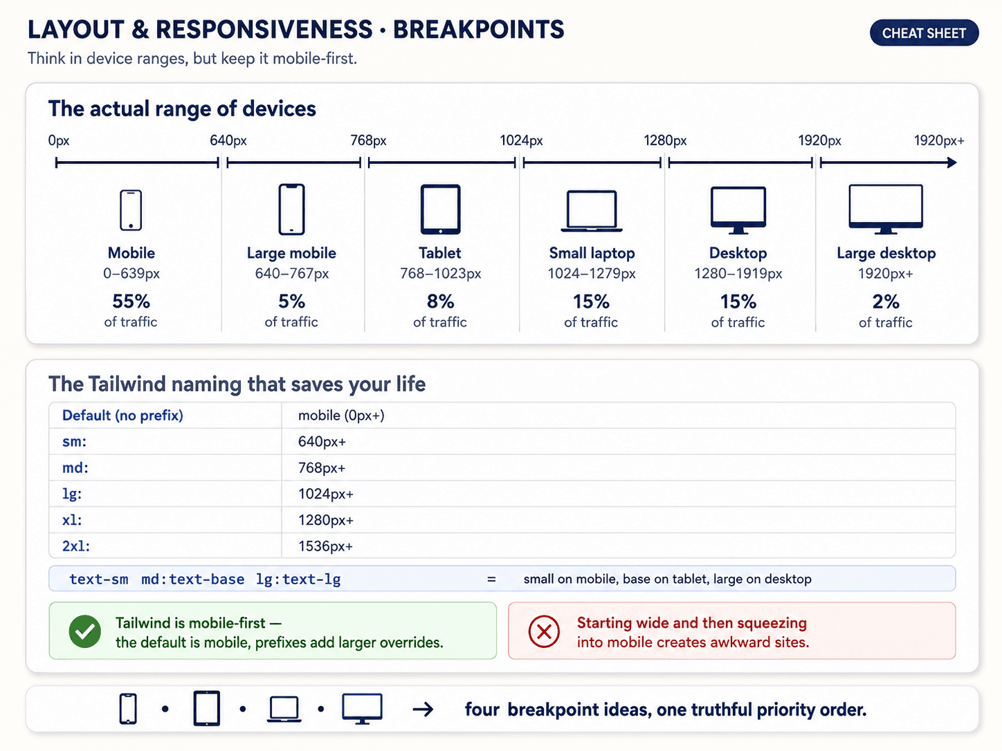
Same idea, drawn with the actual Tailwind prefixes and typical devices in each range:

- Mobile — up to ~640px. Phones in portrait.
- Tablet — ~640 to 1024px. Tablets, small laptops, phones in landscape.
- Laptop — ~1024 to 1280px. Most laptops, big tablets.
- Desktop — 1280px and up. Monitors.
Tailwind uses the prefixes sm:, md:, lg:, xl: for exactly these ranges. If you're not using Tailwind, plain CSS looks like this:
/* mobile styles here — no media query needed */

@media (min-width: 640px)  { /* tablet+  (sm) */ }
@media (min-width: 1024px) { /* laptop+  (lg) */ }
@media (min-width: 1280px) { /* desktop+ (xl) */ }
Notice all of them use min-width. That's mobile-first — and that's the next thing.
Mobile-first vs desktop-first (and why mobile-first wins)
Two ways to think about responsive:
- Desktop-first: write CSS for the big screen, then use
max-widthmedia queries to remove things as the screen shrinks. - Mobile-first: write CSS for the small screen, then use
min-widthmedia queries to add things as the screen grows.


Mobile-first wins for one reason: the mobile version is the hardest. You have the least space, the fewest columns, the fewest CSS features you can afford. If you start there, everything you add afterwards is a bonus — an extra column, a wider sidebar, more type. If you start desktop-first, every media query is an act of taking things away, which is much harder to keep consistent as the site grows.
There's also a performance argument: mobile devices only load the CSS they need, not the full desktop CSS plus overrides. But the real reason is the design discipline.
What actually changes between screen sizes
Responsive isn't really about pixel widths — it's about a small vocabulary of transformations that repeat on every site.


Four patterns cover most sites:
- Nav bar → hamburger menu. Horizontal links collapse into a menu icon. This is almost universal below ~768px.
- Multi-column grid → single column. A 3-column card grid becomes 2, then 1.
auto-fit + minmaxfrom Post 3 handles this for free. - Side-by-side → stacked. Sidebar + content becomes content + sidebar-below. This is a
flex-direction: columntoggle at the tablet breakpoint. - Data table → cards. Wide tables can't shrink gracefully. Below tablet width, each row becomes its own card. This one has no automatic solution — you rewrite the markup.
If you can implement those four transformations, you can make almost any site responsive.
The full responsive toolkit
Breakpoints, media queries, viewport units, container queries, clamp — all in one reference:


The one non-CSS thing you can't skip: touch targets
Buttons and links need to be at least 44×44 pixels on touch devices (Apple's Human Interface Guidelines). Google says 48×48. Smaller than that and thumbs miss. This isn't a media query — it's a minimum size you enforce on every interactive element from the start.
Next up — Post 5: Modern responsive — container queries and clamp().