
Table of Contents
Last update: August 2026. All opinions are my own.
Web Development · Post 8/15
If your headings are 32px, 20px, 19px, 17px, and 14px — pulled from wherever they felt right at the time — the page will feel wrong and you won't be able to say why. There are too many sizes and none of them relate to each other. The fix is a scale.
What a type scale is
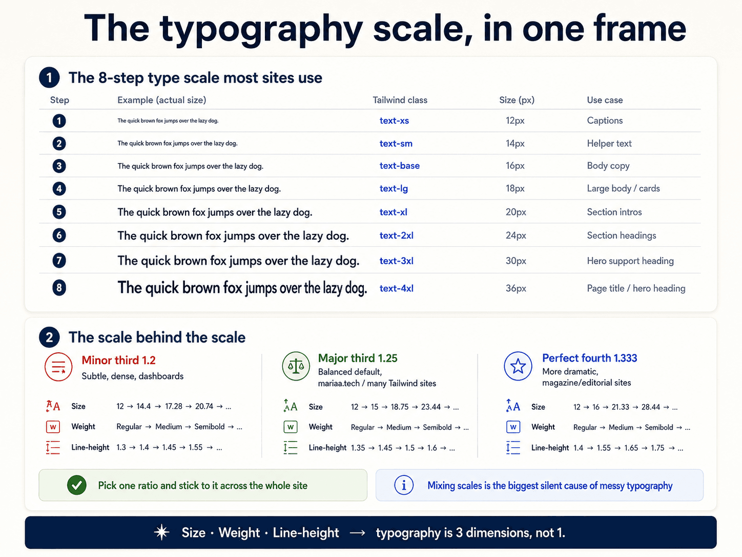
A type scale is a set of font sizes generated from a single base (usually 16px, the body copy size) and a ratio. Multiply by the ratio to go up, divide to go down.


The common ratios:
- 1.125 — Major Second. Very tight. Good for dense UIs (dashboards, admin panels).
- 1.200 — Minor Third. The Tailwind default. Great for content sites.
- 1.250 — Major Third. A bit more dramatic. Good for marketing pages.
- 1.333 — Perfect Fourth. Punchy. Good for editorial layouts.
- 1.618 — Golden ratio. Very dramatic. Only for hero-heavy pages.
Pick one. Store the results as tokens (--text-sm, --text-base, --text-lg, --text-xl, ...). Every heading and paragraph in the entire site uses one of those.
Why "just pick sizes that look good" fails
Because you'll pick 8 sizes when you needed 5, and they won't relate. The scale gives you constraints — you can't pick a 19px because it's not on the scale. That constraint is the whole point.
One font family (or two)
Almost every good-looking site uses one sans-serif family for everything. If you use two, it's usually a serif or display font for headings paired with a sans for body:
:root {
  --font-heading: "Cormorant Garamond", serif;
  --font-body: "Inter", system-ui, sans-serif;
}
That's it. A third font almost always makes the page feel unfocused. If you're on the fence, stick with one — you can always add a second later.
The line-height rule that quietly matters
- Body text (14–18px): line-height ~1.5–1.6.
- Headings (24px+): line-height ~1.2.
- Display text (48px+): line-height ~1.0–1.1.
Bigger text needs less leading in proportion to its size. If your h1 has the same line-height ratio as your paragraphs, it'll feel too airy. If your paragraphs have the same line-height ratio as your h1s, they'll feel cramped.
Typography as communication
Typography isn't decoration — it's the loudest thing on the page after colour. Weight, size, and hierarchy signal what matters before the reader has parsed a single word:

Typography IS visual hierarchy
Type scale is the mechanism. What it creates is visual hierarchy — a map of what to read first, second, and third. When your h1 is 3× the size of body copy, users know where to start. When every heading is nearly the same size, they don't.


Hierarchy isn't only typographic — colour (Post 7), spacing (Post 9), and elevation (Post 10) all contribute. But typography is the most direct lever. Get the type scale right and half of your hierarchy problems solve themselves.
The whole reference in one image
