
Table of Contents
Last update: August 2026. All opinions are my own.
Web Development · Post 9/15
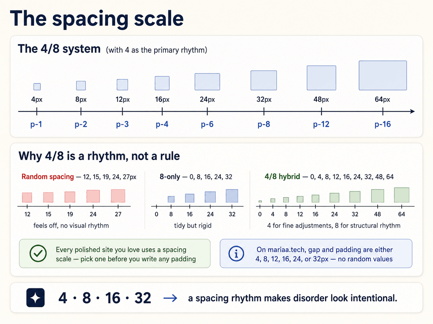
If your padding values are 12px, 16px, 20px, 24px, 27px, 32px, 45px — pulled from wherever — the site will feel visually noisy and you won't know why. Same problem as typography (Post 8), same fix: a scale.
The 4/8px grid
Almost every good design system uses a spacing scale in multiples of 4 or 8 pixels:
:root {
  --space-1: 0.25rem;  /* 4px  */
  --space-2: 0.5rem;   /* 8px  */
  --space-3: 0.75rem;  /* 12px */
  --space-4: 1rem;     /* 16px */
  --space-6: 1.5rem;   /* 24px */
  --space-8: 2rem;     /* 32px */
  --space-12: 3rem;    /* 48px */
  --space-16: 4rem;    /* 64px */
}
Padding, margin, gap — all of these pull from that scale. padding: 15px doesn't exist. You get 12px or 16px.


The constraint is what makes it work. Two elements that both use --space-4 will feel related. Two elements that use 15px and 17px will feel almost related, which is worse than clearly related or clearly separate.
Proximity: the actual design principle
Related things should be closer together than unrelated things. That's it. That's the whole rule.


The classic mistake is spacing everything equally. A form where the label, the input, the helper text, and the next field are all 16px apart reads as one blob. The reader can't see which label belongs to which input.
The fix:
- Label → input: 4px (very close, they're a unit).
- Helper text → input: 4px (also a unit).
- One field group → next field group: 24px (clearly separate).
Same three elements, but the spacing now teaches the reader what belongs together.
Vertical rhythm
The line-heights from Post 8 also come from your spacing scale. If body text has line-height: 1.5 and font size 16px, that's 24px per line — which happens to be --space-6. When paragraphs, headings, and the space between them all land on the same underlying grid, the whole page feels calm even if no one can articulate why.
Alignment: the invisible grid
Every element on a page should align to something — the edge of a container, a shared vertical line, the top of a neighbour. When things don't align, the eye reads chaos even if it can't say why. When they do align (even loosely), the eye reads order.


The spacing scale enforces this for free. If every card has the same padding, every icon the same margin, every button the same height — they all line up automatically. Alignment is what a scale creates, not something you tune per component.
When to break the scale
Almost never. But the exceptions:
- 1px — hairline borders. Not on the scale but universal.
- Optical adjustments — 2px or 3px to visually centre something the scale can't. Rare.
If you find yourself breaking the scale a lot, the scale is wrong — not the situation. Add a value to the scale rather than making a one-off decision.
Next up — Post 10: Shadow hierarchy.