
Table of Contents
Last update: August 2026. All opinions are my own.
Web Development · Post 7/15
The mistake that makes UIs look amateur is not that the colours are ugly — it's that there are too many of them, and none of them have a job. Fix the job assignments and the same three colours suddenly look intentional.
The three groups
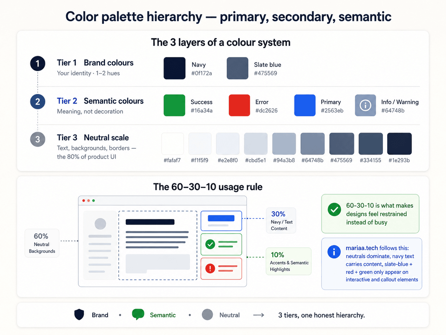
Every professional interface, once you strip it back, has three colour roles:


- Neutrals (60%) — the greys, whites, and off-blacks that make up backgrounds, borders, body text, and cards. Structure.
- Brand accent (30%) — one colour, used for buttons, links, active states, and anywhere the user should click. This is the "where do I go next" colour.
- Semantic colours (10%) — red for danger, green for success, amber for warning, blue for info. These only appear when the app is saying something to the user.
The 60/30/10 ratio is a rough guide, not a law. The real point is that each group has a purpose, and you don't mix jobs.
Neutrals aren't grey — they're a scale
Neutrals feel invisible when you get them right, and look like mud when you don't. The trick is to use a full 11-step scale, not "grey" as one colour:
--neutral-50:  #f8fafc;  /* almost white  — page backgrounds */
--neutral-100: #f1f5f9;  /* subtle bg     — hover states, alt rows */
--neutral-200: #e2e8f0;  /* borders       — dividers, card outlines */
--neutral-400: #94a3b8;  /* muted text    — captions, timestamps */
--neutral-600: #475569;  /* body text     — main paragraphs */
--neutral-900: #0f172a;  /* headings      — max contrast */
Tailwind's slate scale is a good default if you don't want to pick your own. So is neutral, stone, or zinc. Pick one. Don't mix them.
Colour communicates meaning — use it consistently


One accent — really, just one
A common mistake: "our brand has blue and purple and teal." Pick one for the accent role. The others become secondary tokens for specific components (a chart palette, a category tag) — never for CTAs.
The reason is simple: if every button on the page is a different colour, the user has no idea which is the primary action. One accent gives you a hierarchy for free — the primary button uses the accent, the secondary uses a neutral outline, the tertiary uses just text.
Semantic colours have fixed meaning
- Red — destructive, error, danger. Only.
- Green — success, confirmed, positive.
- Amber / yellow — warning, needs attention (but not broken).
- Blue — informational, neutral news (usually distinct from brand blue).
Don't use red for "add to cart" because you like red. Users have decades of training that red means stop. Fighting that costs you conversions.
Contrast is a design principle, not just a rule
Long before WCAG, designers were using contrast to control what the eye lands on first. High contrast between an element and its surroundings makes it the thing you notice. Low contrast between elements makes them feel secondary. If everything on the page has the same contrast, nothing stands out — and the reader has no idea what matters.


Use this on purpose: primary buttons get the highest contrast on the page. Body text gets high contrast against the background. Meta info (dates, byline, tags) gets lower contrast — because it should be readable but not compete with the content.
Contrast: the one accessibility rule you can't opt out of
Body text needs a contrast ratio of at least 4.5:1 against its background. Large text (18px+, or 14px bold+) needs 3:1. This isn't design opinion — it's WCAG, and it's what stops the "designed on a Retina display, unreadable on a real laptop" problem.
Use any contrast checker (Chrome DevTools has one built-in) to verify your neutrals against your backgrounds. If your body text is --neutral-500 on --neutral-50, you're probably below the line.
Next up — Post 8: Type scale.