
Table of Contents
- 1. The four essentials
- 2. Semantic HTML — use the right element for the job
- 3. Keyboard operability — everything works without a mouse
- 4. Contrast — text is readable
- 5. Text alternatives — non-text content has text equivalents
- 6. Simplicity is accessibility
- 7. What "90% is done" doesn't cover
- 8. Where this series ends
Last update: August 2026. All opinions are my own.
Web Development · Post 15/15
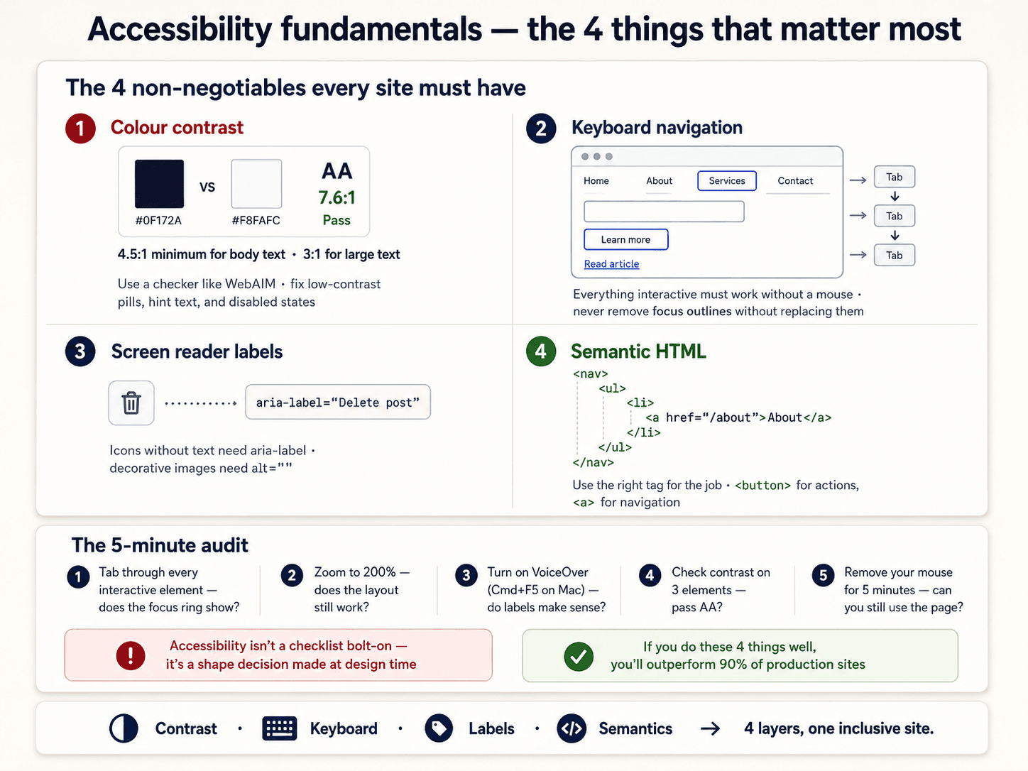
Accessibility (often written a11y — 11 letters between "a" and "y") is the practice of making sure everyone can use your site — people using screen readers, keyboard-only users, colour-blind users, users on old browsers, users on bad connections. It's not a legal compliance box, it's the discipline that makes the interface work under conditions you didn't design for.
The good news: 90% of it is four habits that don't cost you anything if you build them in from the start.
The four essentials


1. Semantic HTML — use the right element for the job
If it's a button, use <button>. If it's a link, use <a>. If it's a heading, use <h1>–<h6> in order. If it's a list, use <ul> or <ol>.
<!-- ❌ Wrong -->
<div onclick="submit()" class="button">Save</div>

<!-- ✅ Right -->
<button type="submit">Save</button>
The <div> version:
- Doesn't respond to Enter or Space keys.
- Isn't announced as a button by screen readers.
- Doesn't get keyboard focus by default.
The <button> version does all of those for free. You didn't have to think about it because the browser does the work — if you used the right tag.
Rule: never build an interactive element from a <div> when there's a native HTML element for it. Almost every accessibility bug comes from doing this.
2. Keyboard operability — everything works without a mouse
Every interactive thing must be reachable and operable with the keyboard:
- Tab moves forward through interactive elements.
- Shift + Tab moves backward.
- Enter activates links and buttons.
- Space activates buttons and checkboxes.
- Arrow keys navigate inside menus, tabs, and lists.
If you can't do the task with only a keyboard, keyboard-only users can't do it either. This is the accessibility test that catches the most bugs, and it costs nothing to run — you're already at the keyboard.
Related: focus management (Post 14). When a modal opens, focus should move into it. When it closes, focus should move back to the button that opened it.
3. Contrast — text is readable
WCAG (the web accessibility standard) says:
- Body text: contrast ratio of at least 4.5:1 against background.
- Large text (18px+, or 14px bold+): at least 3:1.
- Non-text elements (icons, borders on inputs): at least 3:1.
Use a contrast checker. Chrome DevTools has one built in (right-click any text → Inspect → click the colour swatch → contrast ratio shows up). Don't guess. Retina displays and calibrated screens hide contrast problems that show up on real laptops.
4. Text alternatives — non-text content has text equivalents
- Images:
altattribute. Descriptive, not "image1.png." Emptyalt=""for decorative images (so screen readers skip them). - Icons in buttons:
aria-labelon the button. - Videos: captions.
- Audio: transcripts.
<!-- Decorative image -->
<img src="ornament.svg" alt="" />

<!-- Content image -->
<img src="chart.png" alt="Bar chart showing 40% growth in Q3" />

<!-- Icon button -->
<button aria-label="Close dialog">
  <svg><!-- X icon --></svg>
</button>
Simplicity is accessibility
A page that does one thing well is accessible by default. A page that does twelve things at once is hard for everyone — but especially hard for anyone who can't see the whole picture at a glance, or who needs extra time to parse it.


The accessible move is usually the simpler move. Fewer choices. Bigger targets. More whitespace. Clearer labels. This isn't a compromise — it's what makes the interface better for people who don't have accessibility needs too.
What "90% is done" doesn't cover
The last 10% is the specialised stuff:
- ARIA — custom widgets that HTML doesn't provide (tab panels, tree views, complex menus). Every ARIA rule is a fallback for when you had to build something HTML doesn't have — always try HTML first.
- Screen reader testing — actually running VoiceOver (Mac) or NVDA (Windows) on your site. Reveals bugs you can't see.
- Animation preferences — respect
prefers-reduced-motion(Post 14). - Focus management in dynamic UIs — modals, toasts, live regions.
But do those four essentials first. They're the foundation, and no amount of ARIA will fix a page built on divs and empty alts.
Where this series ends
You've now got the fifteen-post floor for web interfaces:
- 1–5 — the layout foundations (box model, Flexbox, Grid, responsive).
- 6–10 — the design system layer (tokens, colour, type, spacing, shadows).
- 11–14 — the component patterns (buttons, forms, cards, states).
- 15 — the accessibility that ties it all together.
There's more to learn — animation, motion design, framework-specific patterns, performance, testing. But everything above is the shared vocabulary. Every React component you'll ever write, every design system you'll ever use, every framework you pick — they all sit on top of these 15 posts.
Build something. That's the only way any of this sticks.
All 15 parts — Layout foundations: 1 · 2 · 3 · 4 · 5 · Design system: 6 · 7 · 8 · 9 · 10 · Components: 11 · 12 · 13 · 14 · Post 15 (you are here).