
Table of Contents
Last update: August 2026. All opinions are my own.
Web Development · Post 10/15
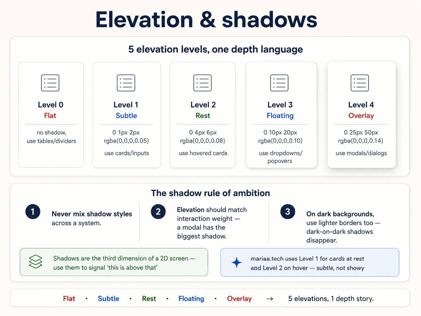
Shadows do one job in interface design: they tell the reader how far something is floating above the page. A tiny shadow means "slightly lifted" (a card). A big soft shadow means "modal, above everything else." A dropdown lives somewhere in between.
Get this wrong and everything looks like it's on the same plane. Get it right and the reader knows what's clickable, what's floating, what's fixed — without you having to say it.
The elevation scale
Six values is plenty. Most systems use five:
:root {
  --shadow-xs:  0 1px 2px  rgba(0,0,0,0.05);
  --shadow-sm:  0 1px 3px  rgba(0,0,0,0.08),  0 1px 2px rgba(0,0,0,0.04);
  --shadow-md:  0 4px 6px  rgba(0,0,0,0.08),  0 2px 4px rgba(0,0,0,0.04);
  --shadow-lg:  0 10px 15px rgba(0,0,0,0.08), 0 4px 6px rgba(0,0,0,0.04);
  --shadow-xl:  0 20px 25px rgba(0,0,0,0.10), 0 8px 10px rgba(0,0,0,0.04);
  --shadow-2xl: 0 25px 50px rgba(0,0,0,0.15);
}

The mapping to real components
--shadow-xs— inputs, small borders. Basically "this thing has an edge."--shadow-sm— resting cards, low-emphasis panels.--shadow-md— cards on hover, tooltips, small popovers.--shadow-lg— dropdowns, menus, floating action buttons.--shadow-xl— dialogs, popovers with more content.--shadow-2xl— full-screen modals, sheets.
Every component in the system uses one of these. No custom box-shadow: 3px 4px 8px purple inline. If it's not on the scale, you're breaking the elevation language.
Two-layer shadows look better than one
Notice how most values above have two shadows stacked (one tight, one soft). That's what gives you a shadow that feels like a real object under a real light — a hard-ish contact shadow near the object and a soft ambient glow further out. One-layer shadows always look a bit fake.
Dark mode shadows
Shadows work by darkening pixels behind the object. In dark mode, there are no lighter pixels to darken — so black shadows disappear. Two fixes:
- Use a border instead —
border: 1px solid rgba(255,255,255,0.08)gives you a hint of edge that reads as elevation. - Use black shadows with higher opacity —
rgba(0,0,0,0.5)instead of0.08. Works but can look muddy.
Most modern systems use both. Border for the outline, shadow for the drop.
When to skip shadows entirely
Flat design (no shadows anywhere) is a real style, and it works if:
- Your background separation comes from colour (cards are
#0f172a, page is#020617). - Your hierarchy comes from borders (
border: 1px solid --neutral-200). - Your interaction feedback comes from motion or colour changes on hover.
You don't need shadows to have depth. But if you do use them, keep them consistent — mixing shadowed and flat components in the same view looks accidental, not intentional.
Next up — Post 11: Buttons.