
Table of Contents
Last update: August 2026. All opinions are my own.
Web Development · Post 11/15
Every button in your app is a combination of a variant (how important is this action?) and a state (what's happening right now?). If you can draw the 3×5 grid, you've designed the whole button system.
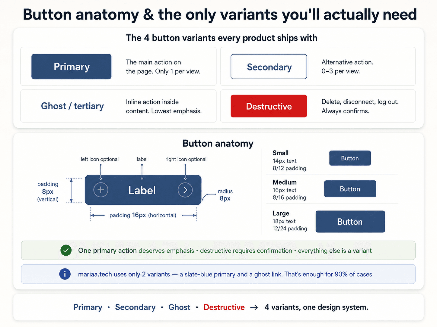
The three variants — and only three


- Primary — solid accent colour. The one action on the page you want the user to take. There should be one primary button per view.
- Secondary — outlined or ghost. Actions that are important but not the action. Cancel, back, secondary CTAs.
- Tertiary — text-only, no border. Low-emphasis actions. "Learn more," "Skip for now."
That's it. If you find yourself designing a fourth variant, you're probably solving the wrong problem.
The five states — and why they all matter
Every interactive element goes through five states. If your button doesn't visually distinguish all five, users don't know if the click registered.
- Default — resting state.
- Hover — mouse is over it (desktop only, but design for it anyway).
- Focus — keyboard has selected it. This is the accessibility one people skip and shouldn't.
- Active — being pressed right now (mouse down, key down).
- Disabled — can't be clicked. Lower contrast, cursor:
not-allowed.
For a primary button, that's usually:
.button-primary {
  background: var(--color-primary);         /* default */
}
.button-primary:hover {
  background: var(--color-primary-hover);   /* slightly darker */
}
.button-primary:focus-visible {
  outline: 2px solid var(--color-focus);    /* keyboard focus ring */
  outline-offset: 2px;
}
.button-primary:active {
  background: var(--color-primary-active);  /* darker still */
  transform: translateY(1px);               /* optional press-down */
}
.button-primary:disabled {
  background: var(--color-neutral-300);
  color: var(--color-neutral-500);
  cursor: not-allowed;
}
Notice :focus-visible (not just :focus) — this shows the ring for keyboard users but hides it for mouse clicks. It's the modern way.
The vocabulary lives here
Buttons are one part of a bigger vocabulary — inputs, links, chips, toggles all share the variant + state pattern. Once you build one, you've built the mental model for all the others:

Size scale
Same principle as everything else — pick a small scale, stick to it. Three sizes is enough for most apps:
sm— 32px tall, 12px horizontal padding. Toolbars, table row actions.md— 40px tall, 16px horizontal padding. The default. Almost everything.lg— 48px tall, 20px horizontal padding. Marketing pages, empty-state CTAs.
Anything smaller than 32px hits the touch target minimum (Post 4). Don't make micro-buttons unless you're absolutely sure no thumb will ever touch them.
Icon buttons
An icon-only button (a trash icon, a search icon) needs:
- Minimum 44×44px hit area — even if the icon is 16×16, pad it out.
- An
aria-label— the icon isn't text, screen readers need a name for it. - A tooltip — for sighted users who don't know your icons yet.
Icons are ambiguous. The trash icon has meant "delete," "archive," and "move to a folder" on different apps. Assume the reader has to guess and give them a way to check.
Next up — Post 12: Forms — anatomy and states.