
Table of Contents
Last update: August 2026. All opinions are my own.
Web Development · Post 14/15
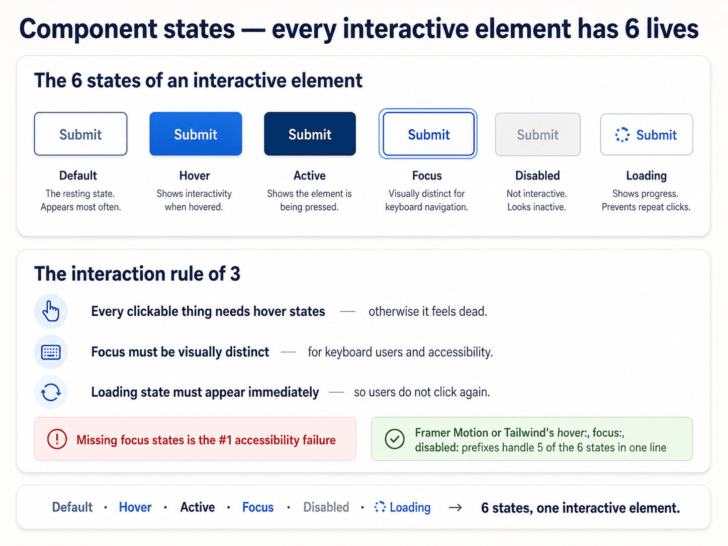
We already met the five states in the button post (Post 11). But they apply to every interactive element, not just buttons — and getting them consistent across the whole system is what makes a UI feel responsive to touch.
The five states, one more time


- Default — resting. Nothing is happening.
- Hover — mouse is over it. Desktop only, but design for it anyway (it also fires on tap-then-hold on mobile).
- Focus — keyboard has selected it. This is the one you'll forget — see next section.
- Active — being clicked/tapped/pressed right now. Fires for the split-second the input is engaged.
- Disabled — can't be interacted with. Lower contrast, no cursor pointer, no hover response.
Some components add:
- Loading — action in flight (spinner replaces label, everything else disabled).
- Success — action completed (green tick for 2 seconds, then reverts).
- Error — action failed (red border, error text below).
The focus state — the one that catches everyone
Keyboard users navigate with Tab. Screen reader users navigate with Tab. Someone with a broken trackpad navigates with Tab. If your focused element doesn't visually distinguish itself, they have no idea where they are on the page.
The default browser focus ring is ugly, and that's the reason so many designers hide it. Don't hide it — restyle it:
*:focus-visible {
  outline: 2px solid var(--color-focus);
  outline-offset: 2px;
  border-radius: var(--radius-sm);
}
Note :focus-visible, not :focus. The distinction:
:focusfires for all focus, including mouse clicks — which puts an ugly ring on a button you just clicked.:focus-visiblefires only when the browser detects keyboard navigation — the case where the ring is actually helpful.
Use :focus-visible everywhere. Almost no reason to use :focus alone.
How to test states without a mouse
Open your site. Press Tab. Keep pressing Tab. Watch where the focus goes and whether you can see it at every step.
If you tab through a form and lose track of where you are — the focus state is failing. If you tab into a modal but can't tab out of it — you have a focus trap (a bug). If a click activates a modal but the focus stays on the button behind it — you're missing focus management (also a bug).
You'll find at least three focus bugs on the first page you test. This is normal.
Transitions between states
The states should transition smoothly, not snap. A transition: all 150ms ease on your interactive elements makes them feel alive without being distracting:
.button {
  transition: background 150ms ease, transform 150ms ease, box-shadow 150ms ease;
}
150ms is the sweet spot for interaction feedback. Under 100ms feels instant (fine for tiny changes). Over 300ms starts to feel sluggish.
But — respect prefers-reduced-motion:
@media (prefers-reduced-motion: reduce) {
  * { transition: none !important; }
}
Some users get motion sick. Some just don't like animation. Give them a way out.
The disabled state — usually the wrong answer
The disabled state is often used to say "you can't do this yet, fill in the other fields first." It's a compromise: the button is technically there, but greyed out and non-clickable.
Better patterns:
- Show why it's disabled — tooltip on hover: "Fill in all required fields to submit."
- Let the user click anyway — show a validation error listing what's missing. This is more helpful than a dead button.
- Hide it entirely until it's usable — if the button doesn't apply yet, don't show it.
Disabled buttons are UI dark patterns waiting to happen. Use them sparingly, and always give a way to understand what would enable them.
Next up — Post 15: Accessibility fundamentals.