
Table of Contents
Last update: August 2026. All opinions are my own.
Web Development · Post 5/15
Everything in Post 4 is still true — but a couple of newer CSS features let you do a lot of it with less code and cleaner mental models. Both landed in every browser between 2023 and 2024, so they're safe to use without polyfills now.
Container queries — sizing based on the parent, not the viewport
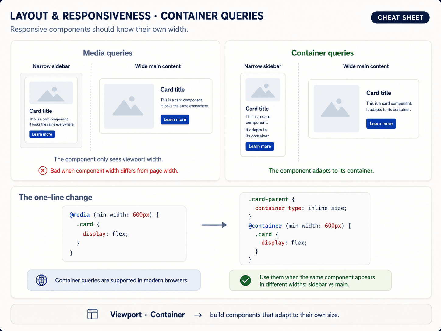
Media queries look at the viewport. That's the whole browser window. Which means the same card component behaves the same whether it lives in a sidebar (narrow), a modal (medium), or the full page (wide) — because none of those change the viewport size.
Container queries look at the parent element instead.


The syntax is two steps: declare an element as a container, then query it.
.card-container {
  container-type: inline-size;
}

@container (min-width: 400px) {
  .card {
    display: grid;
    grid-template-columns: 120px 1fr;
  }
}
Now .card reflows into an image-left layout whenever its container is at least 400px wide — regardless of what the viewport is doing. You drop the same card into a sidebar and it stays stacked; drop it into the main area and it goes side-by-side. Same component, different context, zero if-statements in your JavaScript.
The same component in three different containers, showing why this is different from media queries:

This is the fix for the oldest complaint about media queries: they force every component to know about the global page width.
clamp() — fluid typography in one line
The typical media-query approach to typography:
h1 { font-size: 1.5rem; }
@media (min-width: 640px)  { h1 { font-size: 2rem;   } }
@media (min-width: 1024px) { h1 { font-size: 2.5rem; } }
@media (min-width: 1280px) { h1 { font-size: 3rem;   } }
Four rules, three breakpoints, and it jumps in steps. clamp() replaces all of that with one line:
h1 { font-size: clamp(1.5rem, 4vw, 3rem); }

Three arguments, in this order:
- min — the smallest the value is allowed to be (
1.5rem). - preferred — the ideal value, usually written in
vwso it scales with the viewport (4vw). - max — the largest the value is allowed to be (
3rem).
The browser picks the preferred value, but never goes below min or above max. Between the breakpoints, the size grows smoothly with the window — no jumps.
Use it for the same things you used media queries for on typography: font-size, padding, gap, margin, border-radius. Any length can be fluid.
What still needs a media query
Some things haven't got a "modern" replacement. Reach for a media query when:
- The whole layout structure changes (e.g., sidebar hides on mobile, becomes a bottom sheet).
- You're toggling entire components on and off.
- You need to swap navigation patterns (horizontal to hamburger).
- You're targeting
prefers-color-scheme,prefers-reduced-motion, orprint.
The rule of thumb: media queries for structural breakpoints, container queries and clamp() for the sizing in between.
Where we're going next
That closes the layout & responsive foundations. The next 10 posts move from how to arrange things to how to design what's inside them — colours, typography, spacing, shadows, components. The design system layer that sits on top of everything you learned above.
Next up — Post 6: Design tokens — the single source of truth.