
Table of Contents
Last update: August 2026. All opinions are my own.
Web Development · Post 6/15
You've built a site. It uses blue. Now the founder decides the blue should be greener. If you grep for #2563eb and find 47 hardcoded copies scattered across 30 files, you're going to have a bad afternoon.
What a design token is
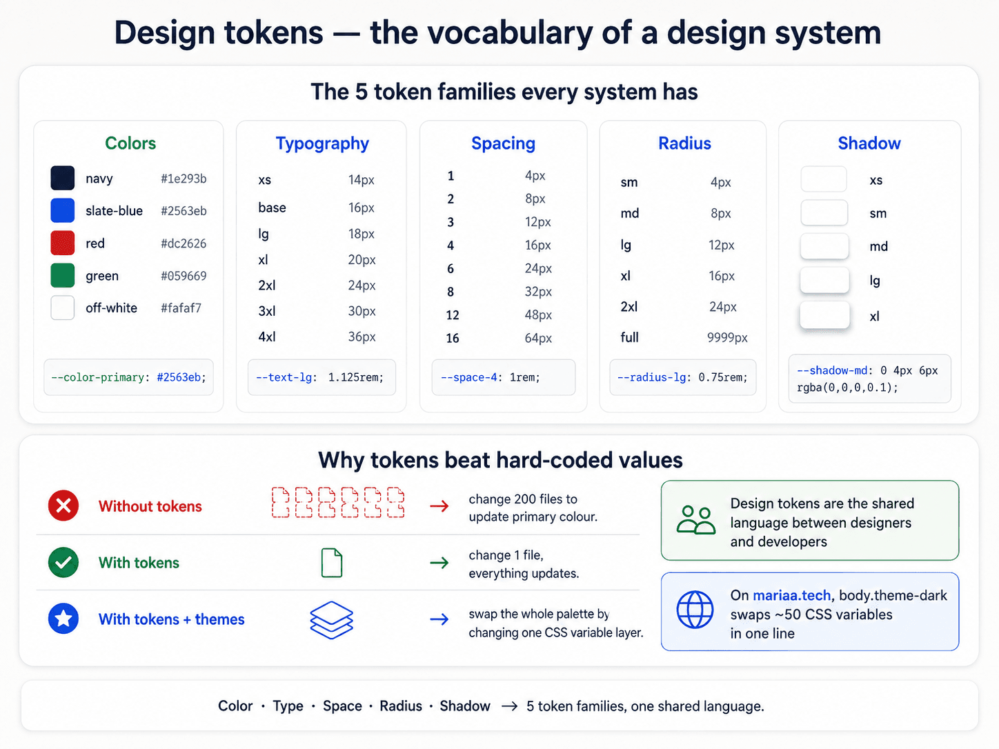
A design token is a named variable for a design decision. In CSS, they live inside :root and start with --:
:root {
  --color-primary: #2563eb;
  --color-text: #0f172a;
  --space-md: 1rem;
  --radius-md: 8px;
  --font-body: system-ui, sans-serif;
}
Then you reference them anywhere: background: var(--color-primary). Change the value once, the whole site updates.


The five families you'll always have
Every design system, no matter the size, has roughly the same categories:
- Colour — brand, text, backgrounds, borders, states (success, warning, danger).
- Typography — font families, sizes, weights, line heights.
- Spacing — the whitespace scale (Post 9).
- Radii — corner rounding (
--radius-sm,--radius-md,--radius-full). - Shadows — the elevation scale (Post 10).
Some systems add motion (durations, easing curves) and z-index layers. But those five are the core.

Semantic vs primitive tokens
Two layers of naming, and both matter:
Primitive tokens describe the value: --blue-500: #2563eb. These are your paint chips.
Semantic tokens describe the purpose: --color-primary: var(--blue-500). These are what your components reference.
Components should almost never touch primitives directly. They should always ask for --color-primary or --color-text-muted. Why? Because when you decide "primary is now green," you edit the semantic layer and every component follows. If components hardcode --blue-500, you're back to grep-and-replace hell.
Tokens + accessibility live together
The moment you have semantic tokens, you can enforce accessibility rules on the tokens themselves — every --color-text-primary must have ≥ 4.5:1 contrast against every --color-bg-* it might sit on. Check the pairs at the token layer, and every component that uses them is safe by default:

Repetition — the whole point
The reason design tokens work is a design principle much older than CSS: repetition builds patterns, and patterns build trust. If every card in the app has the same padding, radius, and shadow, users learn the "card" shape once and recognise it forever. If every card is slightly different, they're never sure what they're looking at.


Tokens are the technical mechanism that lets you enforce that repetition. Without them, "consistent" is aspirational. With them, it's automatic.
The one-line dark mode
Once your components only reference semantic tokens, dark mode is a class flip on <html> (or <body>) that swaps the values:
:root {
  --color-bg: #ffffff;
  --color-text: #0f172a;
}

.theme-dark {
  --color-bg: #020617;
  --color-text: #f8fafc;
}
No .dark button, .dark input, .dark .card overrides. Your components already reference --color-bg and --color-text. They just re-read the new values.
This is the payoff for setting tokens up front — every "theme" feature after this is nearly free.
Next up — Post 7: Colour hierarchy.